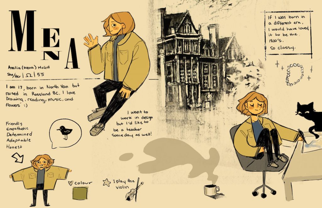
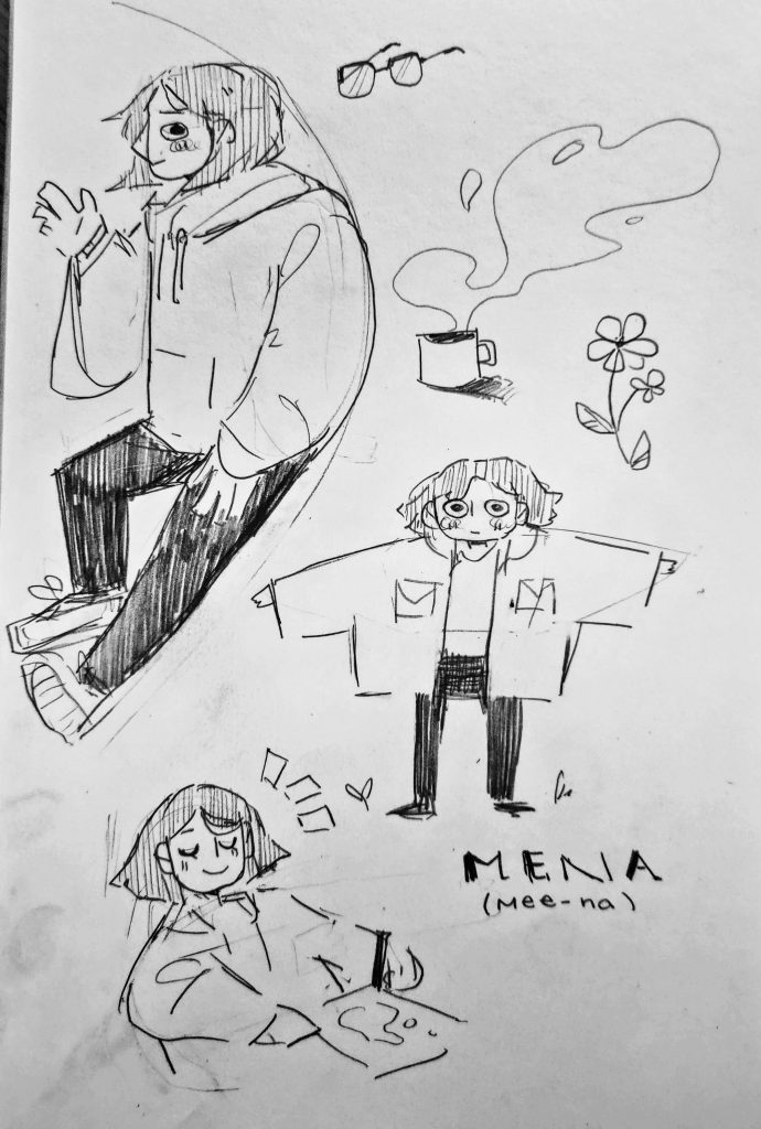
To create my yearbook spread, I started the same way I start any creative process; By drawing out all my ideas in my sketchbook. I focused on illustrating myself as if I were a character in an illustrated children’s book. It was the most simple, fun, and effective way to deliver my persona onto the page.
Once satisfied, I proceeded by tracing over my drawings in procreate and laying out my design. I decided to go for a classic aesthetic, in which I utilized warm tones to set an approachable, calm, and comforting palette. I wanted even the colors to give a glimpse into who I am. They also give off a tea-stained antique effect that I am quite fond of.
Cat- My lovely cat back home.
Necklace- I’d be surprised if I was caught not wearing it.
Bird- My adoration for the winged creatures and how I have some of their traits, such as hoarding small shiny items and the way I favour sitting in a perched manner.
Mug- I am an avid tea drinker, although apple cider season is around the corner
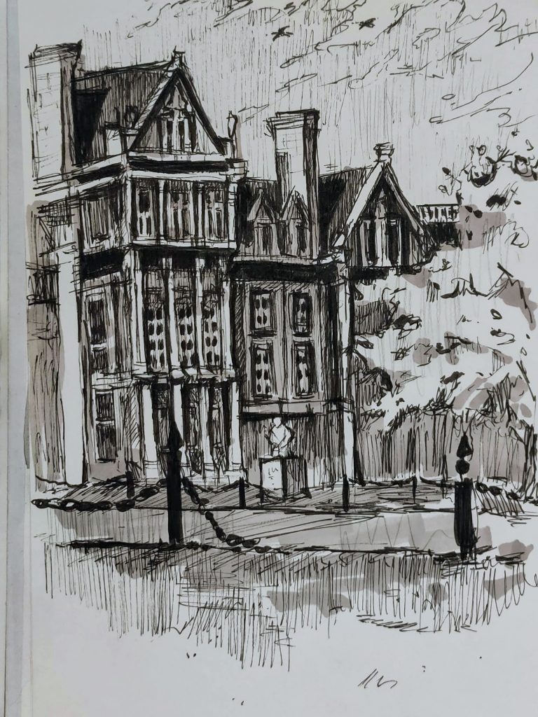
In my spread, I used a mix of digital and traditional mediums. I added a rough sketch of some buildings from my sketchbook for interest, an authentic view of my artwork and a contrast between the clean look of the digital rendering.
I find myself fascinated by intricacy, and I wanted to incorporate that feel into this piece, even with the simplistic design. I wanted my final piece to work together as a whole yet have many parts that each invoked their own individuality. I designed in hopes that even the typography would hold enough interest to captivate the viewer for a few seconds.
For this project, I’d estimate it took me about 4-5 hours total with planning and execution. I’d give myself a 8.5/10, taking off a bit for how I could have arranged my writing to be easier for the eye to read / less cluttered design.
Leave a Reply