I decided to go with a stream overlay theme for my yearbook spread. When I was young, I always thought it would be fun to be a content creator and to connect with people around the world. I always found myself wanting to be there for people or to be a source of comfort, whether that be providing a source of entertainment or comedic relief to take some time away from the stress of people’s lives, or to “rub off” my calm demeanor. I chose to primarily use the colour blue not only because it’s my favourite colour, but to also give off a sense of calmness that contrasts with the dynamism that comes from the use of diagonal lines.
The social aspect of live streaming always intrigued me, and it became more prevalent during the pandemic. Even if people may not physically be with you, their online presence alone can do wonders. I drew a connection at which online platforms like these are a social experience that helps grow a supportive community of like-minded people–and if this were to be taken out of context, you could even say that this could be applicable to post-secondary programs, and in this case, IDEA.
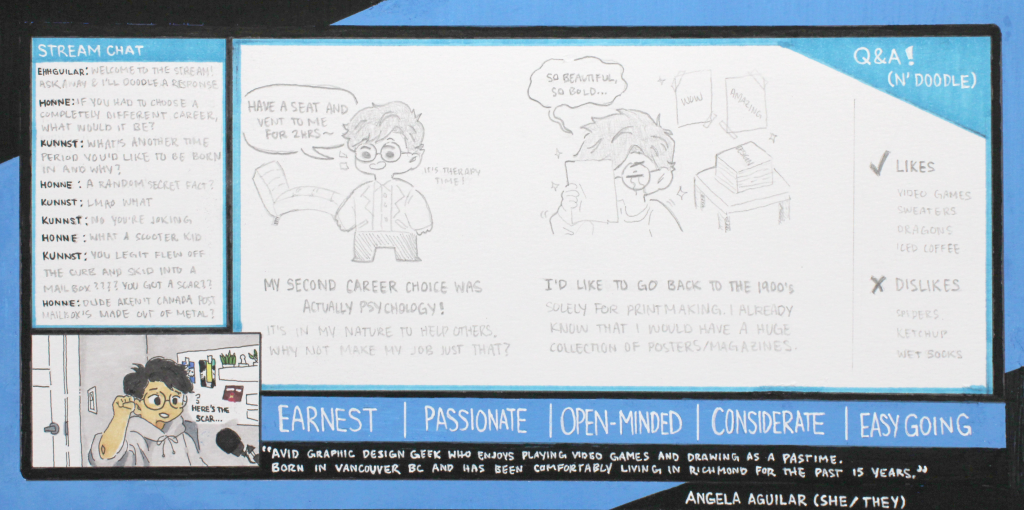
The universal layout for online video platforms is easy to navigate; I utilized this to help better organize my information. In correlation to the project, I made the livestream a Q&A segment where I would doodle my answers and keep a log of my responses in the chat. The colours in this spread other than the overlay itself are fairly monochromatic, although they are reflective of my actual room setup.
This assignment took roughly 5 hours as I had to wait for the posca markers to dry. If I were to grade this, I would give it an 8/10. One mark is for having accidentally ripped the multimedia paper several times while using washi tape, and the other for having marker inconsistencies and bleeds on the borders of the spread.