Before the Gutenberg Printing Press

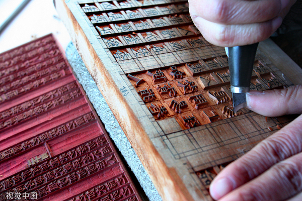
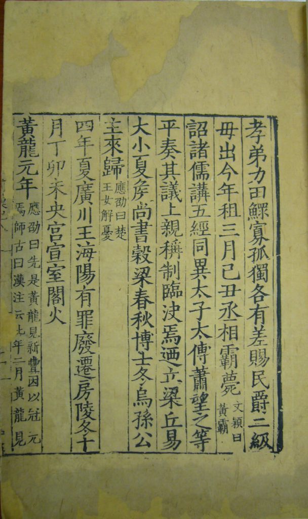
Modern craftsman carving wooden block print - http://www.seeyangzhou.com/2019-11/18/c_425092.htm

Printmaking in China was started around the seventh or eighth century with the creation of xylography, the art of wood carving. Originally, Chinese printmaking was made to spread Buddhist script, but was later adopted by commercial publishers and the state. Early Chinese printmaking flourished thanks to the government of the Song dynasty (960-12766). The Song dynasty government funded printing projects for Confucian classics and the civil service examinations. These exams were important in Song culture, as a means to climb the social ladder through literacy and education.

The printing press used cheap material and labor, since literacy was not required for wood carving. In comparison to the Gutenberg printing press (1450) where the initial investment was more expensive for the metal material and labor, the low investment price for Chinese printing allowed for an increased variety and abundance of books and genres. Chinese genres included: medical manuals, almanacs, calendars, dictionaries, and more. Although it is important to note the speed and quantity at which the Gutenberg printing press was created was greater than the early Chinese printing press. 

Another key difference is that moveable script was not popularly used in China, although it was invented by Bi Sheng in the 11th century. Bi Sheng’s moveable type was made out of delicate porcelain. A later rendition of the moveable type was made of small wooden blocks by Wang Zhen. Korea later added on to this technology with metal casted moveable type in the early 1200’s. The moveable script was not popular because it was expensive to produce. In comparison to Romanized script, Chinese script had thousands of characters that would need to be made for a single set. The great amount of characters needed to be made to start the Chinese printing press was most likely much higher simply because of the thousand more characters needed to be made.

Later forms of woodblock-printed book from the Qing Dynasty (1644-1911) – https://www.metmuseum.org/art/collection/search/60763?ft=chinese+printing&offset=0&rpp=40&pos=38

Why was Gutenberg credited for the printing press when printmaking started in China centuries before Europe? 

It can be argued that Gutenberg gets credit for the invention of the printing press because of the innovative speed, quantity, and widespread use. Meanwhile, the Chinese printing press preferred traditional xylography because of the extensive character count and high expense of moveable print. Though East Asia did create moveable text before 1450, the lack of use could account for the lack of credit.

Continue reading “Before the Gutenberg Printing Press”

How it’s made: Illuminated Manuscripts

Materials

The main materials for illuminated manuscripts include: parchment, ink, quills, and gold. Preparation for illuminated manuscripts starts with the parchment or vellum. Traditionally, parchment and vellum are made from thin, stretched-out animal hides. Continuing the preparation, ingredients are then gathered and made into inks, while feathers are cut into quills.

Instead of the traditional materials, I opted for calligraphy paper, inks, and dip pens.

Final Museum Project

Process

Before putting pen to paper, the scribe starts by mapping out guidelines. Then the guide starts inscribing the plain letters, allowing it to dry before continuing to the complex illumination. The illumination is often designed on a small slab of wax and is transferred with thin perforated parchment and loose charcoal dust. 

In my more modern methods, I transferred my illuminated design with tracing paper and graphite.

Process Picture: preparing the illuminated initial

After transferring the illuminated initials onto the page, the scribe will carefully go in with a gum and apply the gold leaf. Finally, the scribe finishes the laborious process by coloring in and inking the illuminated letters.

After creating my own illuminated page, the process is much simpler said than done. It had taken me about four tries before I was happy with my calligraphy. The final script took about four to five hours to complete. Though, I was unable to get my illuminated initial to be as intricate as I’d like, because of my inexperience with the materials used. Luckily, I didn’t have to go through the added processes of making my parchment or ink mediums. As for the museum set up, I decided to keep it rather plain and simple, as most museums would want their artifacts to be the star of the show.

References

I had tried to choose references of manuscripts before the introduction of the printing presses. Knowing how long the calligraphy was going to take, I also chose simpler pages with large illuminated initials.

Continue reading “How it’s made: Illuminated Manuscripts”

It all started with bones.

Oracle Bone Inscriptions are one of the first known forms of Hanzi, Chinese characters, which were a fundamental part of the evolution of East Asian writing systems. Otherwise known as jia gu wen (甲骨文), these historic inscriptions are found on the shells of tortoises and the bones of large animals. The jia gu wen date back to the Shang Dynasty (1600-1046 BC). The found script consisted of upwards of 3,000 distinct pictographs and ideographs, many of which have been interpreted into the modern language. 

Found by a village farmer.

The jia gue wen inscriptions were originally found in 1899 by a farmer from the Xiaotun Village of Anyang, which was later revealed to have been Yin–the capital of the Shang Dynasty. Roughly 150,000 bone and shell inscriptions have been found throughout China. As archeologists unearth and study more of the  jia gu wen, the script is deciphered to be mostly divine oracles, sacrificial rites, and records of the lunar calendars.

https://www.metmuseum.org/art/collection/search/42037 Oracle Bone Fragment | Shang Dynasty 1600-1046 BC | 3 x 7 inches

The Yin inscriptions were not the first.

Still inscribed onto bone, in 1992 an older version of jia gu wen was discovered in the Shandong Province. The set of twelve older bones were able to be dated back to the Longshan culture (3000-1900BC). Subsequently this confirms that the jia gu wen of the Shang Dynasty is a matured, polished version of Longshan Culture’s inscriptions.

How it’s made:

The theory of how the Shang Dynasty created the Oracle Bone Inscriptions starts with a script outlined in red or black ink. Heat is applied to the bone before inscribing to avoid cracking from the sharp instrument. The jia gu wen did not have a neat or organized writing structure as the natural bend and shape of the bones made it difficult to create uniformity.

https://www.metmuseum.org/art/collection/search/42023 Oracle Bone Fragment | Shang Dynasty 1600 – 1046 BC | 1 x 1.75 in
Continue reading “It all started with bones.”

Hello, I’m Charlie Wongpisethkul.

Long story short, I was born and raised in San Francisco, California. After high school, I graduated from the Culinary Institute of America with an Associates degree in Baking and Pastry Arts. After graduating at the height of the pandemic, I started a side job as a freelance illustrator which reignited my passion for art. Subsequently, I applied to Capilano University to further my education and hone my artistic skills.

Long story long, I was born and raised in San Francisco to a chef and interior designer. As a child I often found myself going to my mother’s restaurant, drawing while I waited for her. Once I got older my father taught me how to draw, using shapes as a guide. He’d often critique my childish attempts at realism, but it gave me a rather solid foundation. Throughout my schooling I often found myself drawing; it was something I couldn’t live without. The kids at school knew me as the restaurant art kid with the really long last name.

In high school I continued to pursue art. I took every art class I could, often staying an hour after class for extra work time and critiques. As much as I enjoyed my time in the studio, I went through a phase of burn out in senior year, especially with the pressures of college exams and applications. I questioned my ability as an artist and feared burn out, so I applied to culinary school. I was accepted into my first choice, The Culinary Institute of America – also known as the CIA.

The CIA established a solid foundation for my skills as a pastry chef. During my time there I was able to work with plenty of experienced chefs from all over the world. I was provided with a multitude of opportunities to help with pop-up restaurants, parties, and conferences. My mother’s connections also allowed me to do prep work for Thailand’s Master Chef. To complete my education, I was required to work an internship. I was lucky to have found a job at a French-Japanese restaurant in Omotesando, Tokyo, so I lived abroad in Japan for four months. I was definitely overworked and tired. This chapter in my life was so busy and strenuous that I didn’t have time to do any art.

My passion for art had plateaued until I graduated from culinary school. I then started working for my mother as a breakfast chef at her boutique inn. I finally had time after work to create and illustrate again. After a couple of months of drawing for myself, I started to take commissions and worked as a freelance illustrator and character designer. I worked freelance for a year and a half, before realizing art was a career I could truly commit to. That’s when I decided to go back to school as an art student. I applied to Capilano University’s IDEA program upon the recommendation from a friend and CapU alumni. Here I am waiting for the rest of my story to unfold as an artist.

Yearbook Spread

Imagine if I was a featured artist in a magazine. There would be an interview, glimpses of my life, some quotes, and a self portrait. Theoretically the editors would include pieces from my portfolio, but this yearbook spread is my work. While planning my layout, I wanted to include a gallery wall, which mimicked how I decorated my bedroom back home, a rather personal view into my life. The many versions of myself represent the many facets to my interests and personality. The first page introduces me more as an illustrator, while the second interview page showcases my life. Front and center on the first page is the largest version of myself as an idealized self portrait, drawn in a way I see myself and how I would like for others to see me. One version of me greets the audience in a cartoon form, welcoming them to my little gallery wall and interview. On the next page is an image of myself cosplaying, this is used to showcase my other hobby and as reference to one of the interview answers. The final image of me, at the bottom of the page, is slightly cut off with my face hidden. Ultimately showing that no matter how much I reveal about myself there are still things unknown to the audience.

For my self assessment I would grade this spread at an A- or a 9/10. Although I was able to include all the requirements in an interview layout, I feel as if it lacks some creativity. The total time it took me to complete was about 3-4 hours of actual work.