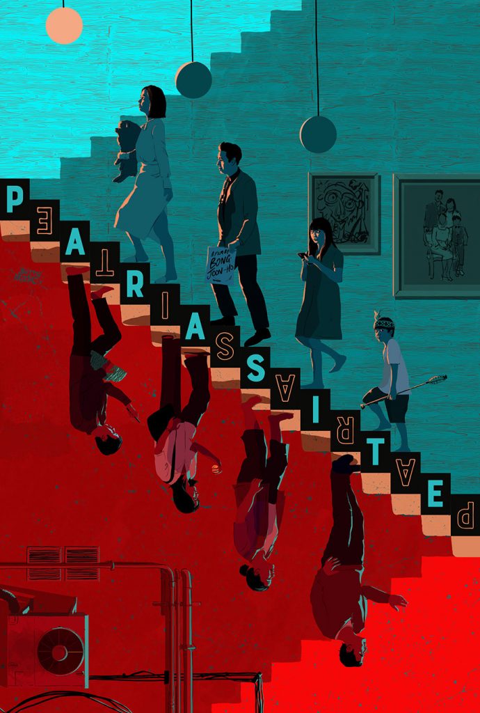
With the award-winning Korean movie Parasite, Andrew Bannister created this masterpiece inspired by the film. In the piece, Andrew used harsh color to differentiate the two families, with blue meaning wisdom and stability, and red symbolizing greed and war. You can also see that he used direction to show that both families are always trying to move forward. As the red family tries to move forward you can see that the light shining on them is a blue light meaning that the red family’s way of moving forward is to leech on the rich blue family.

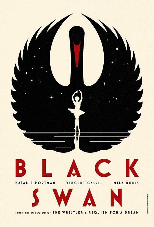
To promote the movie the black swan, Scot Bendall created a beautiful piece using Space and Shape. Scot used the negative space of the poster to create a ballerina in the middle of the piece while using the positive space to create a black swan surrounding it. With the shape of the swan and the letters, he displays a sharp and clean look on the piece.

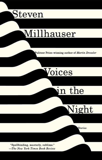
The cover of Steven Millhauser’s “Voices in the Night” shows amazing Linework, though on the computer the design looks flat, the physical copy looks as though the book is morphing. This cover really uses linework to create an optical illusion to the human eye.
Leave a Reply