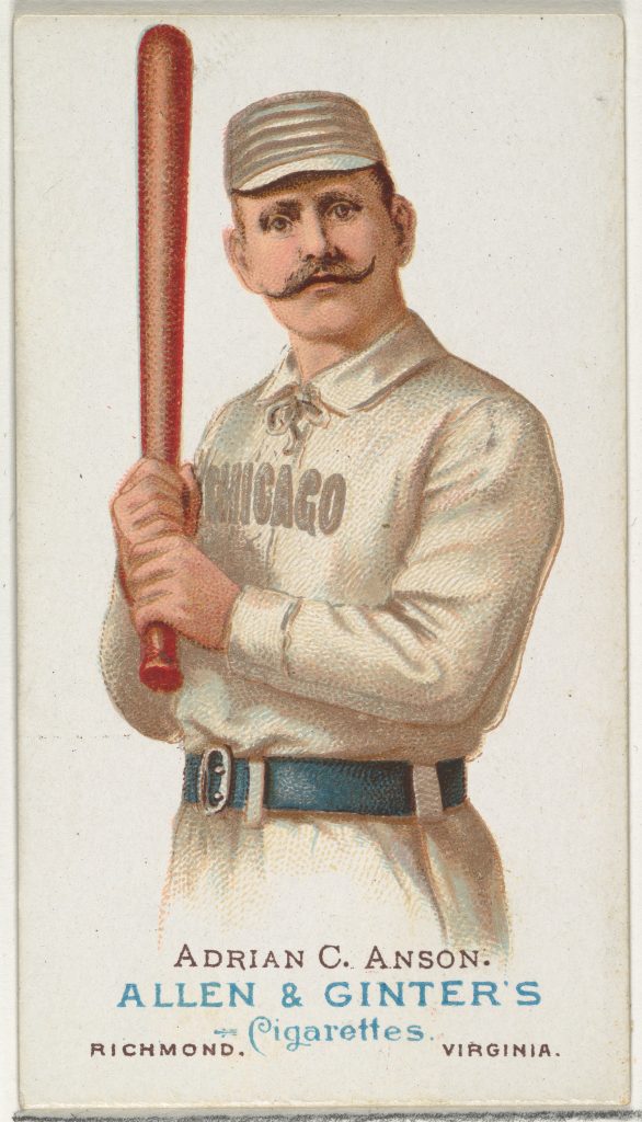
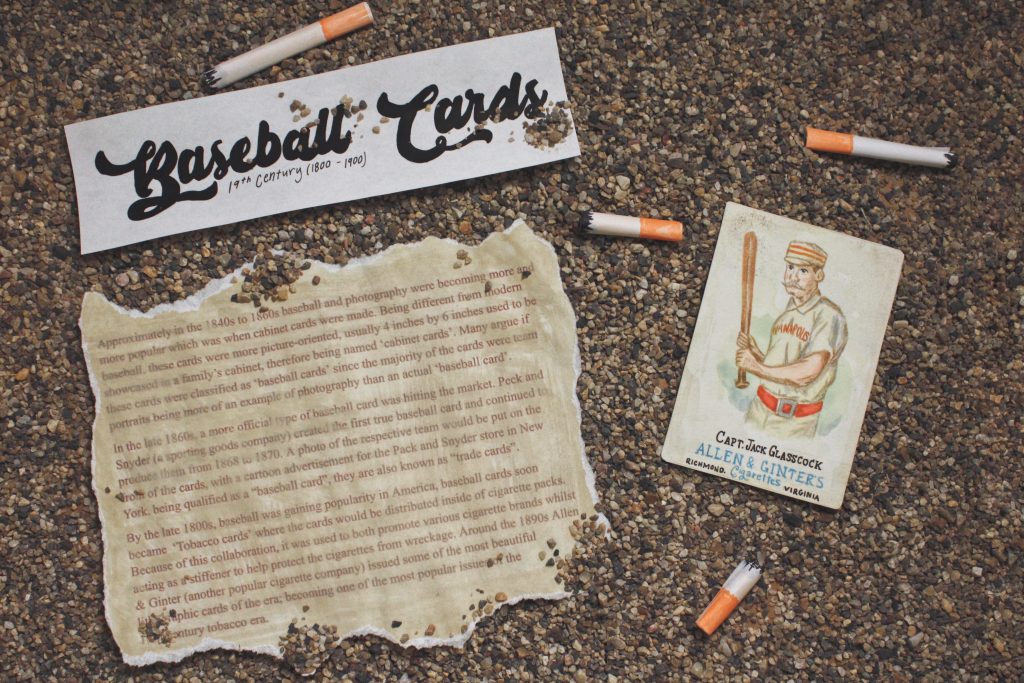
For my Historical Artifact assignment, I was researching on the internet and came upon an article about “The History of Baseball Cards”. As a child, I used to collect various type of trading cards which is very similar to baseball cards, after reading the article I felt drawn to the interesting story of its origin. At first, I wanted to do a card of ‘Adrian C. Anson’ but felt it was graphically bland, therefore while researching around and I saw a card of ‘Capt. Jack Glasscock’ where I instantly fell in love. The design had great aspects of the brilliant red and is added by a light greenwash at the back which toned down the red on the card. Though red and green are complementary colors many believe it is a questionable color combination, the designed tone of the red and green card is perfectly created to harmonize the two colors together.

Adrain C. Anson 
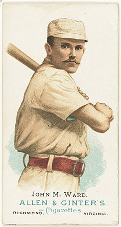
John M. Ward 
Capt. Jack Glasscock
If I had to give myself a rating out of ten I would give myself a 9/10. I feel that I did a good job copying the image to the reference, but I felt I could have made another card or maybe a cigarette box. It took me a moment to find an artifact that caught my eye therefore not being able to put my full potential. This project took me about 10 hours to design my piece and create the set for my photo, but I also did 5 hours of researching as well.

Leave a Reply