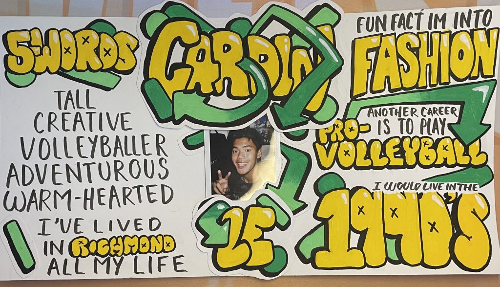
For my yearbook spread, I tried to go for a 90s retro theme, throughout the piece I used paint markers to put iconic rectangles and circles in the 90’s era. In the middle of the piece is a photo of myself that I took on a polaroid camera. I choose to go with a yellow and green theme to symbolize my joyness and hope. In the piece, the yellow words represent me as a joyful person and the green shapes show how I always surround myself with hope.
I would rate myself a 9/10. I feel that a lot of the words clash with the title/my name because I wrote and colored it in the same style. I also wish I could have thought of a more creative way to illustrate the 5 words about myself and where I grew up.

Leave a Reply