Month September 2021
This image is an example of Gestalt’s figure/ground principle. Our brains separate the foreground, that being the shark, and the background, which is the light blue color. The designer of this piece used this principle to create multistability. This means… Continue Reading →
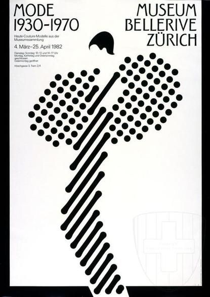
This poster, by Martin Diethelm, is an example of Gestalt’s closure principle. This is because we can see the model and her dress in the image, despite it being made up of unfinished shapes. The illustration breaks, but our brains… Continue Reading →
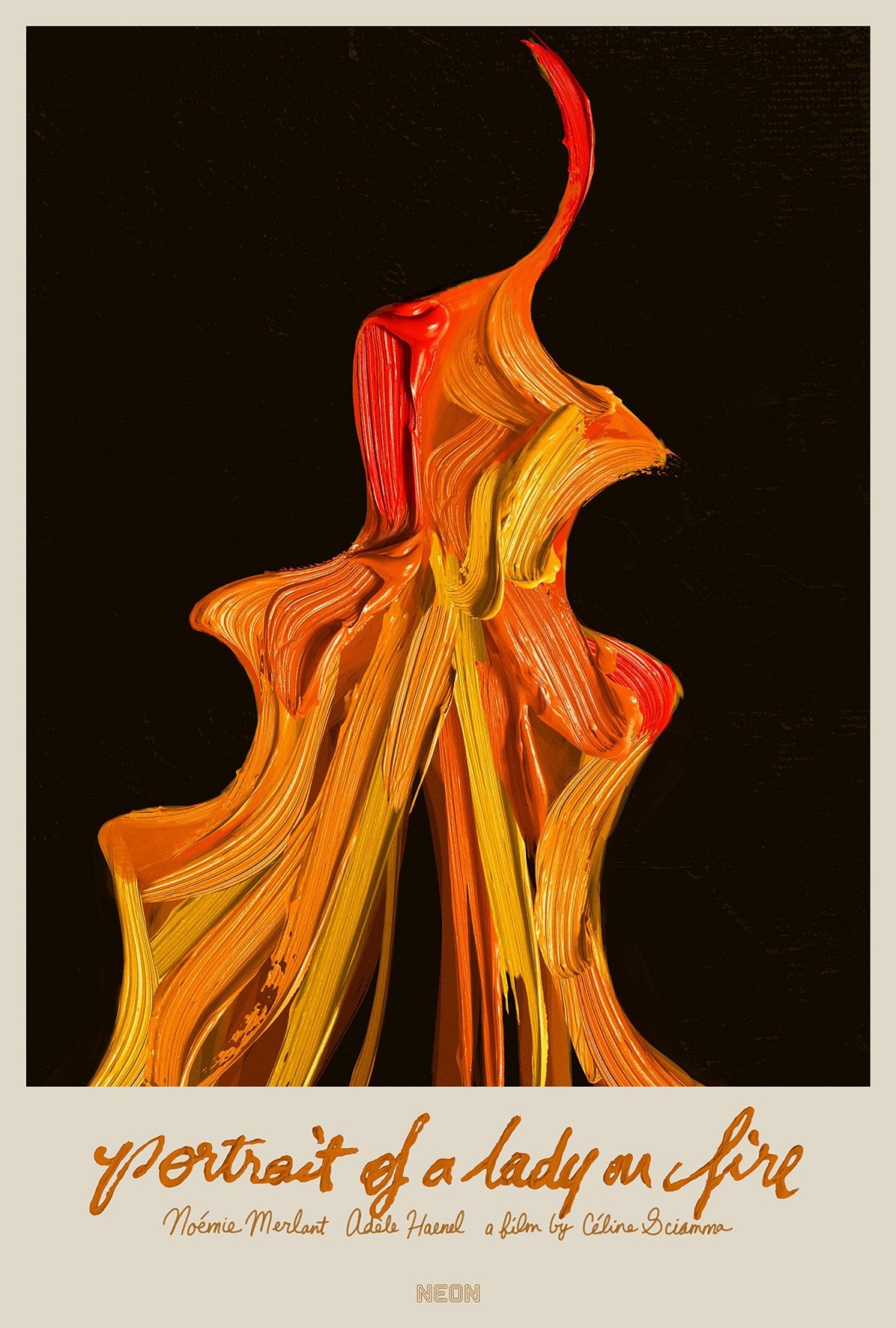
This poster was made by Akiko Stehrenberger, for the movie Portrait of a Lady on Fire. The fire is conveyed through very visible brush strokes. The use of texture combines two of the most important aspects of the movie. One… Continue Reading →
This poster, for the movie Fantastic Planet by Rene Laloux, uses size to tell the viewers what the movie will be about. The blue creature in the foreground is huge compared to the little boy she’s holding. Her striking red… Continue Reading →
Vogue Cover of Jean Patchett, by Erwin Blumenfeld. This image uses a significant amount of white space to highlight the eye and lips of model Jean Patchett. Aside from creating elegance, the use of white as the background color also… Continue Reading →


