September 19 2022
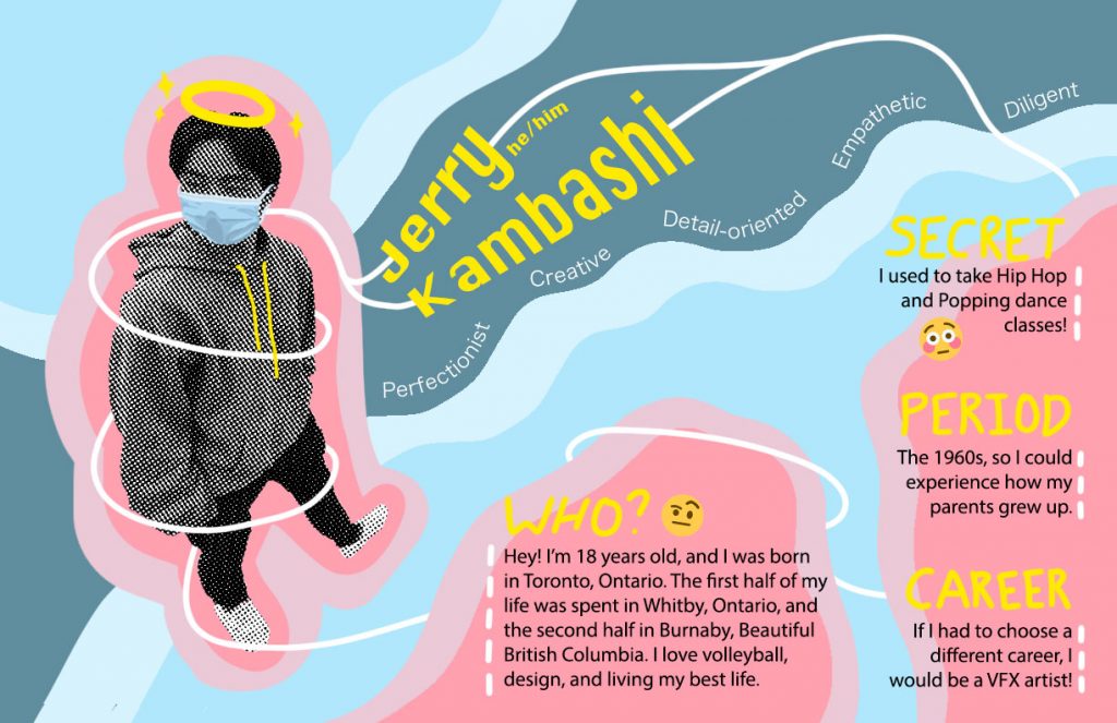
Right from the get-go, I had a couple concepts and ideas I wanted to do for this project. First was the bitmap photo of me. Knowing my illustration level, I knew I was going to use a photo of myself, and that it was going to be bitmap to add contrast. I chose this specific photo because of the different angle it had, and the pose which I kind of liked. Second was the “layers” concept. I knew I wanted to have outlines of shapes giving a simple and clean layered effect, and that it would be the bulk of the composition. Lastly, I knew I wanted it to have some doodles littered around, to make it more interesting and give the whole thing more personality.
I decided to execute the layers through wavy shapes as I wanted it to be more organic visually. For the colour scheme, I knew I wanted bright colours, and I found that pink went really well with my favourite colour blue. For the doodles, I thought that the halo and added sparkles would just be a fun touch. Initially, I had the idea of having a line swirl just around me, also as one of the doodles. Then, I decided to have the line go around the whole piece to give it a better sense of flow and direction, and to unite all the components. For the text, I decided to use the pink blobs as the background to make it pop out more, and I knew it would be difficult to try and keep the text strictly inside the inner blob, so I intentionally let the text bleed over. I also drew the different text section titles to add to the doodle effect. For my name, I thought it would be cool to have it a little wavy to match the fluidity of the white line. For the 5 adjectives, I thought that it would look good to curve the words to match the big wavy blue blob for more fluidity.
I would give myself an A. I spent around 12+ hours on this project, most of which was just playing around with different ideas and compositions. I am also very indecisive, and my workflow and process are quite slow at the moment.
Leave a Reply