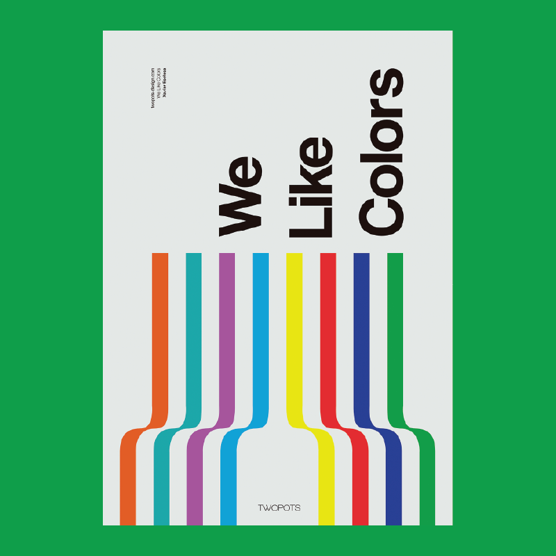
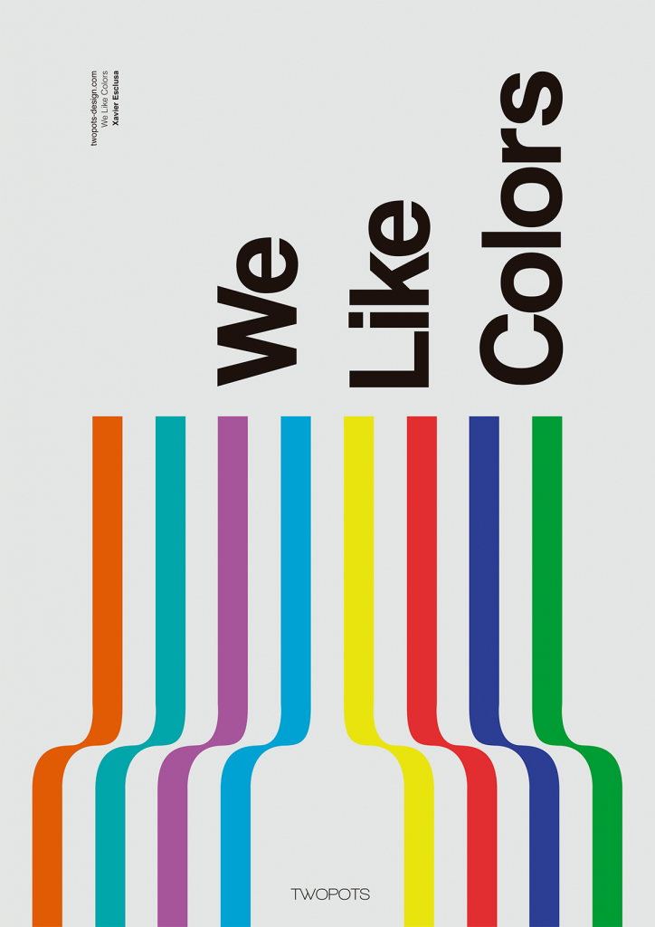
Colour — Xavier Esclusa / Twopots Design Studio
Xavier Esclusa created this poster to help promote his design firm. It’s a strong example of harnessing colour to help tell a story, in this case, about Xavier’s company Two Pots. They love working with colour, and they’re good at it. Additionally, the effect of the colours in the poster strike the same tone as the message, “we like colors”; playful, organized, and friendly. Who wouldn’t want to work with Xavier after seeing this?!
Leave a Reply