I created The Tiny Tome Of Humanist Typography to look like an old book to fit the subject and period of the early humanist typefaces.
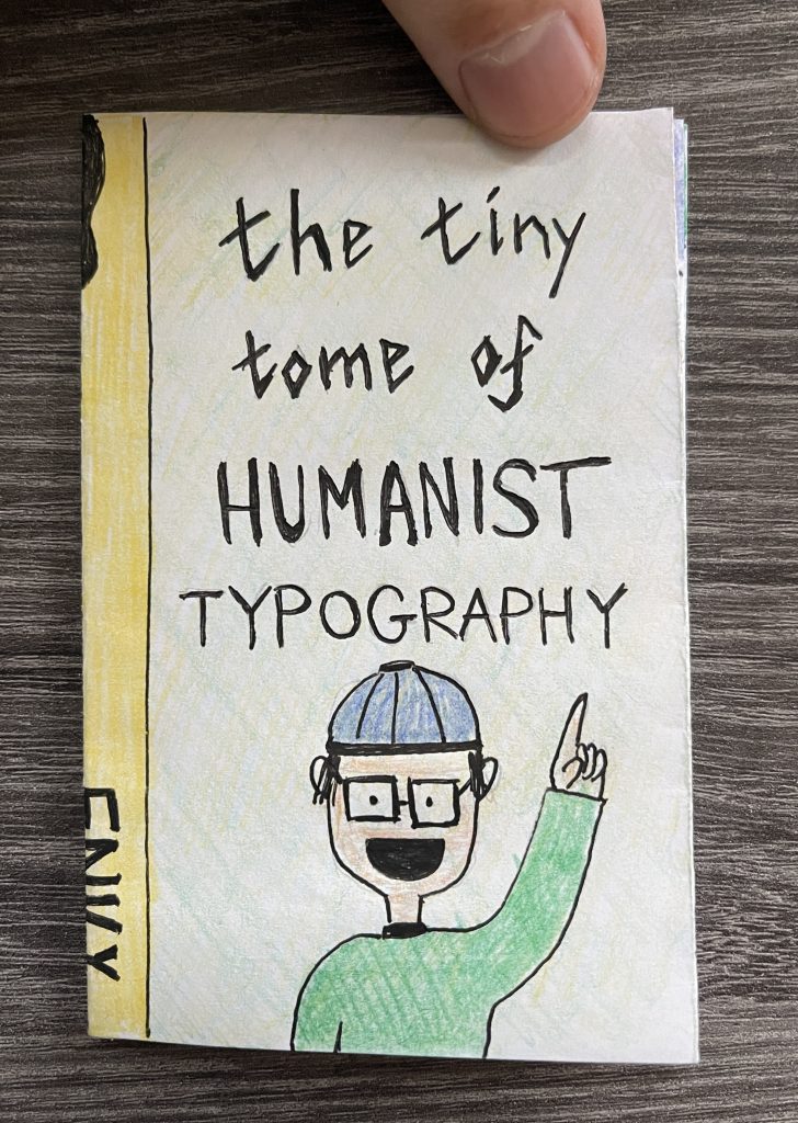
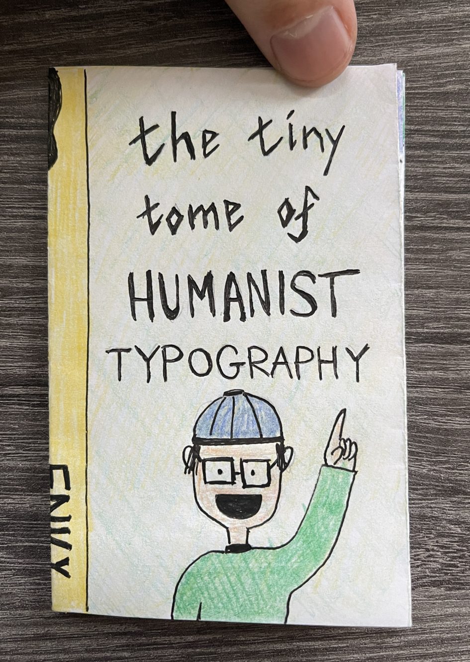
Cover 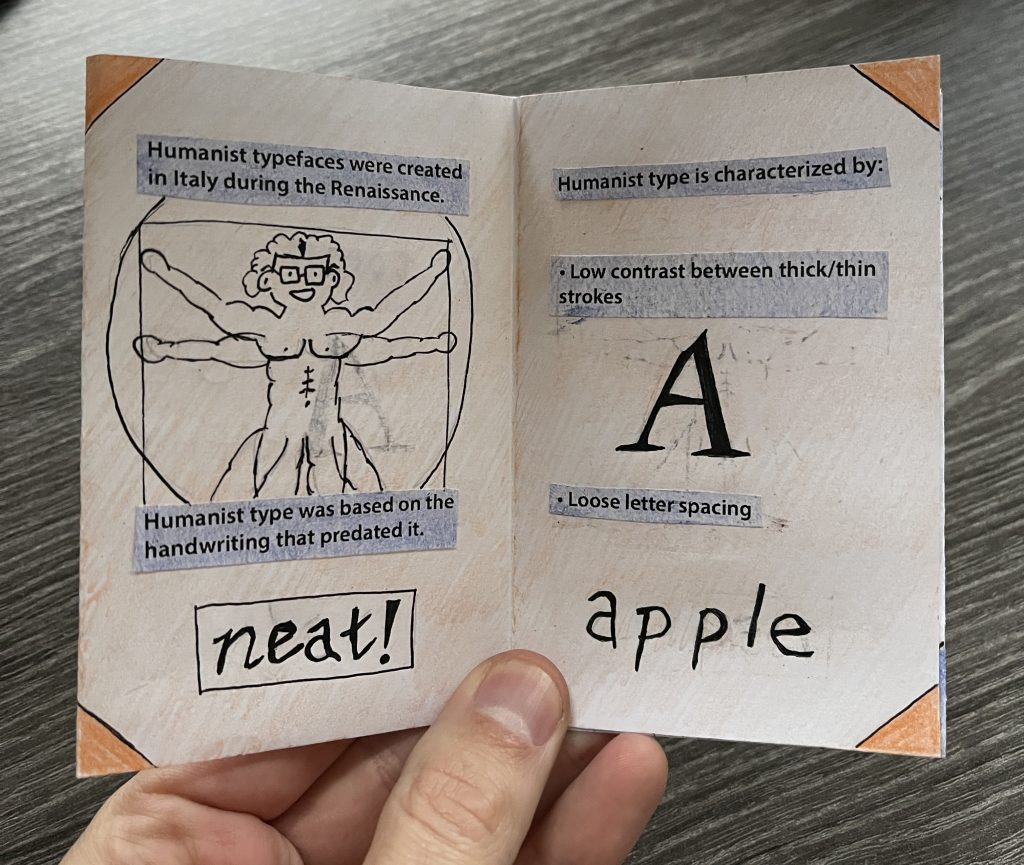
Spread #1 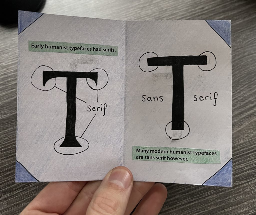
Spread #2 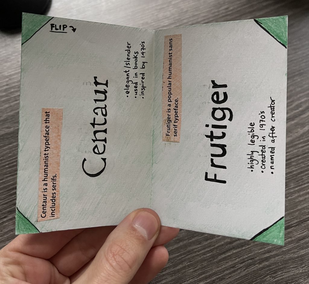
Spread #3 (Vertical) 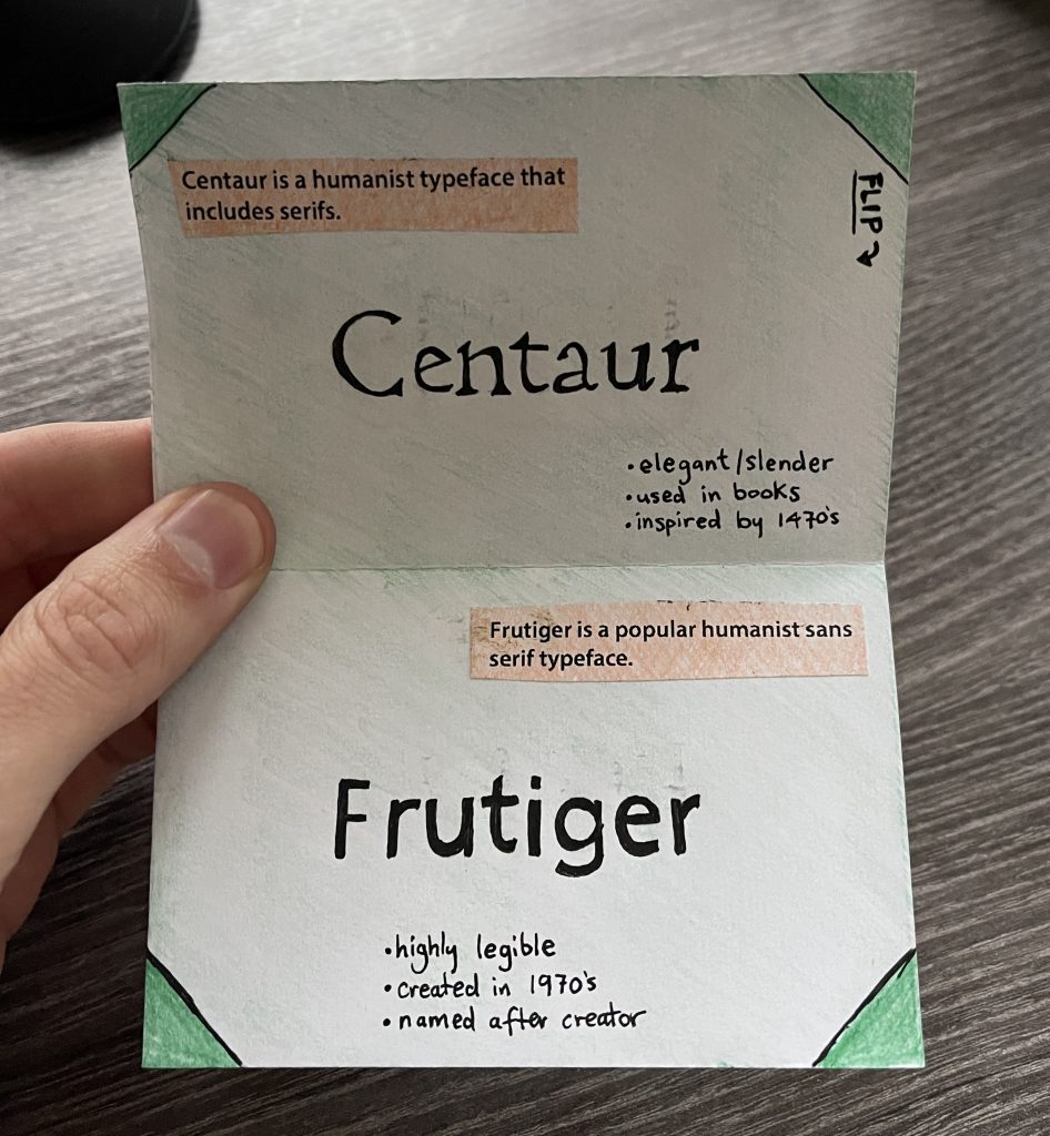
Spread #3 (Horizontal) 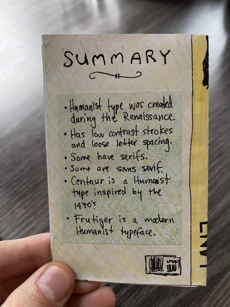
Back
In my research, I noticed most zines are very busy. This inspired me to try and design a cleaner layout that would feel unique but still be visually pleasing. I chose a humanist typeface as the body text (printed from my computer) to keep things tidy on the interior of the zine. I also included hand-drawn elements to mirror the human aspect of the subject I chose. I think bringing digital and analogue visual elements together in my design was a great choice for this topic. I applied the colors I selected for my zine consistently with the same rules (two colours per page) to bring the whole piece together.
With this project, I challenged myself to make the information enjoyable and functional. I imagined my audience might try the typefaces I suggested on spread #3 so I wanted to include information that could help others use them.
I spent 7 hours on this project from start to finish including research and playing around with the layout. I have to admit; I’m pretty happy with the design of my Zine. I think it’s cute and clean in the way I set out to achieve. Critically, I feel I could have spent a little more time in initial research to find a slightly more unique subject. I’m pleased, but there’s always room for improvement.
8.5/10.
Research Sources
https://en.wikipedia.org/wiki/Centaur_(typeface)
https://en.wikipedia.org/wiki/Frutiger_(typeface)
https://www.masterclass.com/articles/humanist-typeface-guide#4-attributes-of-humanist-typefaces
Leave a Reply