Category 121
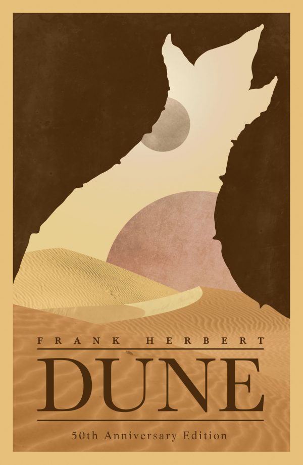
I’m reading Dune in my spare time (of which there is very little). Here’s an excellent example of the Gestalt Principle, “Figure and Ground.” The plot hinges on the setting; the desert planet of Arrakis. That, and the murderous sandworms,… Continue Reading →
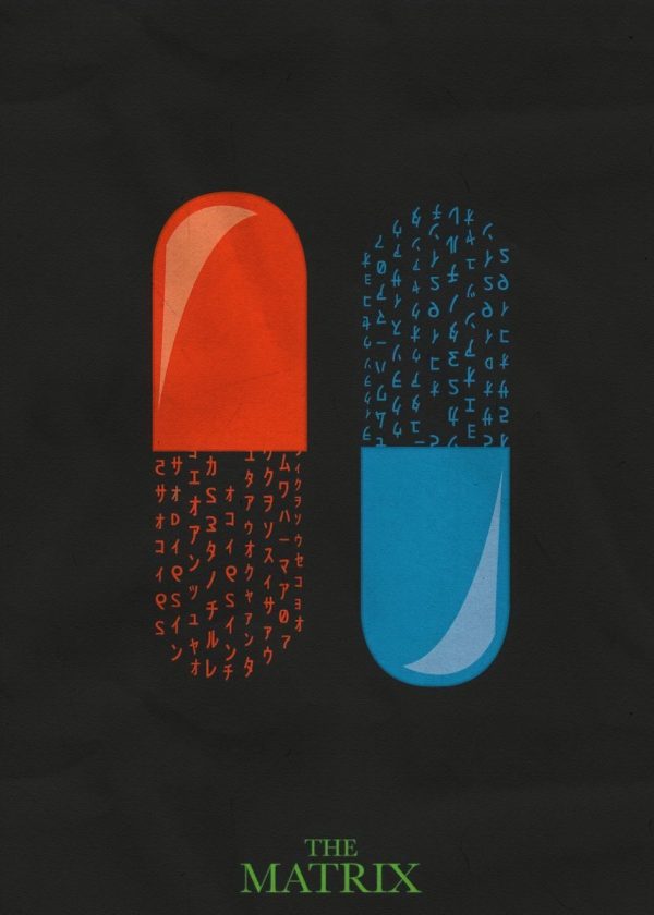
This concept poster for the film, The Matrix illustrates the Gestalt Principle of Continuity in my opinion. The evenly spaced groups of the characters work together to complete the image of the red and blue pills that are so iconic… Continue Reading →
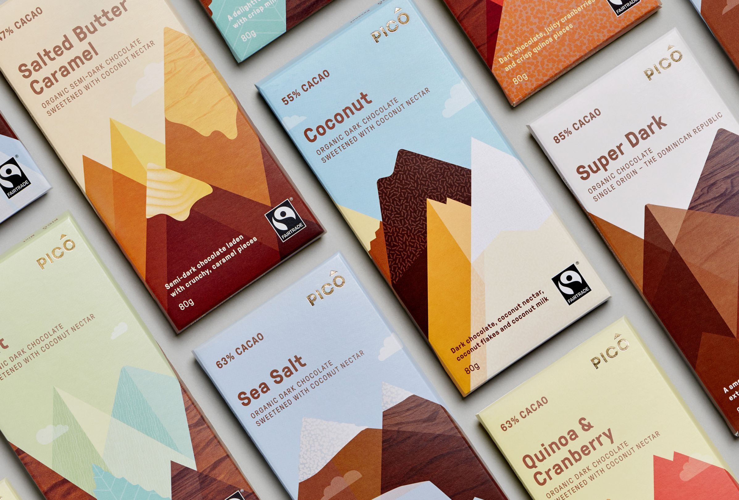
Texture — Swear Words Design The textures used in the design of these chocolate bar packages bring this design home, in my opinion. Their job is an important one: to stimulate your appetite! The textures hint at chocolate, confectionery sprinkles,… Continue Reading →
Space — Sir Peter Scott Sir Peter Scott’s logo for WWF is an impressive application of white space. The panda is a simple and effective illustration that cleverly uses negative space. Of course, we know real pandas are black and… Continue Reading →
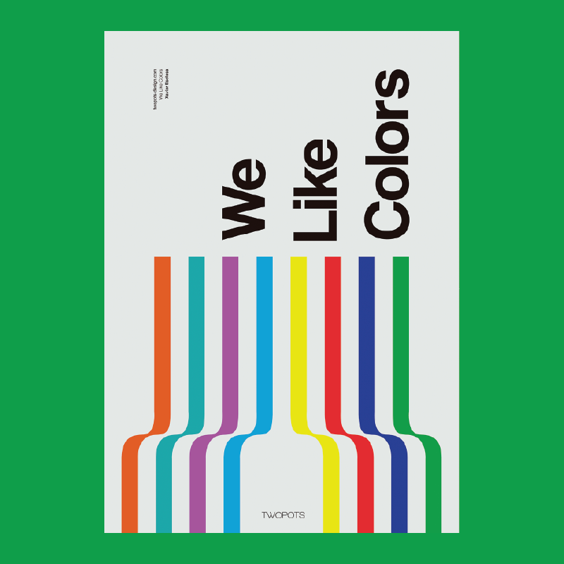
Colour — Xavier Esclusa / Twopots Design Studio Xavier Esclusa created this poster to help promote his design firm. It’s a strong example of harnessing colour to help tell a story, in this case, about Xavier’s company Two Pots. They… Continue Reading →


