Page 3 of 3
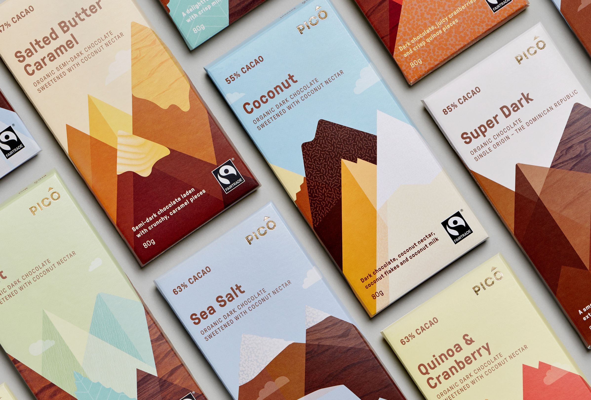
Texture — Swear Words Design The textures used in the design of these chocolate bar packages bring this design home, in my opinion. Their job is an important one: to stimulate your appetite! The textures hint at chocolate, confectionery sprinkles,… Continue Reading →
Space — Sir Peter Scott Sir Peter Scott’s logo for WWF is an impressive application of white space. The panda is a simple and effective illustration that cleverly uses negative space. Of course, we know real pandas are black and… Continue Reading →
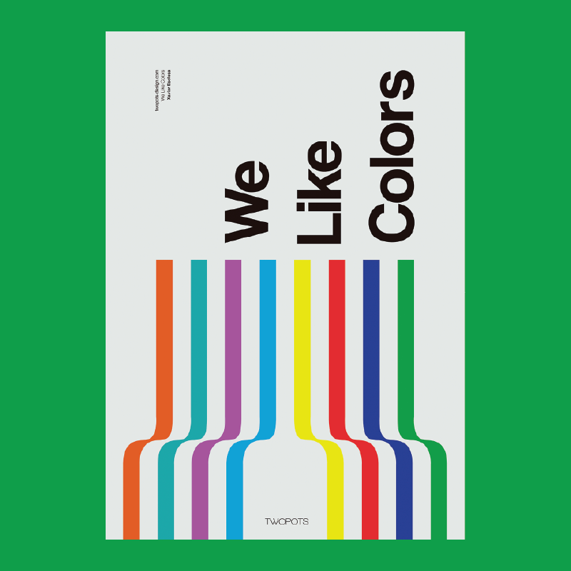
Colour — Xavier Esclusa / Twopots Design Studio Xavier Esclusa created this poster to help promote his design firm. It’s a strong example of harnessing colour to help tell a story, in this case, about Xavier’s company Two Pots. They… Continue Reading →
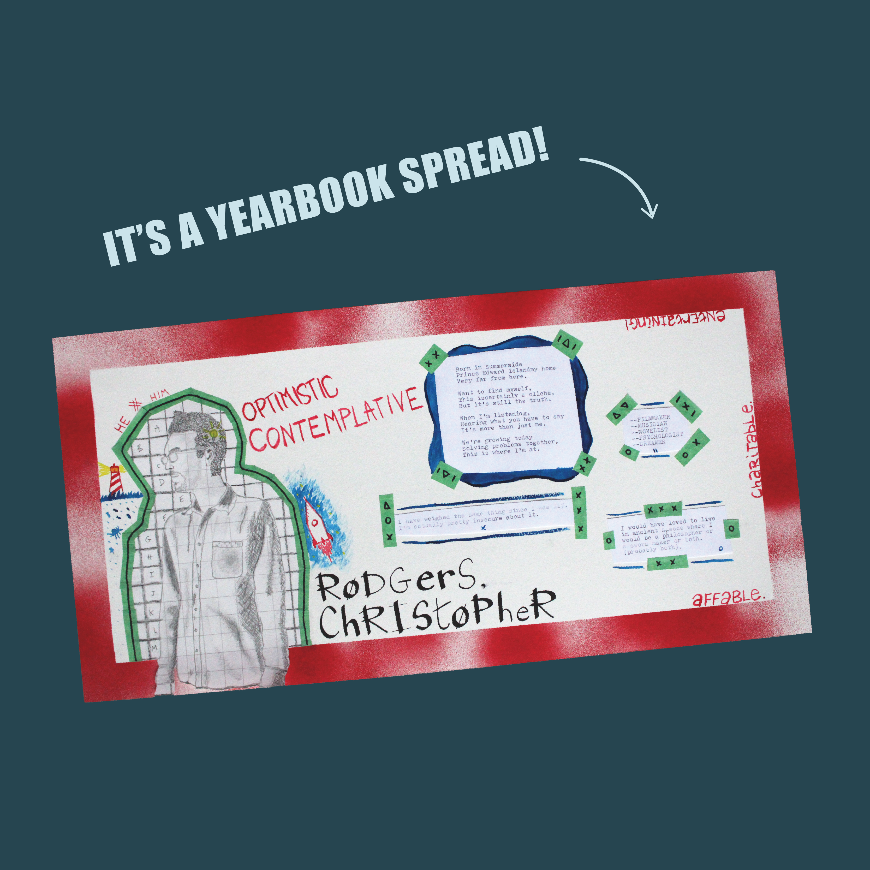
When I started brainstorming about my yearbook spread, I considered the aesthetic that would represent me. I was inspired to create a clean layout with ample whitespace and a culmination of different materials. Overall the goal was to come up… Continue Reading →