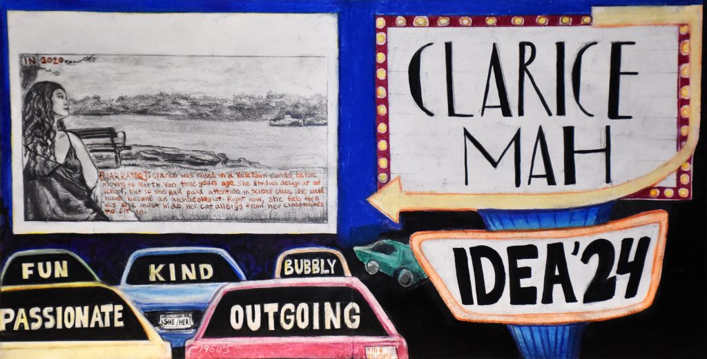
For my yearbook spread, I chose the drive-in theatre theme to portray how I compare my life to a movie.
I spent the first couple days brainstorming my characteristics. Then, I came up with a list of concepts. I only drew up the ones that I felt inspired by, and that I could visualize.
A blu-ray disc and a movie poster theme were my two final ideas. I spent time elaborating each of their layout plans. However, after receiving feedback from Megan, I chose the movie idea instead. It makes more sense in a story-telling aspect, and I’ve always wanted to see a drive-in movie!
I like to believe I am a movie character because I experience “movie moments”: memories that seem too good to be true. This mindset comes from the gratefulness I have for my life.
My picture illustrates me looking off into the distance; I seem to be deep in thought. This represents how I am an over thinker and a day dreamer.
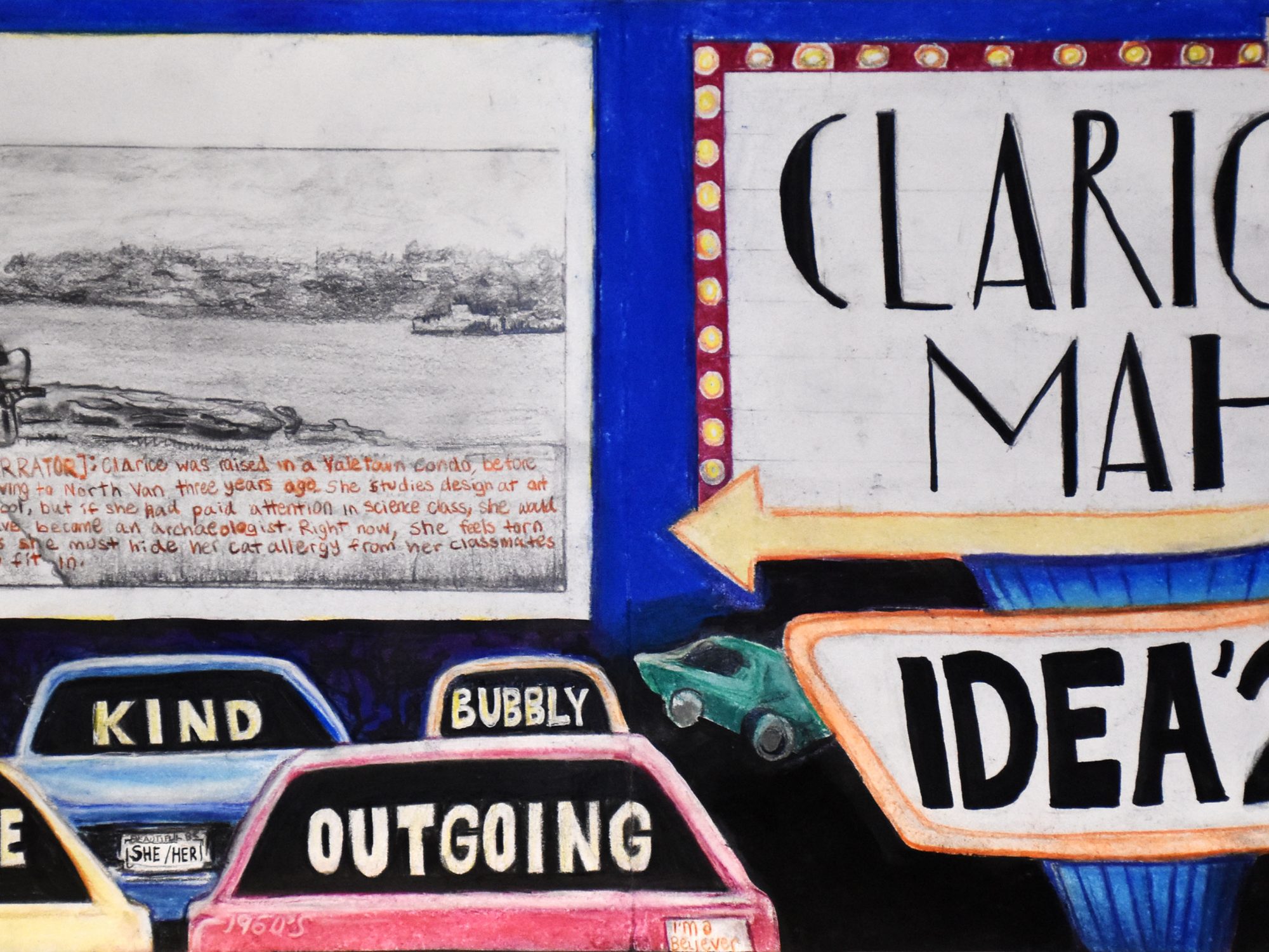
The bright colours and bold font depicts my open personality. The font of my name references “La La Land” (I adore Emma Stone). My key words are illustrated in the cars’ back windows, emulating the light from the screen. I would’ve loved to be born in the 1960s, which I referenced on the red car with the 1960s text and Beatles sticker. My introduction is written as “subtitles” to fit the theme.
My project is an 8/10. It engages the viewer by using direction, and has depth through colour and the elements’ arrangement. I worked really hard on this project with good time management. It’s not a 10 because the introduction is hard to read, and I didn’t explain why I chose the 1960’s decade.