For my project, I chose to create an art-nouveau alphonse mucha inspired typographic infographic timeline focusing on women in typography.
Some examples of my original inspiration:


First idea generation/rough sketches:

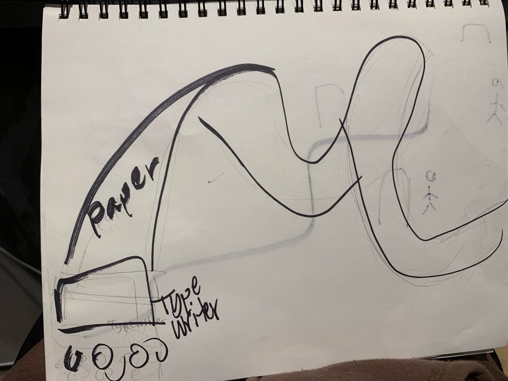

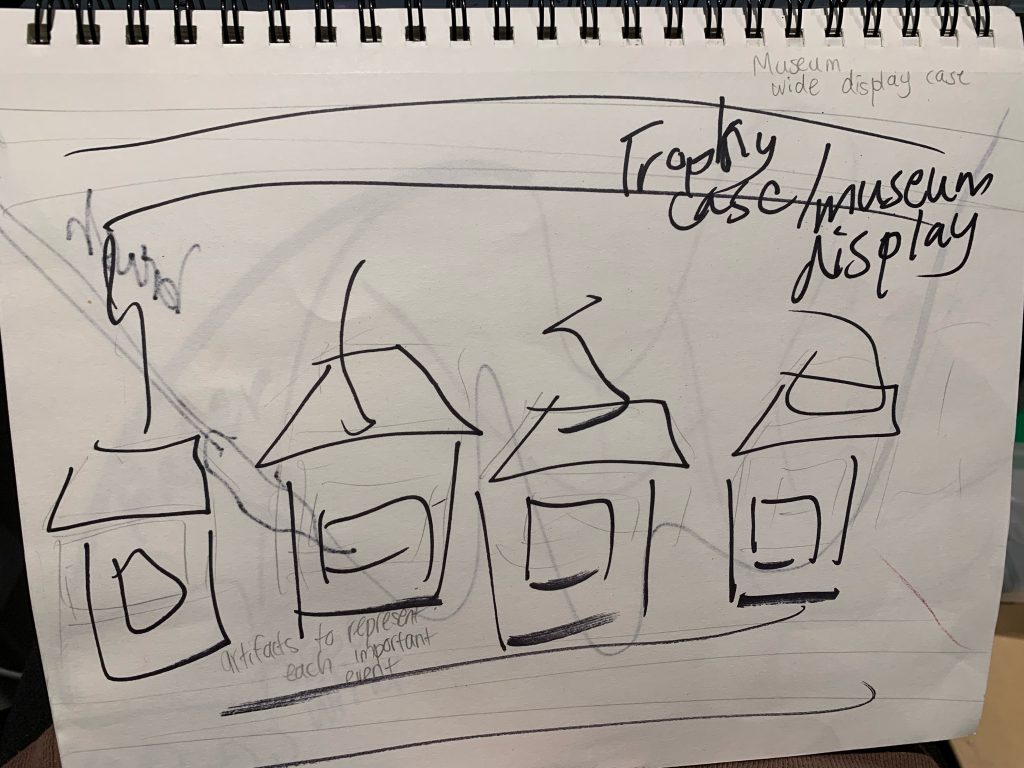
At first I didn’t understand what content/ information my timeline would represent, and I was originally going to create a timeline based on the general history of typography. However, I received some helpful clarification from Tiffany. She told me I could create a more focused timeline on a topic that I wanted to.
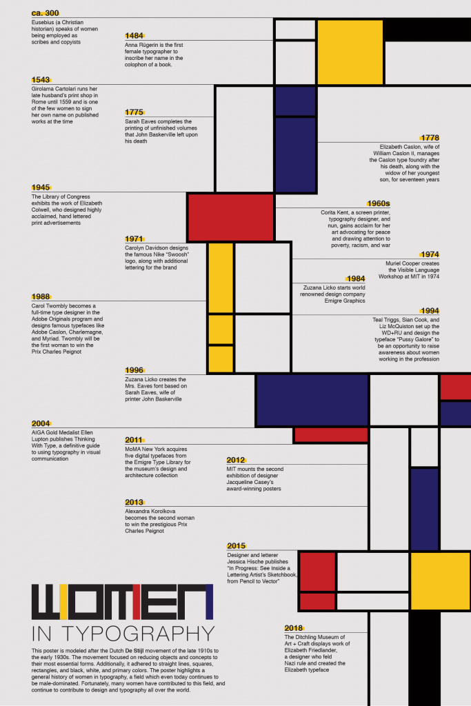
So I began narrowing down my research by googling art movements I am inspired by such as Art Deco and De Stijl. I chose to research women influenced events because of this De Stijl inspired typographic timeline of Women in Typography.
Then, I sketched some ideas based on these movements, but I came to a final idea based on Alphonse Mucha’s piece “The Precious Stone Series” from 1900. My final concept idea for this project was to create an art nouveau inspired timeline on women in typography.
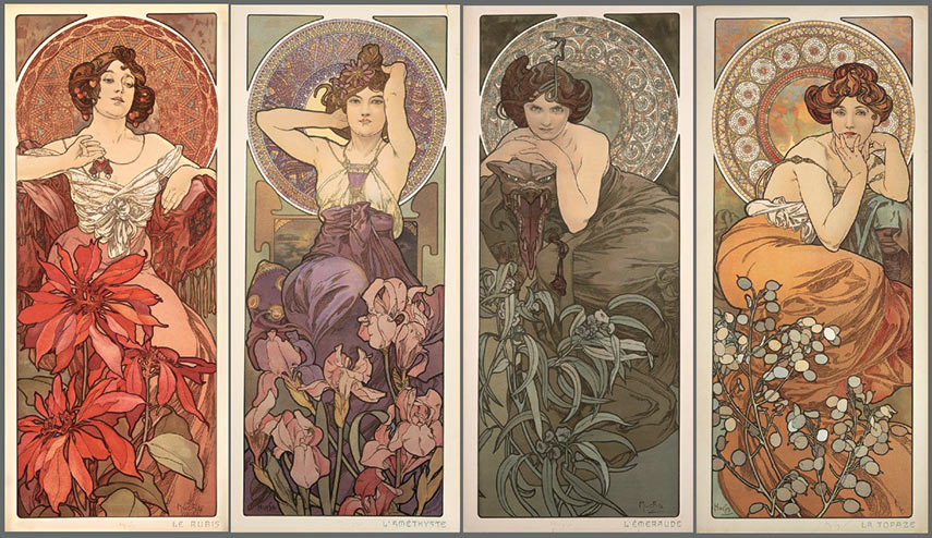
https://www.widewalls.ch/magazine/art-nouveau-history-and-legacy
Sketches after more research:

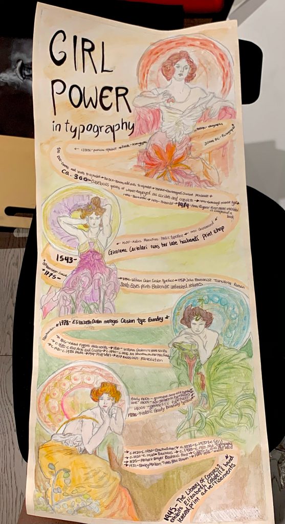
I thought the imagery of the women in this piece would be fitting for my timeline. So I illustrated them using hierarchy by placing the first girl at the top (the text reads from left to right and top to bottom, and this illustration is red which helps to draw the eye) and scaling her a bit larger compared to the rest of the figures.
To display the events and the text, I illustrated a ribbon that wraps around the figures and flows to the bottom of the page. The historical events that were specifically relevant to women are bolded. Watercolour pencil was used to illustrate the women and the background, acrylic paint was used to paint the ribbon, and I used a black marker to write the text.
I really like how my poster turned out. I think this assignment was fun to make and a good way to learn about typographic infographic timelines, as I’ve never made any sort of infographic before.
My infographic typographic timeline:
Self-evaluation:
I give myself a 8/10. It’s not a 10 because I feel like my design could be rendered even cleaner and sharper, some of my pencil lines were not drawn lightly enough and can still be seen through the paint in certain areas. I also feel like I could have displayed my information in a way that would be easier to follow. However, I followed all the steps of the brief: I researched and decided on the events and presented accurate information; I researched and found inspiration on infographics and timelines; I created sketches and generated ideas; I did everything by hand; I delivered a creative style poster; and I wrote this blog post.
Sources:
“40 Infographic Ideas to Jumpstart Your Creativity.” Visual Learning Center by Visme, visme.co/blog/infographic-ideas/.
“Art Nouveau – History and Legacy.” Widewalls, www.widewalls.ch/magazine/art-nouveau-history-and-legacy.
Audralinsner. “Linsner – Timeline.” TYPE MATTERS, 30 Jan. 2018, 437.claudiastrong.com/linsner-timeline/.
“History of Typography Timeline.” Visual.ly, visual.ly/community/Infographics/history/history-typography-timeline.
McCready, Ryan. “15 Timeline Infographic Design Examples & Ideas – Daily Design Inspiration #18: Venngage Gallery.” 1000 Infographics, Posters, Flyers & More | Venngage Gallery, 12 June 2020, venngage.com/gallery/timeline-infographic-design-examples/.
