Ruedi Baur


Research:
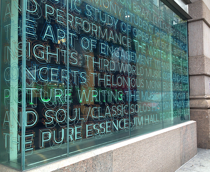
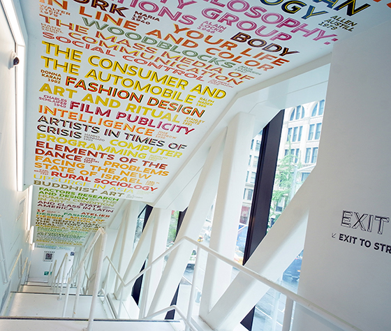
Born in 1956 in Paris, France, Ruedi Baur is a graphic designer who is known for his visual identities, as well as the signage for the Centre Pompidou in Paris, the New School in New York, Cologne-Bonn and Vienna airports and the Greater Bordeaux area. He was trained in graphic design by Michael Baviera in Switzerland. In the early 1980s, he founded his first studio in Lyon and began curating design exhibitions. He returned to Paris in the late 80s to develop design projects. Baur was commissioned by the Picasso Museum, the Louvre, and particularly the Pompidou Centre, as he designed their complete directory and identification system for their reopening. His work then became more architecture-focused. Along with Pippo Lionni and Philippe Delis, he developed the multidisciplinary design that combined architecture and urban development by creating the Intégral network of studios. Since 1987, Baur has delivered lectures on transdisciplinary design in design schools and has become a member of the AGI.
Opinion:

Baur believes that “it is the function of the information that defines the space more than anything else” – Rudy Baur https://www.architonic.com/es/story/tlmag-ruedi-baur-swiss-graphic-design-past-present-and-future/7001409.
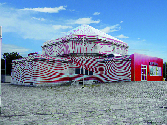
I believe that this quote is well reflected in Baur’s urban design work. This project he did for the Maison de la Villette particularly stood out to me. I love bold art in a public environment because it always gives the real world a lively energy and brightens up a space. What struck me from this design was how it is able to add depth to an otherwise simple structure. The tenseness in the closer line work contrasted with the dynamic and flowing waves is what makes this a bold design.
Image Credit:
Image 1: https://www.culture-grandparisexpress.fr/ruedi-baur
Image 2 and 3: http://www.ruedi-baur.eu/en/
Image 4, 5, and 6: https://www.architonic.com/es/story/tlmag-ruedi-baur-swiss-graphic-design-past-present-and-future/7001409
Sources:
Baur, Ruedi. Ruedi Et Vera Baur – Ruedi Et Vera Baur, www.ruedi-baur.eu/en/.
Baur, Ruedi. Ruedi Et Vera Baur – SHORT BIOGRAPHY., ruedi-baur.eu/en/biography/short-biography.html.
“Ruedi BAUR.” Grand Paris Express – Culture & Création, www.culture-grandparisexpress.fr/ruedi-baur.
TLmag. “Ruedi Baur: Swiss Graphic Design – Past, Present and Future.” Architonic, Architonic, 28 Aug. 2016, www.architonic.com/es/story/tlmag-ruedi-baur-swiss-graphic-design-past-present-and-future/7001409.
