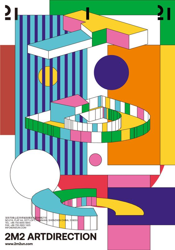
Use of Line
Use of line is important in this example to add motion, as well as place emphasis and draw attention to the earth illustration. Lines are also used in the hand illustration to create structure.
Use of Size
This book cover employs the use of size by creating a great contrast between the giant and the trees. The size difference creates an interesting composition to frame the book title.
Use of Texture
“Darius the Great Is Not Okay” book jacket, by Mina Chung, illustrator.
In this example, texture adds visual interest to the illustration. The use of texture makes a greater contrast between the illustration and the typography. This creates an effective composition.
Use of Colour
Colour is the primary element of this poster. It adds depth and contrast within the composition. Without colour, the imagery would be flat.
Use of Shape (2D)
The design in this magazine cover uses shape to form the eyeball and the silhouette of the figure. This use of shape adds a playful tone to engage the audience.
Use of Shape (3D)
This movie poster implies 3-dimensional shape through light contrast and perspective. The title relies on its three dimensions to appear powerful.
Use of Space
In this example, negative space is used to create a distinct optical illusion. This ad relies on the use of space to communicate its message: promoting environmentally friendly packaging.
Use of Direction
Direction is the key element in this movie poster. Every element of the composition is pointing in the same direction to guide the viewer’s eye.
