Typography Infographic

I decided to create an infographic focusing on the first focal figures of typographic history. The first step was to create a rough ‘mood-board,’ so I could generate ideas for my design and come up with a layout that pleased me. From the beginning, I knew that my focal point would be the first figures of design, focusing on the ones who designed their own fonts that would later gain high amounts of popularity.
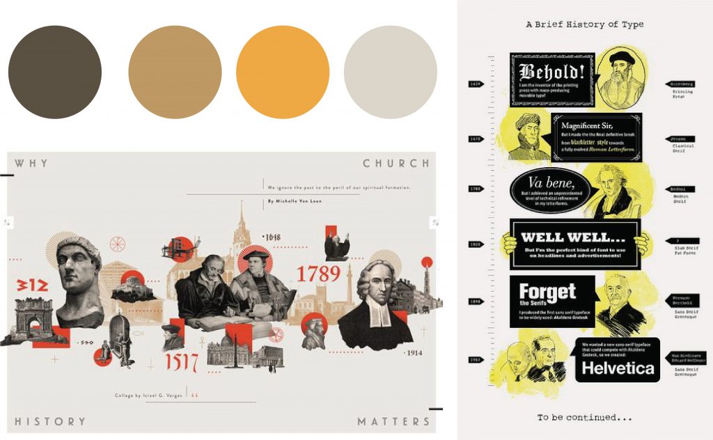
Once I had come up with a colour pallet, a layout, and an overall theme, I created a rough draft, mainly to give me the chance to play with colour and mediums. Within this step of my process, I realized I wanted the aesthetic to portray the gritty feeling of an old, vintage piece of paper that one would want to hold on to because of its importance. As for the colour, Orange/ tan tend to create a feeling of age. Plus, I decided to use ink and stamps solely for writing out the information to add even more of an element of age. I was to give myself a grade, I would give myself a 7.5 out of 10 because I struggled to figure out what information to include and how much to write beside the portraits. If I had to change anything about my finished piece, it would definitely have to be the information layout. But overall, I enjoyed this project and found it very interesting.
References
Flask, Dominic. Type Classification : Design Is History, www.designishistory.com/1450/type-classification/.
Tracy. “A Brief History of Typography & Typefaces.” Ashworth Creative, 21 Dec. 2018, www.ashworthcreative.com/blog/2014/07/brief-typography-typefaces/.
“The History of Typography and Its Journey Through Art.” Widewalls, www.widewalls.ch/magazine/typography-history-art.
Lectures from 1 to 7