Design elements are the fundamentals or “building blocks” to all designs.
In class we learned about the 7 main elements: line, directions, shape, size, colour, space, and texture.
For this blog, we were challenged to choose at least three of the seven design elements we learned about in class and find an image that relies on that element. Since we were also supposed to choose designs we love, I decided to choose some of my favorite famous album covers.
Texture
The element texture changes the quality of the surface which can add visual interest.
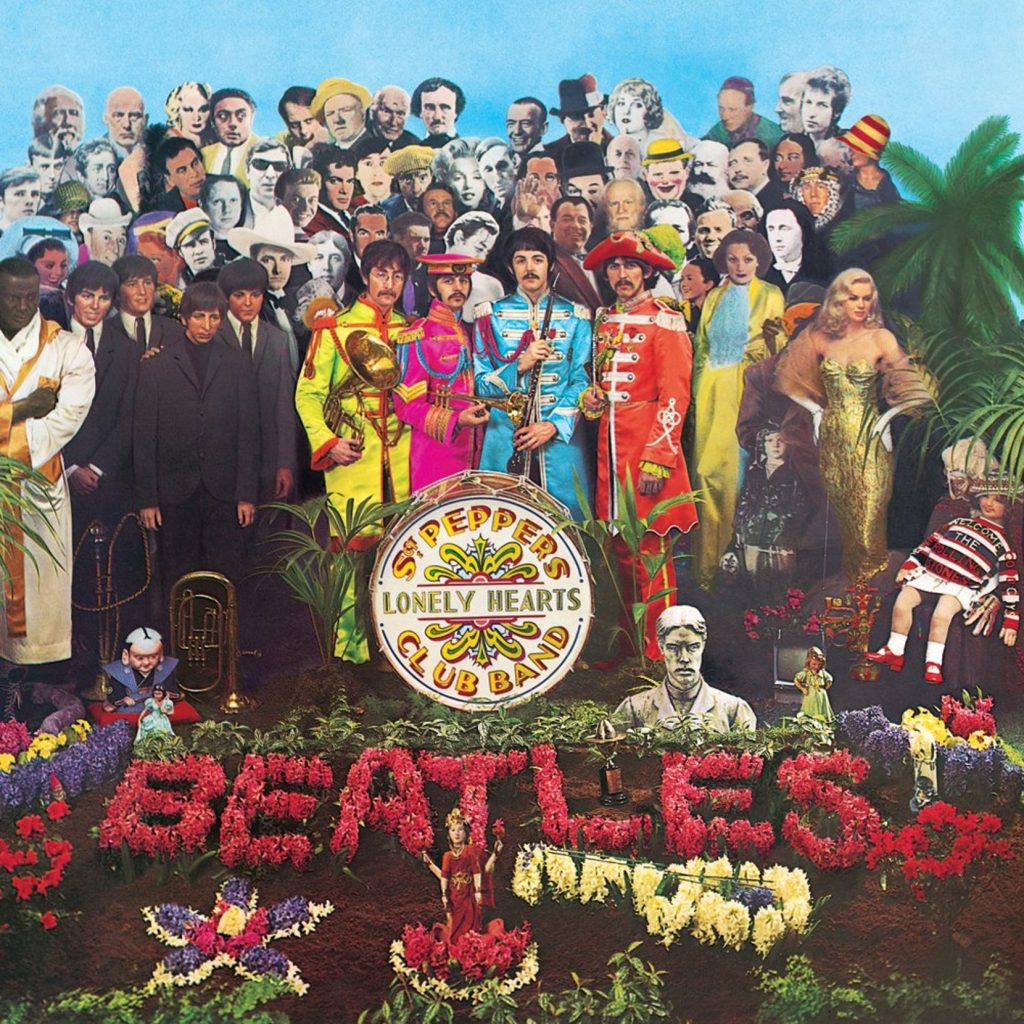
This cover art for The Beatles album Sgt. Pepper’s was designed by artists Peter Blake and Jann Haworth. The artists used wax sculptures of the group members and life-sized cardboard cut-outs of famous people, making this one of the most expensive album covers in history.
Direction
Direction can be used to convey feelings and give a design spontaneity

The Supertramp album cover, Breakfast in America, was created by Art Director at record sleeve print company AGI Mike Doud. The story behind the design was to create something that represented the upheaval and change the band had all gone through when they relocated from Britain to Hollywood in search of greater fame and fortune in 1977.
Size
Differences in size can give importance and attract attention to key parts of your design.

This design for David Bowie: Sound + Vision CD was created by Roger Gorman and highly credited as it was the 1989 Grammy winner for Best Album Package. Behind the lavender photo, taken by photographer Greg Gorman, you can see the three discs that celebrate Bowie at various stages in his career.
Space
Positive space is the area an element takes up while negative space is the empty areas. When used effectively space can be used to lead your eye through a design.
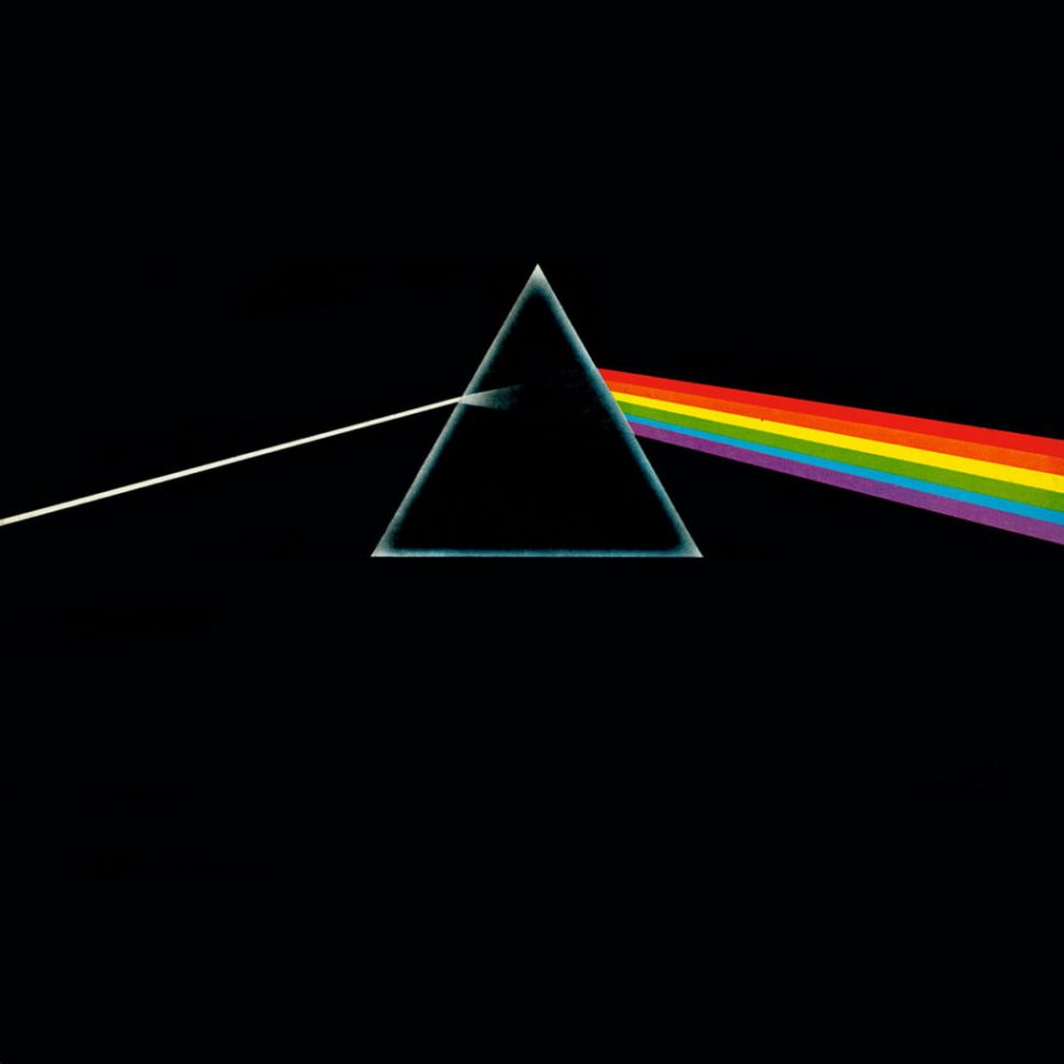
The iconic cover to their 1973 album Dark Side of the Moon, Colour was created by Aubrey Powell and Storm Thorgerson of Hipgnosis. The concept of the design was inspired by an image of a prism found in a photography book. At the time the design raised eyebrows at the time for including neither the band’s name nor the album’s title but has become more well known than the actual band.
Colour
Colour is seen through light waves reflecting off objects and can create a mood within your design to tell a story.
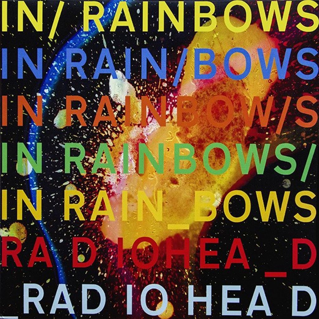
Artist Stanley Donwood has created many designs for Radiohead including the album In Rainbows. The celestial effect you can see behind the text of this cover came about when the artist was experimenting with a photographic etching technique and putting prints into acid baths. He also included molten wax after a “happy accident” of spilling it on his work. This design also has a hidden reference to the number 10 being the release date as well as conspiracies on it’s relation to the past album OK Computer that was released 10 years earlier.
Sources:
https://magazine.vinylmeplease.com/magazine/the-10-best-grammy-award-winning-album-covers/
https://www.creativebloq.com/features/the-20-best-album-covers-of-all-time