My yearbook spread took close to a week to come to the final draft. I would give myself a C+ as I wanted an interesting layout but I was unable to achieve that, however I had fun drawing the 8-bit icons.
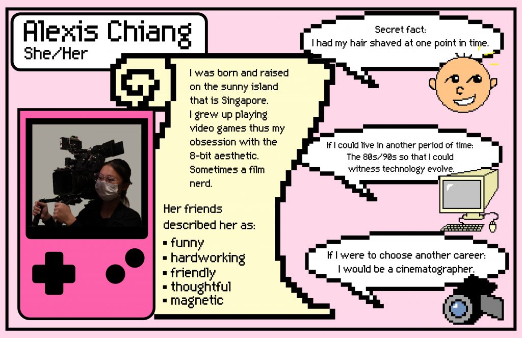
Since I really enjoy the 8-bit aesthetic and the video game devices of the 90s, I wanted to use the Gameboy SP (since it flips out) and lay it out as 2 pages with its top screen and bottom controls. However, I encountered several problems with that layout as I had trouble presenting text, and more importantly it was vertical, which would be harder to read as a book. Eventually, I scraped the idea and went with a simpler layout but still retaining the 8-bit style.
I mainly used Photoshop to edit and lay out all the elements. I used pink for both the Gameboy and the background as it is my favourite colour. The scroll beside the Gameboy was meant to be the paper from the Gameboy printer. I chose that picture of me as it relates to one of the questions, and the photo holds a lot of good memories for me and my growth as an artist. I used to study, and then eventually worked in the film industry, I still have love for the art but I would like to equip myself with different skills, thus taking the leap to join IDEA.
Although there were many challenges, it was honestly fun to think of solutions to the issues faced. It reminded me of the basis of design which is to solve problems.