1960-1970 Departures and Rumblings
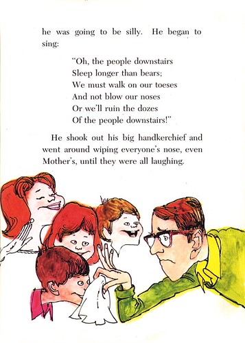
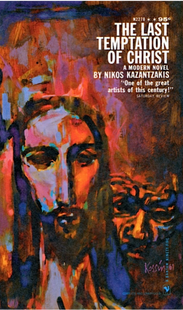
Most noticeable known for his blockbuster movie posters such as Beckett and The Train and paperback covers, The Shadow and The Last Temptation of Christ, American illustrator Stanford “Sandy” Kossin had always been very successful in capturing audience’ attention with his compelling interpretation and style. His skillful handling of different media, beautiful use of colour combination and layout composition are just a few things that made me really admire his talent. Like illustrator, Drew Friedman, mentioned in his blog, there are seemingly “the many sides of Sandy Kossin” as Kossin intended to not settle with simply one style. Instead, he was one of those illustrators who was able to navigate the media for the purpose of storytelling, and therefore, he often had a deft ability to shift styles accordingly.

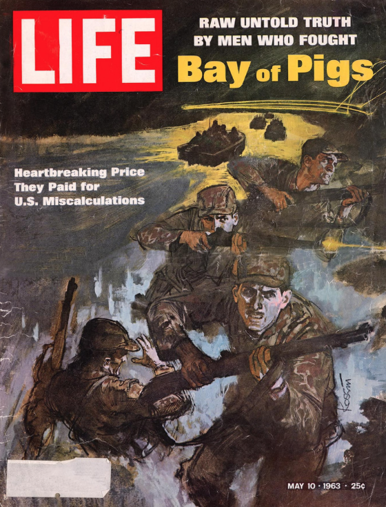
While creating rough and bold strokes, Kossin still manage to maintain a certain realistic quality. The portrait example below by Sandy Kossin is so beautifully drawn. Kossin had always been really daring in his choice of both technique and subject matter.
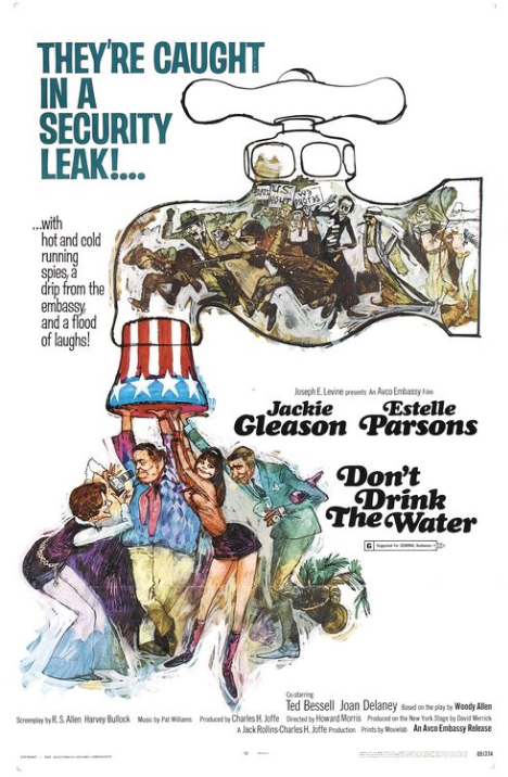
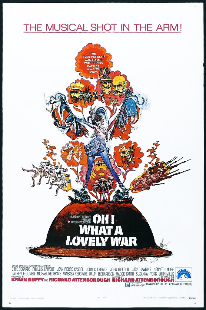
Not only did Kossin push through boundaries of expectation in styles, but also in subject matter. Kossin provided an unique perspective of post-war culture and the 60s U.S. politics in his conceptual film posters such as Don’t Drink the Water and Oh! What a Lovely War. When it comes down to integrating concepts with technique, I see Sandy Kossin as one of my role models and his illustration works are truly a feast for the eyes!

References:
https://www.societyillustrators.org/sandy-kossin
http://drewfriedman.blogspot.com/2011/06/sandy-kossin-realistically-funny.html
Recent Comments