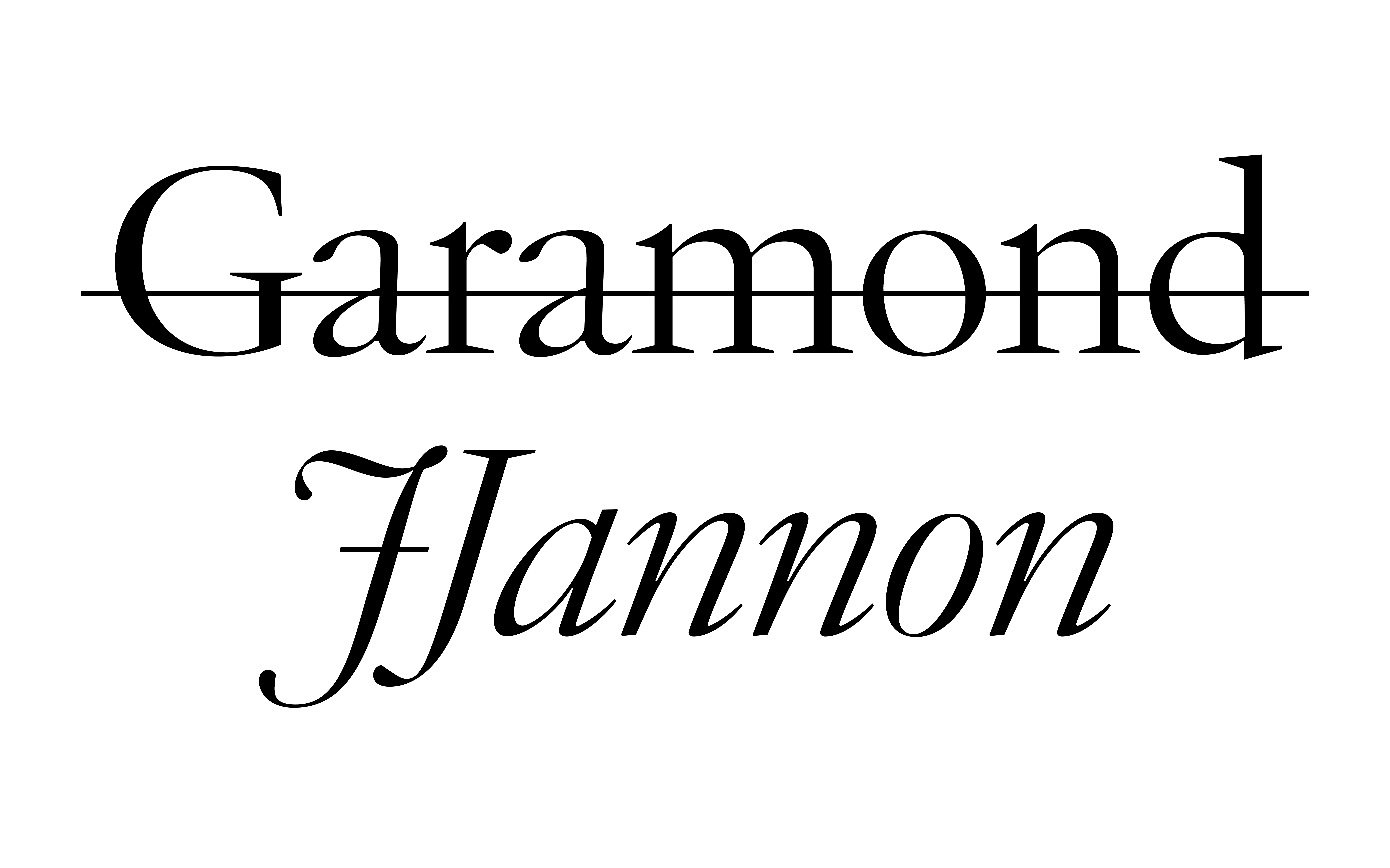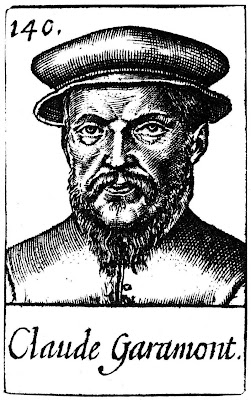

Garamond’s influence on typography is unquestionable. Designed by Claude Garamond (c. 1480 – 1561) (or Garamont, as he originally spelt it) (Mosley, 2011) in the 16th century, it has been adapted into hundreds of variations, making it somewhat confusing to determine its precise origin. Even Garamond’s own design is based on typefaces designed by Aldus Manutius (1450 – 1515) for the Aldine Press in the late 15th century (Poulin, 2017, p. 24).

Garamond’s elegance and readability make it a popular choice for a variety of uses, but its application is most widely seen in printed text. The modern-day usage of Garamond is recognized in the publications of Dr. Seuss and Harry Potter, but it was also used in Google’s original logo and Apple’s ‘Think different’ campaign in the 90s.
What’s interesting is that for almost a century, what was thought to be Garamond turned out to be the work of an entirely different person!
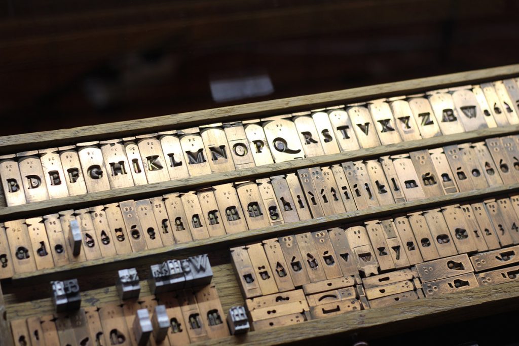
In 1621, sixty years after Garamond’s death, the French printer Jean Jannon (1580–1658) designed a typeface heavily influenced by Garamond’s design. Unfortunately, Jannon ended up having his punches and matrices confiscated under the orders of Cardinal Richelieu. (Lawson, 1990, p. 136).

Jannon’s types disappeared for almost 200 years until they were eventually ‘discovered” in the vaults of the French national printing office in 1825. However, by this time, Jannon had been long forgotten, and they were wrongly attributed to Claude Garamond (Lawson, 1990, p. 137).

It wasn’t until a century later, in an article published in The Fleuron (1926) by Paul Beaujon, that the typefaces that were originally thought to have been Garamond’s, were discovered to be in fact, Jean Jannon’s (Mosley, 2011).
In a surprising twist, Paul Beaujon turned out not to be a man at all, but a woman named Beatrice Warde, who used a pen-name to avoid the prejudices against women at the time (Loxley, 2004, p. 124).
She later recalled envisioning ‘Paul Beaujon’ to be a man with “a long grey beard, four grandchildren, a great interest in antique furniture and a rather vague address in Montparnasse” (Loxley, 2004, p. 129).
Nowadays, many modern revivals of Garamond are based off of both Jean Jannon and Claude Garamond’s original typefaces.
References
ActuaLitté. (2013). Matrices originales du Romain de l’Université de Jean Jannon. https://www.flickr.com/photos/actualitte/9730999371
Bohm, T. (2022). Measuring The Performance Of Typefaces For Users (Part 1). https://www.smashingmagazine.com/2022/06/measuring-performance-typefaces-users-part1/
Jones, S. (2017) De La Warr Pavilion. Finding Beatrice Warde. https://www.dlwp.com/finding-beatrice-warde/
Lawson, A. (1990). Anatomy of a Typeface. David R. Godine.
Loxley, S. (2004). Type: The Secret History of Letters. I.B.Tauris & Co. Ltd.
Mosley, J. (2011, April 1). Garamond or Garamont? http://typefoundry.blogspot.com/2011/04/garamond-or-garamont.html
Mosley, J. (2012, Feb 3). The types of Jean Jannon at the Imprimerie royale. http://typefoundry.blogspot.com/2012/02/types-of-jean-jannon-at-imprimerie.html
Murray, S. (2019). Garamond, An Inception Journey to Prototype. https://medium.com/@sarah.murray3000/garamond-fc17b5b27c6e
Piot, J. -C. Garamond, La Classe et L’humanisme. https://www.cailleassocies.fr/garamond-la-classe-et-lhumanisme/
Poulin, R. (2017). Design School: Type : A Practical Guide for Students and Designers. Rockport Publishers.
Stock-Allen, N. (2011). Type Design in the French Renaissance. http://www.designhistory.org/Type_milestones_pages/FrenchType.html