The London Underground is the oldest underground railway system in the world and services up to 5 million passenger journeys per day (TfL). Along with the iconic roundel and tube map, the typeface is as recognizable as part of the Underground as it is with London’s identity.
The typeface was commissioned between 1913 and 1915 by Frank Pick, the Commercial Manager of The Underground Group, as part of his plan to unify the company brand (Devroye). At the time, train lines were being operated by different companies, all of which employed different typefaces in their signage that made everything very confusing (Londonist).
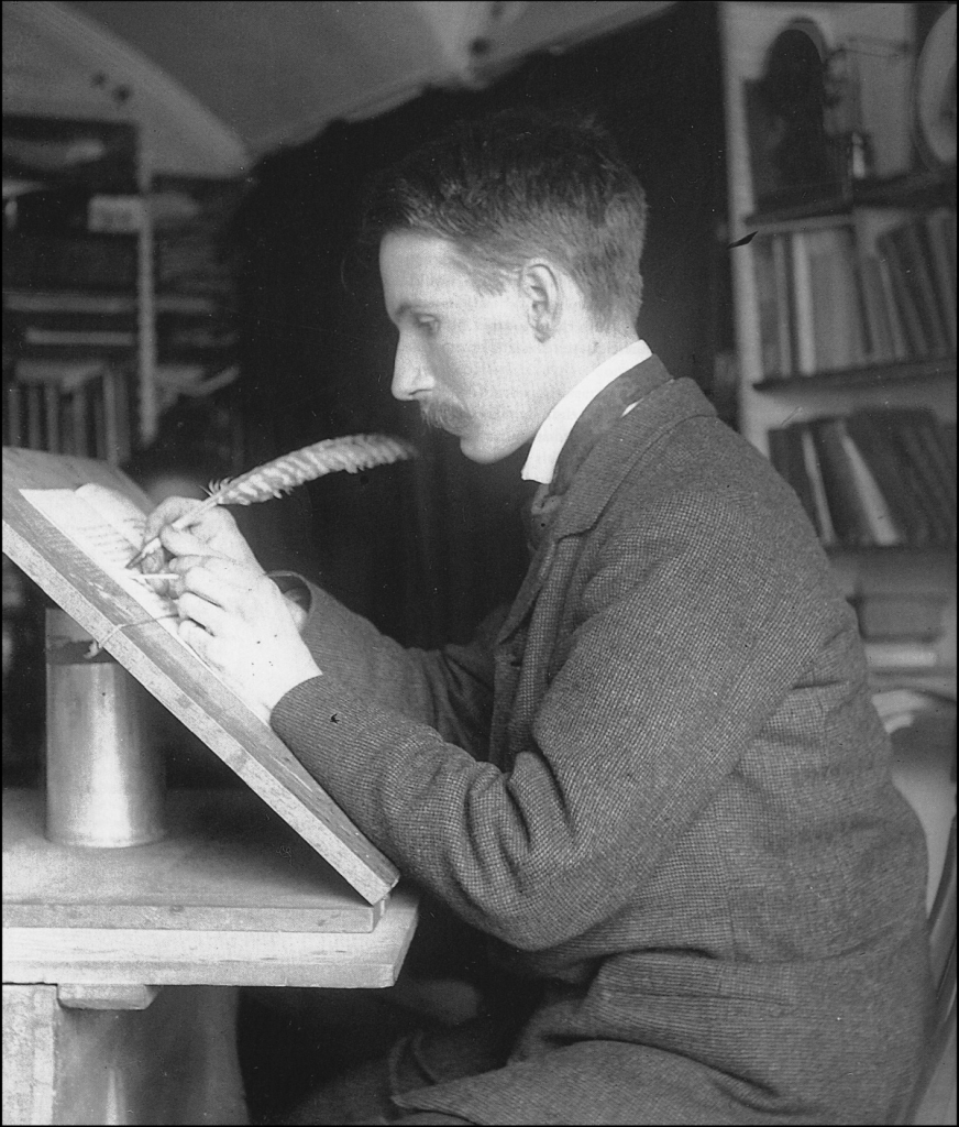
Pick sought out the calligrapher Edward Johnston to create a new typeface for its posters and signage, which was to be distinctively different from the type used in advertisements of the era (Vida Creative).
Johnston was instructed to create a typeface with “the bold simplicity of the authentic lettering of the finest periods and yet belonging unmistakably to the 20th century” (as cited in Wainright).
The resulting typeface, Johnston Sans, first appeared on a poster in 1916. The type was based off of the Roman lettering seen on Trajan’s Column, as Johnston believed “the Roman capitals have held the supreme place among letters for readableness and beauty,” and as a general rule for lettering, “when in doubt, use Roman Capitals” (Johnston, p. 269).
Johnston Sans is an example of how typography can be used as a powerful, authoritative tool to convey information (Devroye). It had to capture the viewers’ attention, while still being simple enough to blend in with London’s visual landscape, and this is likely one of the reasons for its longevity in use for over a century (Urban Stories).
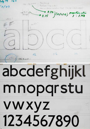
In 1979, there was considerable debate over whether Johnston Sans should be abandoned in favour of Helvetica or Univers Bold, which were more complete typefaces that could be better used to accommodate print materials (Bull).
However, the advertising agency Banks & Miles argued that Johnston Sans should be retained, as the typeface was a vital part of the Underground’s foundation. As a result, “New Johnston” was developed, a redesign accredited to Eiichi Kono at Banks & Miles (Bull).
It is perfectly reasonable for designers to want to change things and make their mark. But not changing something is a perfectly legitimate design decision. It can sometimes be better to retain the existing core and make modifications and perhaps improvements around the edges.
– John Miles (as cited in Bull).
In 2016, Transport for London (TfL) commissioned Monotype to redesign the typeface again to transition into the digital environment. Many of the changes were actually a return to features that were seen in Johnston’s original typeface (Bull).
Our brief to Monotype was to go back to the original principles of Johnston, to reflect on the way the font is now, and see what we might have lost in its 100-year journey
– Jon Hunter, Tfl Head of Design (as cited in Bull).

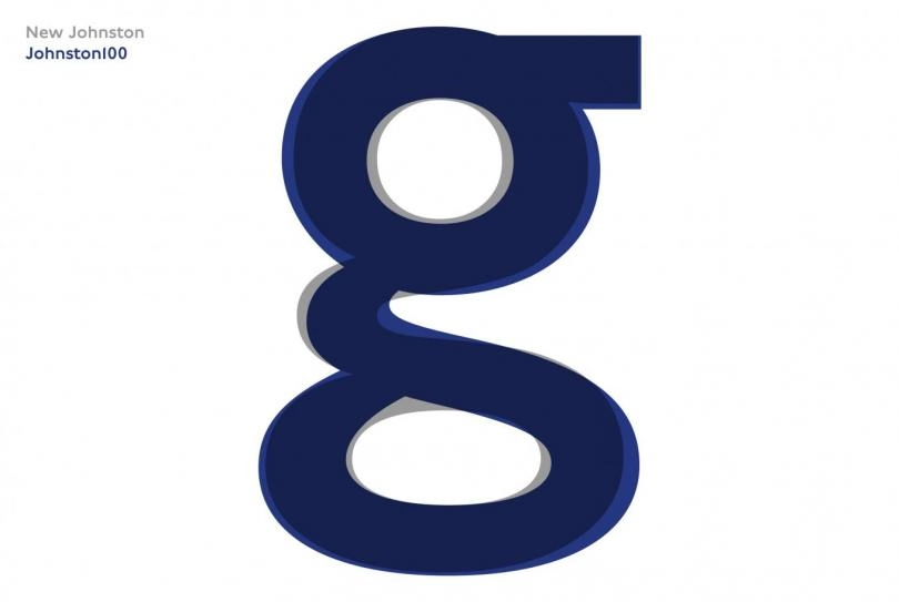
The new typeface, Johnston100, was to be initially used for printed material such as tube maps and posters, but it’s expected to migrate into use within TfL’s trains and station signage over time (Monotype).
References
Bull, J. (2016, Jun 14). A New Typeface for the Underground: Johnston 100. London Reconnections. https://www.londonreconnections.com/2016/new-typeface-underground-johnston-100/
Devroye, L. (n.d.). Johnston’s Underground Type [Edward Johnston]. http://luc.devroye.org/fonts-66504.html
Johnston, E. (1906). Writing & Illuminating & Lettering. New York, Macmillan. https://archive.org/details/writingilluminat00johnrich/mode/2up
Kono, E. (n.d.) New Johnston. The Edward Johnston Foundation. http://www.ejf.org.uk/Resources/ekono.pdf
London Transport Museum. (n.d.). B/W print; Edward Johnston. https://www.ltmuseum.co.uk/collections/collections-online/photographs/item/1998-20736
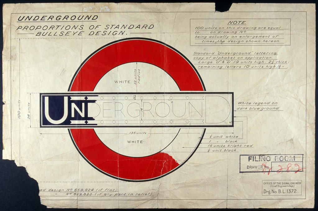
London Transport Museum. (n.d.). Roundel drawing. https://www.ltmuseum.co.uk/collections/collections-online/drawings/item/2000-9202
Londonist. (2005, July 14) The Font Of The Underground. https://londonist.com/2005/07/the_font_of_the
Monotype. (n.d.). Introducing Johnston100, the language of London. https://www.monotype.com/resources/case-studies/introducing-johnston100-the-language-of-london
Transport for London (n.d.). What we do. https://tfl.gov.uk/corporate/about-tfl/what-we-do
Urban Stories. (2018, Avril 13). Johnston Typeface | How Tube Font was designed. https://www.urbanstories.co/post/172888181046/johnston-typeface-how-tube-font-was-designed
Vida Creative. (2020, Nov 27). Typography in Focus: Johnstone Sans, a Typeface for London. https://vidacreative.co.uk/johnston-sans-typeface/
Wainwright, O. (2016, Mar 10). London to the letter: meet Edward Johnston, the font of all tube style. The Guardian. https://www.theguardian.com/artanddesign/2016/mar/10/edward-johnston-london-underground-typeface-100-years-ditchling-sussex-eric-gill