The Manifesto Minute

Overview

In the early 20th century the Western art world was completely redefined by the wave of avant-garde that flooded across Europe and North America. This period was a time of immense change; advances in technology and industry, world war, politics, and plague affected every aspect of life. Artists reacted to this change by rejecting logic, reality, and tradition; they became pioneers themselves, seeking to create a form of art that reflected their new world. The Modernists, as they came to be known, were made up of various groups, each with their own distinct aesthetics and philosophies; some became political, some were philosophical, or spiritual, but the one thing they had in common was that they were all experimental. Each group played off of the others; adopting or rejecting new ideas and aesthetics, building upon or paring down concepts.
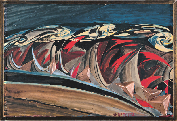
Benedetta Cappa Marinetti, Lights + Sounds of a Night Train (Luci + rumori di un treno notturno)

Modernists believed that everything in life could be defined and categorized and that by specifying, abstract concepts became easier to understand. They wanted to convince, convert, shock, inspire, and sometimes, even offend. One tool in particular became very popular amongst this generation of creatives, and that was the artist’s manifesto.
Manifesting A Definition

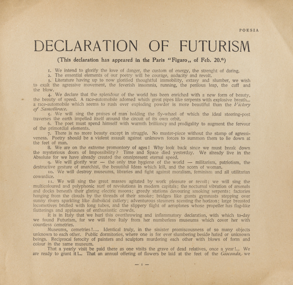
A number of groups and individuals associated with the Modernist movement took to creating these manifestos, which were public declarations used to aid their art movements by defining their intentions, motives, or views. Manifestos were intended to be works of art themselve; usually they were published in magazines or newspapers relying heavily on graphic design, although some were created with the intention to be used in performance art.
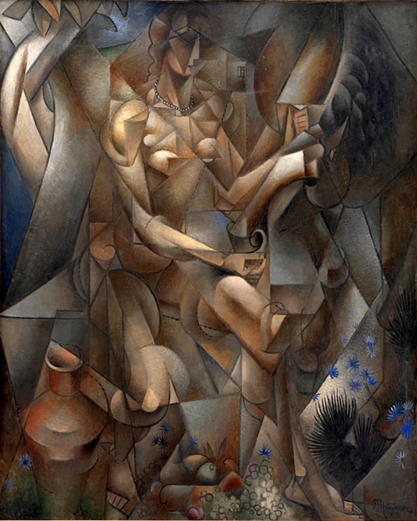
Jean Metzinger,  La Femme au Cheval, Woman with a Horse – note the similarities between the Futurist

Manifestos had a number of uses; they were often used to define and criticize a pattern in contemporary art, and then define a set of aesthetic values to counter this pattern. Sometimes they would also address wider issues, such as the political system, a need for revolution, or freedom of expression. They usually consisted of a number of statements, which notably, did not always follow logically. 
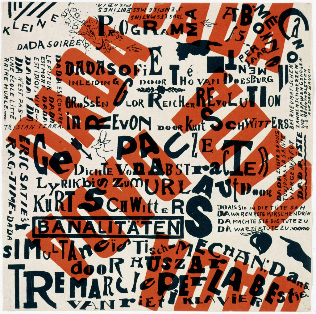
Theo van Doesburg with Kurt Schwitters, Kleine Dada Soirée – an example of the DADA graphic design

A few of the most influential movements of the 20th century that created manifestos were the Futurists, Cubists, Suprematists, DADAists, the De Stijl, the Bauhaus (specifically Wassily Kandinsky), as well as the Constructivists, Purists and Surrealists. 
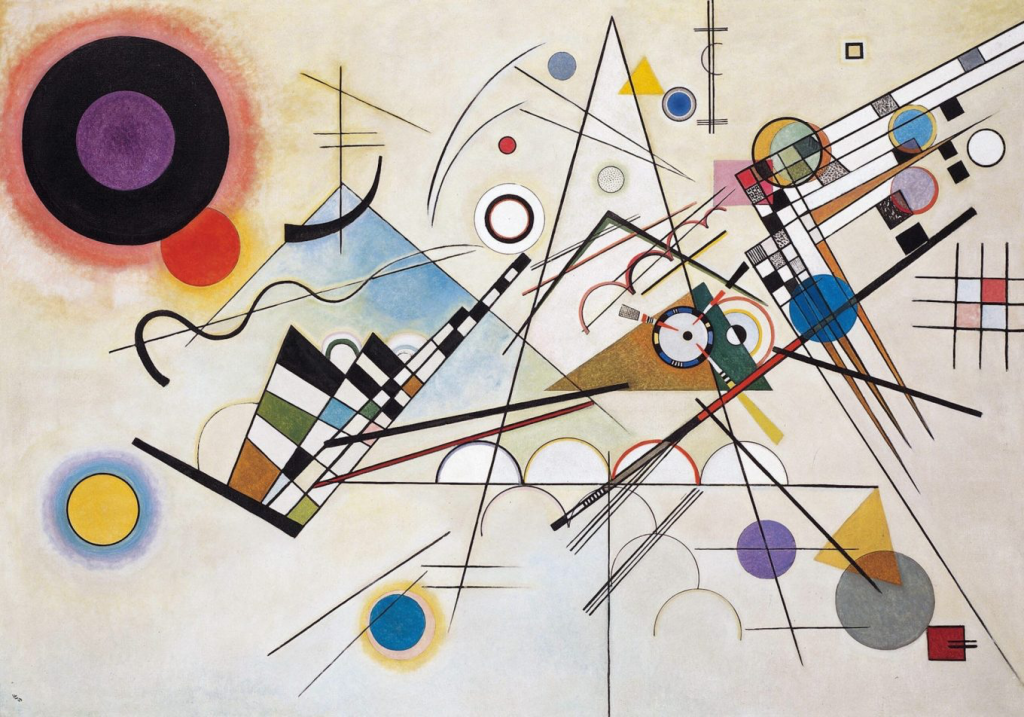
Wassily Kandinsky, Composition 8  inspired by the artist’s experience of listening to a symphony.

“Every artist, as child of his age, is impelled to express the spirit of his age (this is the element of style) — dictated by the period and particular country to which the artist belongs (it is doubtful how long the latter distinction will continue to exist).” – excerpt from “Concerning the Spiritual in Art”, which was Kandinsky’s personal manifesto

The Next Minute

The period between 1900 and into the 1930s came to be known as the “minute of manifestos”; although art manifestos continued to be created following WWII, and are still occasionally used to help define the intentions of specific artists today, they have mostly fallen out of practice with the rise of Post Modernism and the promotion of individualism. Contemporary artists now tend to embrace the idea of chaos and uncertainty; they believe that to truly categorize a concept is impossible, and absolute knowledge inaccessible, very unlike their predecessors, who sought to explain everything they did. 
Gustav Klimt: His Mark

A brief exploration of Gustav Klimt’s life and legacy

Gustav Klimt was born outside of Vienna in July of 1862; his father was a gold engraver and his mother was musical. Although Klimt grew up in poverty, there was an abundance of creativity in the family, and he displayed a talent for the arts at an early age. His career began at the age of 14 when he received a full scholarship to attend the Vienna School of Arts and Crafts, where he was trained in the classical style that was prevalent at the time, and specialized in architectural painting. He would continue exploring this academic style for the first few years of his career, joining the conservative Vienna Artists’ Association alongside his brother Ersnt, who he shared a studio with.

Gustav Klimt, The Auditorium of the Old Burgtheater, circa 1888-89

However, when both his brother and father died in 1892, there occurred a shift in his style. In his grief, he began to contemplate the human condition. This fascination with the psychological pushed him to begin exploring themes of desire, dreams, and mortality. Rejecting the traditional, conservative way in which he was trained, he and a group of like-minded artists resigned from the Vienna Artists’ Association. In 1897 they founded a new organization called the Vienna Secession, which aimed to promote nontraditional artists, establish the exchange of ideas with artists outside of Vienna, and renewed Gesamtkunstwerk or “total art”, which unified painting, architecture and the decorative arts. They completely rejected the traditional art establishment that favoured classicism, rationality and naturalism. With the creation of an exhibition space called the Secession Building, international artists and art movements were introduced to Vienna, influencing the European Art Nouveau movement. Klimt would be nominated as president of the organization, and serve as a member of the editorial staff for its magazine Var Sacrum (Sacred Spring), a spearhead for the Secessionists.

Left: Isabella d’Este but Titian, circa 1534-36 Right: Judith and the Head of Holofernes by Gustav Klimt, circa 1901

During this period, Klimt continued to explore his artistic style; he began employing gold leaf reminiscent of Byzantine mosaics, and composed with the flat shapes and patterns similar to the art flowing into Vienna from the Japonisme movement. His new works were decorative, eclectic and fantastical, and considered quite erotic in nature. Another of his influences came from a dear friend of his, Emilie Flöge, a fashion designer whose flowing, corsetless dresses inspired the garments adorning his painted figures. In addition to the female figure, Klimt also explored different genres in his works like landscape painting. He created decorative wall hangings, and continued to do murals for buildings, collaborating with his Secessionist peers in the “total art” style. Though his work was often controversial, Klimt experienced great fame in his career, and went on to mentor fledgling artists like Egon Schiele, who became a major name in the Expressionist movement.

Top: Courtesan of the Ogiva Brothel by Kikukawa Eizan, circa 1810-1815 Bottom Left: Baby (Cradle) by Gustav Klimt, circa 1914-1918 Bottom Right: Portrait of Adele Block-Bauer I by Gustav Klimt, circa 1907

https://en.wikipedia.org/wiki/Vienna_Secession

https://www.theartstory.org/artist/klimt-gustav/

https://www.theartstory.org/movement/vienna-secession/

https://www.artsy.net/article/artsy-editorial-gustav-klimt

https://www.artsy.net/gene/vienna-secession

https://www.artsy.net/artist/gustav-klimt

https://artsandculture.google.com/story/gustav-klimt-a-biography-klimt-foundation/fgURx6ucrcQjHw?hl=en

https://www.biography.com/artist/gustav-klimt

https://www.britannica.com/biography/Gustav-Klimt

Ukiyo-e: Japanese Art Prints

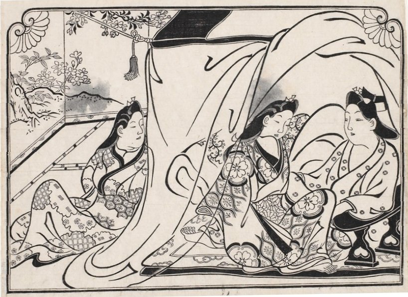
The Edo period lasted over 250 years, and is well known for its art; poetry, plays, and in particular, the art prints, ukiyo-e. These prints were produced from intricately carved woodblocks, and relief-printed onto paper. They required a great level of time and skill to create. 

To print with precision using numerous blocks on a single paper sheet, a system of placing two cuts on the edge of each block to serve as alignment guides was employed. Paper made from the inner bark of mulberry trees was favoured, as it was strong enough to withstand numerous rubbings on the various woodblocks and sufficiently absorbent to take up the ink and pigments.” (1)

Initially Introduced from China in the 8th century as a way to reproduce handwritten scrolls, the 17th century saw these techniques adopted and perfected for creating images as well. At the time, only black and white inks were available, and printmaking remained the same for almost a hundred years. As the 18th century drew to a close however, coloured inks were introduced to the process, spurring new developments in the style of ukiyo-e

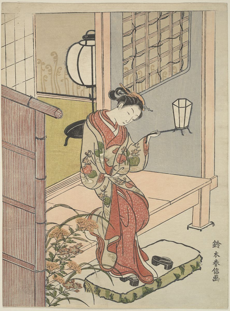
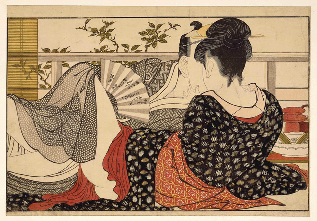
Ukiyo-e, meaning “pictures of the floating world,” depicted the simple pleasures of everyday life, celebrating peace in a country that had been divided for centuries. These prints featured scenes from the kabuki theatre, tea houses and restaurants, the female form, and myths and legends. Gradually, the typical bold lines became more refined and delicate, and the subject matter more harsh and risqué. (2)

Effects of Japan reopening to the West: Japonisme

In the mid 18th century, Commodore Matthew C. Perry sailed into the bay of Tokyo with a fleet of American warships. He had been commissioned to convince Japan to reopen its borders for trade after it had been closed to the West for over two centuries; knowing their navy was no match against the warships, Japan’s governing body, the Tokugawa shogunate, conceded.

Not long after all manner of wares were being shipped into Europe. England and France in particular were fascinated by these exotic imports, especially their artists; Audrey Beardsley, Henri Toulouse-Lautrec, Pablo Picasso, Claude Monet, Paul Gauguin, Auguste Rodin, Edgar Degas, Gustave Klimt, Édouard Manet, Vincent van Gogh, and Franz Marc, are all big names in art history who took inspiration from Ukiyo-e. (3)

Notable artists from this period include:

Hishikawa Moronobu: primarily active before the introduction of coloured inks, Hishikawa used bold line art inspired by his understanding of calligraphy. His family belonged to the textile business, so he was very familiar with the movement of fabrics. 

Suzuki Harunobu: when colour became more prevalent, a new style arose, referred to as benizuri-e, or “rose prints” for the subtle blush pink and sage green hues commonly used. Harunobu was known for his naturalism, featuring graceful, flowing figures that conveyed a sense of emotion and harmony.

Kitagawa Utamaro: perhaps one of the most influential artists on future Western audiences was Utamaro, whose works were often erotic in nature. This genre of ukiyo-e was called shunga, and would go on to captivate the artistic audiences in the West.

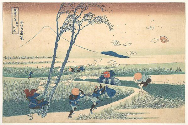
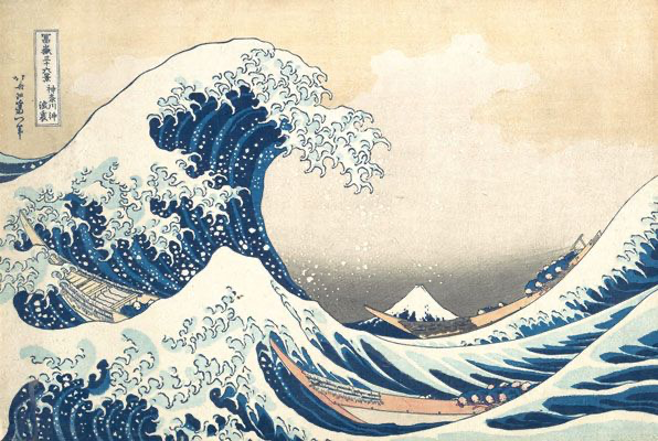
Katsushika Hokusai: now considered the most renowned artist from the entirety of the Edo period, Hokusai’s use of perspective and background, contrast, form and scale has become legendary.

(4)

  1. https://www.metmuseum.org/toah/hd/ukiy/hd_ukiy.htm
  2. https://search-credoreference-com.ezproxy.capilanou.ca/content/entry/heliconhe/ukiyo_e/0
  3. https://www.metmuseum.org/toah/hd/jpon/hd_jpon.htm
  4. https://www.theartstory.org/movement/ukiyo-e-japanese-woodblock-prints/

Nefertiti and the Amarna Period

IDES 141 Exhibit Project


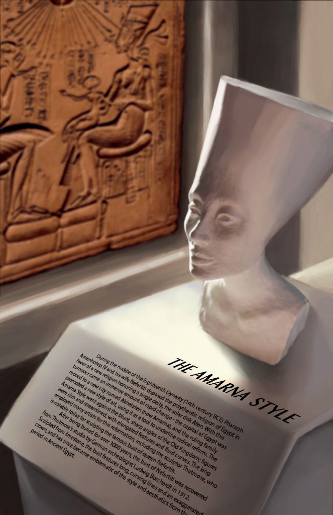
For the Exhibit Project I chose to recreate the Bust of Nefertiti as my artifact. I have always been fascinated by this sculpture, and as I was brainstorming potential subjects in the beginning I kept being drawn back to Nefertiti, although initially I wasn’t really sure if she had a strong tie to visual communication. As it turns out, however, she does have quite an interesting history relating to the subject.

Queen Nefertiti and her pharaoh husband were responsible for an era in Ancient Egypt now referred to as the Amarna Period, which was defined by one of the first monotheistic religions in history. This worship of a single god, the solar disk Aten, brought about what we now refer to as the Amarna Style; this style, characterized by long lines and fluid curves, was used as a way to communicate an era of reformation by going against the sharp angles and rigid forms of the past. The Bust of Nefertiti turned out to be a perfect example of the Amarna style; beside her husband and their god, Queen Nefertiti was one of the main subjects featured in the art of the time, and she remains an emblem of this great cultural shift. We see this type of shift repeated throughout history, wherein one movement directly opposes its precursor in thought, theory, or aesthetic – or oftentimes, as in this case, all three.

I decided to start by creating a physical sculpture out of air dry clay, and initially the plan was to create an entire physical set around it. However, there were so many aspects necessary to my initial design that were just too time-consuming given the deadline, so I decided to switch to digital illustration halfway through. This ended up being quite difficult as I tried to incorporate an entire scene around the sculpture in a way that was believable.

Keeping in mind composition and visual hierarchy, I incorporated a photo of hieroglyphs from the Amarna Period into the background as if it were an additional artifact. Making sure my sculpture remained the focus of the composition was a bit of a challenge because the hues and shadows were so different between both artifacts.

In many of the reference photos I looked at, most museums displayed their statues on minimalistic podiums lit by spotlights. I wanted to come up with a unique, dynamic way to recreate these elements, so I sketched out numerous vantage points and scrapped a few drafts before finally settling on a scene. I took new photos of the bust with different light sources throughout the process and once I had everything aligned, I built the highlights and shadows up based on the light sources on both the statue and the hieroglyphs. I also blurred the hieroglyphs to create the illusion of distance.

Overall I’m very happy with how the image turned out. I had a lot of trouble with adding text in Illustrator, but otherwise things went pretty smoothly. Picking a statue as an artifact was hard given the fact that museums display them in fairly simplistic ways, and that took time to figure out. As well, if I hadn’t lost so much time trying to build a physical set, I probably would have added colour to my artifact as well. In total, the whole project took about 15 hours to complete. 


References

https://www.smb.museum/en/museums-institutions/aegyptisches-museum-und-papyrussammlung/collection-research/bust-of-nefertiti/the-bust/

https://www.nationalgeographic.co.uk/history-and-civilisation/2022/03/nefertiti-was-more-than-just-a-pretty-face

https://www.britannica.com/art/Amarna-style

https://www.britannica.com/biography/Nefertiti

https://www.jpost.com/archaeology/article-717631

During the middle of the Eighteenth Dynasty (14th century BCE) Pharaoh Amenhotep IV and his wife Nefertiti deposed the polytheistic religion of Egypt in favor of a new religion honoring a single deity, the solar disk Aten. With this turnover came an immense amount of rapid change – the capital of Egypt was moved to a new city named Akhetaten (now Amarna), and the ruling family promoted a new style of art, using it as a tool to underline radical reform. The Amarna Style went against the blunt, sharp angles of the Old Kingdom; figures were slim and streamlined, with elongated features and fluid curves. The king employed many artists for this reformation, including the sculptor Thutmose, who is notable today for sculpting the famous bust of queen Nefertiti. 

After being buried for over 3000 years, the bust of Nefertiti was recovered from Thutmose’s studio by German archeologist Ludwig Borchardt in 1912. Sculpted from limestone, the bust features long, curving lines and an exaggerated crown, and has since become emblematic of the style and aesthetics from this period in Ancient Egypt. 

The Cave Artist’s Tool Kit

An examination of the tools and materials used for cave paintings during the Stone Age

Have you ever used a shell or maybe a piece of charcoal to draw with at the beach? Scratched doodles into the surface of some limestone? If you have, then you’d be emulating some of the very first artists on earth. Well, for the most part. It turns out that the art of cave drawing was much more elaborate than you might have thought.

During the Upper Paleolithic period, nomadic tribes started to form semi-permanent settlements. The use of tools like fire and stone had long since been established, but up until that point, those things were mostly reserved for more technical manners like hunting. Once humans had somewhere to go home and relax at the end of the day, things began to change. Stories were told around the fire and recorded on the rock walls of their shelters. Lessons of their histories, their beliefs, began to pass down through families. Creativity bloomed. And over the years the materials, tools and techniques were transformed alongside those walls.

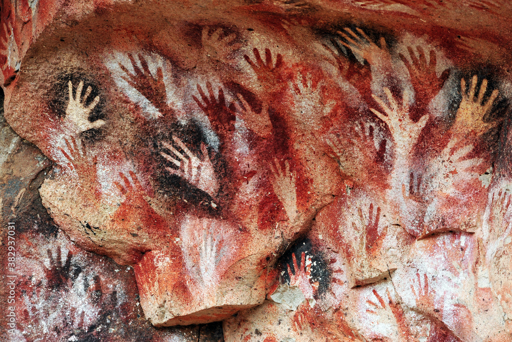
Cueva de las Manos, Perito Moreno, Argentina “Cave of the Hands” (Nunes, n.d.)

“All of the prints are negatives or stencils; created by placing the hand against the rock face and blowing paint at it through a tube made of bone.” (Cave Art Movement Overview, n.d.)

Pigments

Though these people’s imaginations were expansive, their color palette was mostly restricted to varying shades of red and yellow, umber, black, and white; 

  • Yellow and red ochre were made from limonite and hematite respectively 
  • Umber could be made from iron oxide or manganese 
  • There were various ways to make black, such as charring organic materials, like bone or wood, or by using mined manganese dioxide
  • Calcite, which could be found in limestone, marble, and shells, was used to create white. 

(Pigments Through the Ages – Prehistory, n.d.)

Examples of raw pigment before it is grounded into powder, including red ochre, charcoal and clay (Reid, 2020)

Large animal bones or stones were used as mortars to grind these pigments into a fine powder before mixing them with binding agents to create paint. (Pigments Through the Ages – Prehistory, n.d.)

The number of binding agents were numerous; cave artists would use water, plant extracts, urine, animal fat, bone marrow, blood, or albumen (which is a protein contained in egg whites) to seal pigments into the rock walls. (Pigments Through the Ages – Prehistory, n.d.)

Techniques 

For an art form that touched every continent but Antartica (Ehrenreich, 2022), it’s not surprising that many different techniques developed over time. Materials varied depending on the resources available in various parts of the world. But in every environment there remained a few staples, such as flint and stone, animal products, certain pigments, found materials, and human ingenuity. 

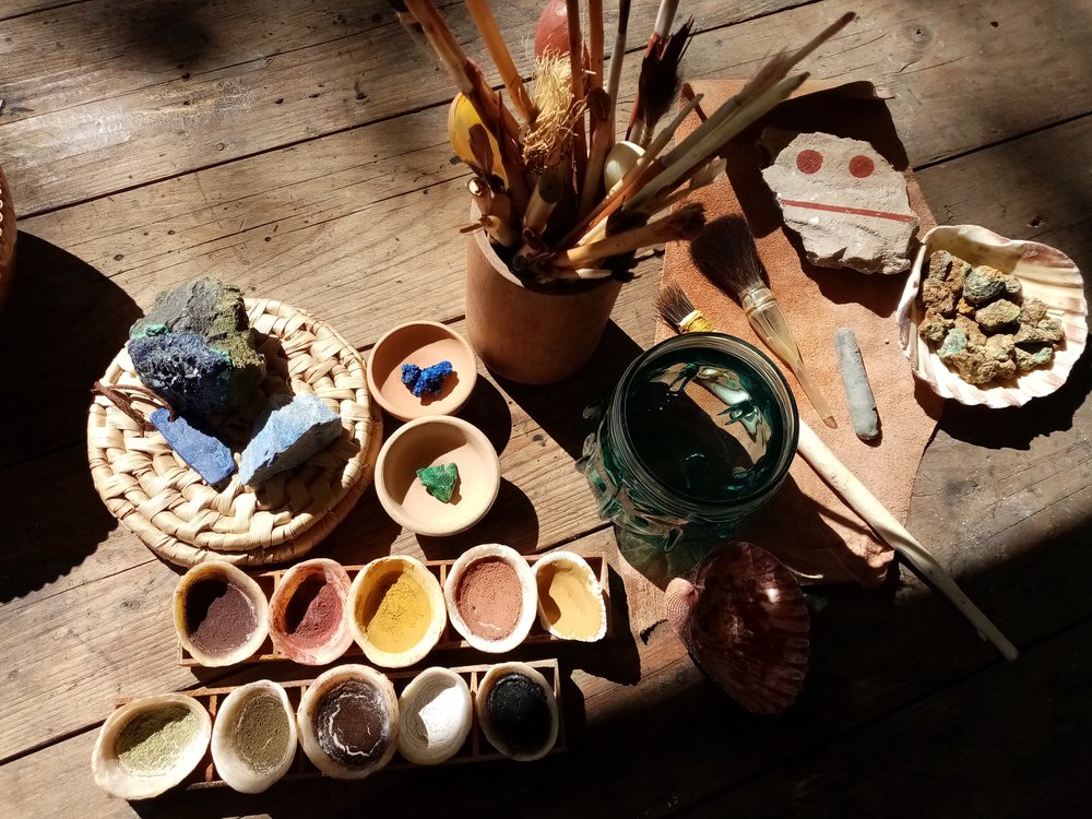
A recreation of a the cave artists’ tool kit (Ancient Paints & Pigments, 2022)

You see this when you examine the multiple ways certain materials were manipulated; 

  • Fingertips, or pads of lichen or moss dabbed across a surface were used to cover larger areas in pigment. This could also be done by blowing paint through a hollowed out bone or reed stalk, similar to what we know as airbrushing. (Prehistoric Pigments, n.d.)
  • Lines were created by clay rolled and dried to create crayons, or by twigs and bones sharpened to a point. 
  • Feathers, fingers or fur were used to blend the pigments out even more. 
  • Paint brushes were made from various animal products, like leg bones or by bundling animal hair together. 
  • Abalone shells and shoulder bones were a favorite for use as a palette plate.
  • Carving into the walls, bones or ivory was done with flint tools. Flint was sharpened by chipping at it with another rock, bone or antler. 

(Pigments Through the Ages – Prehistory, n.d.)

Examples of the different versions of ancient paint brushes (Ancient Paints & Pigments, 2022)

There’s something so primally satisfying about using found materials to create markings; an instinct which certainly developed from our ancestors, those cave artists that lived some 40,000 years ago. 

While researching this topic I was struck by how ingenuous these early peoples were, despite being so limited in the number of resources they could utilize. In their techniques we start to see the beginnings of chemistry, the beginnings of color theory and basic tools that we take advantage of in this day and age. It’s fascinating to think that this way of communicating touched every population on the planet around the same time, that humans realized the value of visual communication so early on in our history. The labor put into these paintings was immense, and required both time and skill, but the drive to create, to tell stories, was incredibly strong and made a lasting impression on the humans of today.

  1. Nunes, R. M. (n.d.). Prehistoric hand paintings at the Cave of the Hands (Spanish: Cueva de Las Manos ) in Santa Cruz Province, Patagonia, Argentina. The art in the cave dates from 13,000 to 9,000 years ago. Adobe Stock. Retrieved October 2, 2022, from https://stock.adobe.com/bg/search?k=%22cave+of+hands%22&asset_id=382937031
  2. Cave Art Movement Overview. (n.d.). The Art Story. Retrieved October 2, 2022, from https://www.theartstory.org/movement/cave-art/
  3. Pigments through the Ages – Prehistory. (n.d.-b). Retrieved October 2, 2022, from http://www.webexhibits.org/pigments/intro/early.html
  4. Reid, J. (2020, September 25). Fraser Woods Montessori School | Exploring Natural Pigments and Prehistoric Art Materials. Retrieved October 2, 2022, from https://fraserwoods.com/exploring-natural-pigments-and-prehistoric-art-materials/
  5. Ehrenreich, B. (2022, August 30). ‘Humans were not centre stage’: how ancient cave art puts us in our place. The Guardian. Retrieved October 2, 2022, from https://www.theguardian.com/artanddesign/2019/dec/12/humans-were-not-centre-stage-ancient-cave-art-painting-lascaux-chauvet-altamira
  6. Ancient Paints & Pigments. (2022, June 12). Butser Ancient Farm. Retrieved October 2, 2022, from https://www.butserancientfarm.co.uk/workshop-calendar/2022/june/12/ancient-paints
  7. Prehistoric pigments. (n.d.). RSC Education. Retrieved October 2, 2022, from https://edu.rsc.org/resources/prehistoric-pigments/1540.article