Survey 10- Design Spread
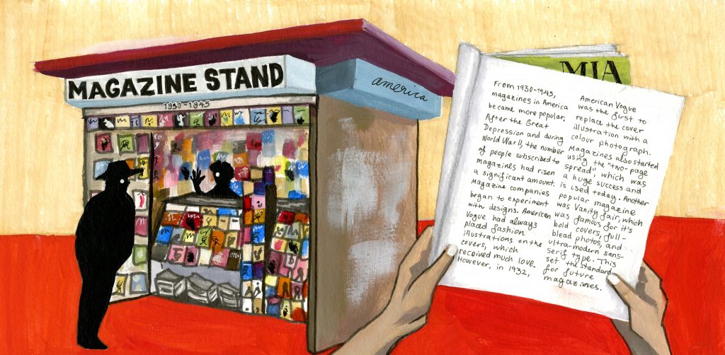
This is a design spread, in which I chose to focus on magazines in America from 1930-1945. I decided to create a magazine stand to symbolize the abundance of magazines being produced at the time and showcase the two most significant magazines which were Vogue and Vanity Fair. The style in which I painted the spread was inspired by a number of the illustrations seen on the front covers of the Vanity Fair magazines. The colour pallet I chose was meant to look similar to some of the bold choices magazine companies were making during this time, hence the bright red and yellow.
I give myself an 8/10 on this because perhaps I could have added something more to the background. I also believe that moving the magazine stand over to the left would have suited the page better. However I think the spread reflects the era well and i am happy with the colour choices and execution.
