Survey 5: Painters and Posters

In the 19th century, the art of posters was introduced to the western world as one of its first forms of advertisement. It is an effective form of visual communication and it continues to evolve with time. Typography was a crucial element of poster design, as they were meant to be read from a distance and they were made to convey a clear message to the targetted audience. Each poster made itself bold and flashy to attract the attention of the public, and the freeform of type played a huge role for them.

Technological advancements in moveable type with metal and wood type allowed for companies to have an easier time creating advertisements for themselves. In the early 19th century, posters consisted of huge fonts and a whole lot of information, which was hard to read at a glance and could not convey all the information well enough. This was due to companies having the printers design the posters instead of hiring artists. But by the late 19th century, the European poster designing game had changed completely with the birth of the lithographic poster.

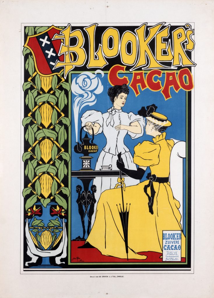
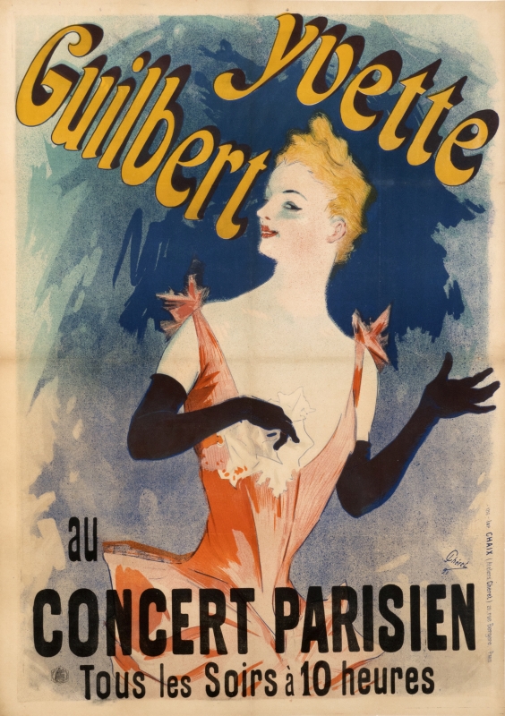
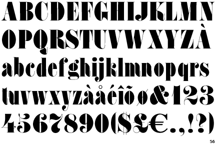
Although lithography was invented in the late 18th century, it continued to be too slow and expensive for producing large posters. That was until French poster artist Jules Chéret produced the first colour lithograph poster with his breakthrough of the 3 stone lithographic process. With this breakthrough, poster designers insisted on using their own, freeform and hand-drawn type instead of sticking to one specific typeface, or continued utilizing the typefaces invented in the early 19th century for posters such as the Slab Serif (Egyptian) or my personal favourite, the Fat Face, which is “fundamentally Didones on steroids” (A Brief History of Type – Part 5). Fat Face type was essentially a Modern type with more weighted strokes and triangulated serifs.

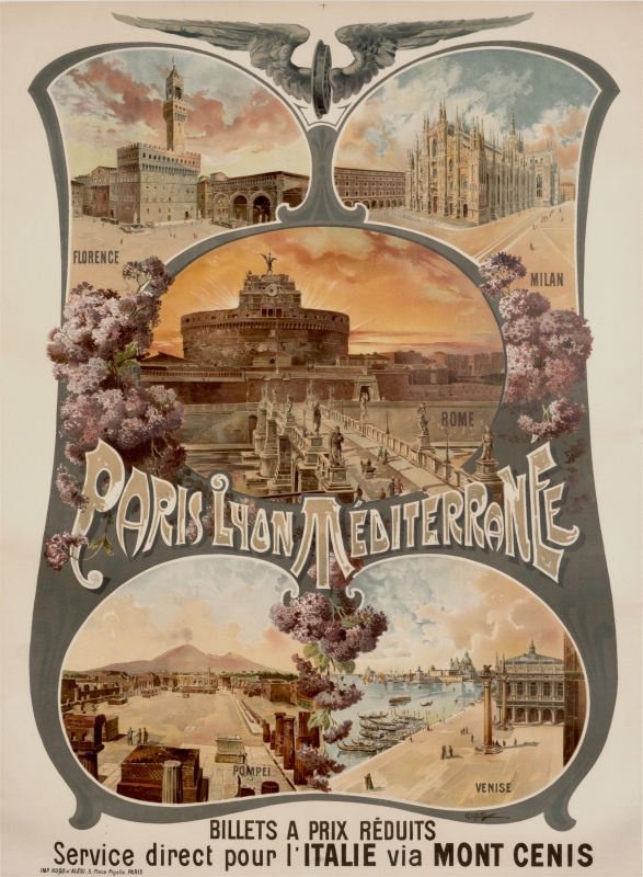
With the innovation of Chéret’s 3 stone lithographic process, designers were not bound to typefaces when it came to posters. This was a period of poster design with one of the most creative hand-drawn fonts ever. Even today, we can find many examples of copied typeface styles from the late 19th century. The designs were captivating and now, nostalgic, and can be seen used in many posters today.

19th-century typefaces created as fonts, courtesy of https://creativemarket.com/blog/1800s-fonts

http://www.designishistory.com/1850/poster https://www.vam.ac.uk/articles/a-short-history-of-the-poster https://www.internationalposter.com/a-brief-history-of-the-poster/


Survey 4: Steam and the Speed of light

While Europe was starting to flourish in its industrial revolution, another important period in world history was going down in the East. More specifically, in Japan. During this period, Japan was under the rule of a military dictatorship, historically referred to as the Tokugawa Shogunate or the Edo period. 

The Great Wave off Kanagawa, Katsushika Hokusai

      During the Edo period (1603CE – 1867CE) the Tokugawa Shogunate finally unified all of Japan. With that, there were no more civil wars among Japanese clans. This lead to a period of internal peace, political stability, and economic growth that grew Japan’s culture to the next level. Business increased, schools and roads were built, everyone learned to read, and many books were published. There was poetry, puppet shows and even Dutch studies. During this period, Japan had cut off the majority of its external relations and trade with other countries out of fear for being invaded by outside forces, with the exception of the Dutch. The trade between the Dutch and the Japanese allowed for people of Japan to study European works of Physics and Astronomy. Only after a couple of centuries, in the early 1800s, Japan opened its trade relations again, allowing for the very influential style of traditional Japanese artworks called ukiyo-e to travel over to Europe. 

Station Kawasaki, “The Rokugo Ferry” 

Ukiyo-e, meaning “the floating world”, was the style of art popularized within the Edo period. Its characteristics were not focused on realism, but more so on the beauty and the essence of the natural world. It originated from the various depictions of the red-light districts across Japan at the time. With the abundance of prostitution in feudal Japan, the government decided to push all of them into one area. The lives of these prostitutes, both male and female, were incredibly depressing. The majority of them were sold to brothels by their own family and worked in a never-ending cycle of debt until their death. They were not allowed to step outside of the walls of the brothel, unless if it were to visit a dying relative or once a year for hanami, the viewing of cherry blossoms. The only escape was to marry a client, to be taken in as a concubine, or in death, commonly due to sexually transmitted infections, failed abortions or sexual abuse. In rare instances, some were able to pay off their debts and live a normal life, but it was near impossible to achieve this as the financial outcome was in the brothel’s favour.

Tokyo’s Yoshiwara pleasure quarter, antique postcard.

Though the dark history of sex trafficking may make the Edo period seem gloom, the red light district lead to the flourishing of art and culture across the country. The members of the shogunate being wealthy alongside a booming consumerism culture, patrons of arts, music and literature grew the art history of Japan and pushed their limits. And like every cultural advancement, life wasn’t perfect, but it allowed Japanese art to bloom.

https://www.collectorsweekly.com/articles/the-tragic-life-of-the-courtesan-in-japans-floating-world/

https://ukiyo-e.org/

https://en.wikipedia.org/wiki/Yoshiwara

Survey 3:Block books and Baroque

The world starts to shift as the inventive minds bring new light into it. Methods of type improve the way of living and enlighten the population. We learned just how much type evolves through this time period, moving from simple text to being able to print detailed illustrations and developing different fonts was a fascinating growth to learn about.

The Witch Hunt

Burning of three “witches” in Baden, Switzerland (1585), by Johann Jakob Wick

In the lives of early modern Europeans and colonial North Americans were wild as they were without the threat of “witches”. Most accusations took place in Germany, France, Switzerland, and the Netherlands. These “witches” were considered to be using magic to influence people for their own benefit. What people considered “witchcraft” though, was not something scientifically proven nor support by factual evidence that it makes a person a witch. The qualifications of a “witch” would usually be a single woman past her prime age for marriage, one who reads a lot, the ones who seem knowledgable (for women), ones who own cats, especially black ones, people who practiced medicine, and often cases scientists.

The people of this time could not possibly prove dark powers of magic that they would use to influence others. But from the religious bigotry and medieval ignorance, it has been found that over 40,000 people were executed all over the world for their accusations of being a witch.

Instead of scientific accuracy, people ran practical tests based on their beliefs to test an individual accused of being a witch. One of the most infamous tests is the “swimming” test. Since the Catholic Church believed the witches were not baptized, they also believed that any body of water would reject their presence. So these “witches” were tested through being tossed into the nearest body of water, stripped of their clothes. The theory was that if the accused were a “witch” then the water would reject them and they would float, while a regular human being would start to sink. This process did not last a long time due to its uncertainty and not to mention the “accidental” drownings that often occurred.

An image of suspected witches being hanged in England, published in 1655

With many tests to prove their innocence, the people at the time were not satisfied with any defiance of God. Many of the accused “witches” were even Christian, yet the Church overlooked some facts to take control of the public. Eventually, by the 1730s, the witch-trials and executions ended for the time being on the fact that by this point, most people thought of witch-hunting to be fraudulent. There are occurrences of the rise of witch-hunting throughout modern times, but none were as severe as the witch-hunts during this time. As unfortunate as these circumstances were for the poor innocent, the phenomenon did spark modern cultural interpretations of witches in literary culture and has effected a lot of pop culture. To look into the positive, without these witches being executed, we wouldn’t have grown up with “The Wizard of Oz”.

The Malleus Maleficarum (the ‘Hammer against the Witches’), published in 1487, accused women of destroying men by planting bitter herbs throughout the field.

Andrews, Evan. “7 Bizarre Witch Trial Tests.” History.com, A&E Television Networks, 18 Mar. 2014, https://www.history.com/news/7-bizarre-witch-trial-tests.

Lewis, Jone Johnson. “A Timeline of Witch Hunts in Europe.” ThoughtCo, ThoughtCo, 13 Mar. 2019, https://www.thoughtco.com/european-witch-hunts-timeline-3530786.

User, Super. “Who Burned the Witches?” Catholic Education Resource Center, https://www.catholiceducation.org/en/controversy/common-misconceptions/who-burned-the-witches.html.

Survey 2: God and Gutenberg

Maestà del Duomo di Siena

By the mid-1100s, Europeans across the continent developed a higher understanding of art. The Church provided commissions for works of art depicting biblical elements. This let art in many forms started to flourish. From frescoes, panel paintings, manuscript illuminations and stained glass, the painting world became a whole lot broader.

Art in the gothic period predominantly featured biblical elements. Painting of any form hadn’t been commercialized and was very expensive, so without patrons from the Church it was impossible to pursue a future in art. 

Cappella Scrovegni – by Giotto Di Bondone

The use of colour in gothic art was vibrant and was used with a purpose in mind. The reason might be because of the lack of understanding of visual depictions or that there were limitations to the medium compared to the later periods in art, as painting techniques and resources were not developed as much. The main source of colour in frescoes was from minerals and plants. Frescoes consisted of plastering powder into a mixture of lime and water to implant it into the wall, and colourful materials could be found all over nature. 

Coronation of the Virgin

Colour was utilized as more than just decorations, but more so as symbols. There was a reason why Jesus Christ was depicted in blue and red clothes. Blue symbolized his royalty, his Godly heritage, and the red symbolized the blood and passion of Christ. Like this, European artists of the gothic period started to have a greater understanding of colour beyond what can be seen. By bringing an emotional connection to the colours used in artwork allowed the viewers to feel the ideas presented. This was a great promotion for the Church since many people were illiterate and could not fully read or understand the teachings of the Bible. The help of visual communication advanced the ways the Church could teach and at the same time, art commissions became profitable, allowing for more people to pursue art and eventually blossom into the renaissance.

“Gothic Art (C.1150-1375).” Gothic Art: Characteristics, History, http://www.visual-arts-cork.com/history-of-art/gothic.htm.  Wiley, Lucia, et al. The Art of Fresco: Color, http://www.muralist.org/fresco/color.html. The Meaning of Colors Symbols in Byzantine, Gothic and Renaissance Painting, http://www.historyofpainters.com/colors.htm.

Late Gothic & Early Renaissance: Andrea Mantegna

http://www.travelingintuscany.com/art/andreamantegna.htm
The Lamentation over the Dead Christ
https://www.britannica.com/biography/Andrea-Mantegna
The Madonna of the Cherubim (1485).

Starting early at the mere age of 10 in the city of Padua (ca. 1441 C.E.), Andrea Mantegna would start training as an apprentice under his legal guardian, painter and antique-collector Francesco Squarcione for his recognizable natural talent and understanding of art.

By the age of 17 (ca. 1448 C.E.), Mantegna moved on beyond Squarcione’s guardianship in order to establish his own footing in the art industry of Padua. The first official commission he had was to paint an altarpiece for the Church of Santa Sofia, which was highly unusual, for artists as young as Mantegna to get such an important commission as his first work.

The Virgin Mary in Andrea Mantegna’s San Zeno Altarpiece

Andrea Mantegna, though not financially fortunate throughout his life, continued working until the age of 74 (ca. 1506 C.E.) and passed on his legacy to his son, who unfortunately passed not long after his father. Mantegna is highly regarded in art history for being one of the first real renaissance artists and for his spatial illusionism used in frescoes and his sacra conversazione (depiction of Madonna and Child with saints) that artists like Giovanni Bellini (Mantegna’s brother-in-law) and Albrecht Dürer (German painter) followed. “[Mantegna’s] invention of total spatial illusionism by the manipulation of perspective and foreshortening began a tradition … followed for three centuries” (Sheard, Wendy Stedman) and the most prominent example is Camera Degli Sposi (“Room of the Bride and Groom”)

The illusion of depth, especially in the case of Camera Degli Sposi, where if you were to stare up at it the painting would look as if the ceiling opened up to show the blue sky, is an amazing technique that applies another level of realism. The ingenious idea of making a painting share the same physical space as the viewer makes looking at the painting feel real as if you were looking out the window. Mantegna introduced this concept and developed it all by himself, which is an incredible achievement for the early renaissance, as it propelled artists’ understanding of physical space and its relationship to the viewer and use of visual tricks to fool the viewer. Andrea Mantegna is and should be regarded highly for his development of spatial illusionism that evolved into the many illusionism techniques utilized by artists in different forms of media to add depth and effect to their work.

https://www.britannica.com/biography/Andrea-Mantegna
Arrival of Cardinal Francesco Gonzaga

Sheard, Wendy Stedman. “Andrea Mantegna.” Encyclopædia Britannica, Encyclopædia Britannica, Inc., 9 Sept. 2019, https://www.britannica.com/biography/Andrea-Mantegna.

Mattioli, Massimo. “Immagini Della Camera Degli Sposi Di Andrea Mantegna. Il Capolavoro Mantovano Riaprirà Il 3 Aprile Dopo i Lavori Di Adeguamento Strutturale e Antisismico.” Artribune, 11 June 2015, https://www.artribune.com/tribnews/2015/02/immagini-della-camera-degli-sposi-di-andrea-mantegna-il-capolavoro-mantovano-riaprira-il-3-aprile-dopo-i-lavori-di-adeguamento-strutturale-e-antisismico/.

Survey 1: Handprints and Handwriting

http://www.oldest.org/artliterature/cave-paintings/

In the grand timeline of human evolution, dating all the way back since ca. 40,000 BCE, mankind developed many forms of communicating with each other. From cave drawings to forming systems of languages, these incredible advancements in early civilizations lead mankind to the complex world we now live in.

I was amazed by the amount of effort and time that was put into making the basic languages that we use to this day. For example, English started from the Phoenicians creating the first-ever written alphabet, then the Greeks adapted the Phoenician alphabet for their own language which came to be the Greek alphabet, which has a lot of similarities to modern English letters. The Greek alphabet was combined with the Etruscans’ to create the language of Romans, Latin, which is the basis of English that we use. It was very inspiring to see just how far humanity advanced from a very primitive way of communication like hieroglyphs to creating written languages. The collaboration that many countries went through by copying and borrowing elements of another country’s language to develop their own also showed me how powerful different cultures learning from each other can be.

Your Body is Your Canvas

The history of painting one’s body goes way back, nearly to the beginning of humanity itself. In almost every continent there is a history of our ancestors utilizing natural pigments from plants and fruits for many different purposes and occasions.

https://www.ancient-origins.net/history-ancient-traditions/were-norsemen-tattooed-evidence-ink-rugged-rusiyyah-008351

The colourful history of augmenting our bodies is more than just for cosmetic purposes. When people painted their bodies it was common to do so for social and spiritual events, such as a marriage, funerals, rites of passage, and for war. In these different circumstances painting their bodies symbolized different meanings, had different reasons and purposes for why people painted themselves. For example, body paint in wars was used for camouflage, or often in order to make a warrior look fiercer to intimidate the enemy. It would also often indicate the position or rank of the person as well.

It was common for people to decorate themselves with ritual paintings, tattoos, piercings and scarrings instead of simply using pigments rubbed on their skin. In many cases, body art was a very important part of people’s everyday and spiritual lives, as the markings on their bodies represented their inner qualities, their wishes, and many illustrations of gods or scenes of war. Some cultures, such as the Romans, used tattoos and carved skin designs to mark people as criminals or slaves instead of incorporating it into a cosmetic lifestyle.

https://people.howstuffworks.com/culture-traditions/body-art/body-painting3.htm

In today’s society, people are getting cosmetic tattoos, usually symbolizing a person’s ideals, their likes or memories that they want to cherish. The idea behind modern body art and augmentation is for entirely cosmetic purposes, artistic projects and to engrave a part of their lives onto their bodies to remember them and to indicate to other of what they are like, without having to communicate anything in words. It isn’t utilized as ceremonial designs but communicates ideas from one another without the use of words.

McManus, M. R. (2015, February 17). How Body Painting Works. Retrieved from https://people.howstuffworks.com/culture-traditions/body-art/body-painting3.htm Body Painting History. (n.d.). Retrieved from http://www.historyofcosmetics.net/history-of-makeup/body-painting-history/ The world’s oldest tattoos. (2015, November 11). Retrieved from https://www.sciencedirect.com/science/article/pii/S2352409X15301772?via=ihub Rank, S. (2019, August 5). Were Norsemen Tattooed? Evidence of Ink on the Rugged Rusiyyah. Retrieved from https://www.ancient-origins.net/history-ancient-traditions/were-norsemen-tattooed-evidence-ink-rugged-rusiyyah-008351 7 Oldest Cave Paintings in The World. (2017, November 13). Retrieved from http://www.oldest.org/artliterature/cave-paintings/

The Exclusive Interview with Andrew Choi

The central theme of my yearbook spread assignment was to make it in the style of an ‘80s pop culture magazine, with its flashy colours and clean-cut shapes. As told on the spread, I have an intrigue for ‘80s culture and aesthetic, which is why I wanted my yearbook spread to reflect that aspect of myself, the colourful, exciting and fun part of me feels greatly represented by the ’80s look.

The colour choice and the layout is loosely based on a magazine cover from 1983, with the use of vibrant primary colours that grabs the attention of the viewer. the second half of the spread is just using the secondary colours to contrast the primary colours on the left and make it stand out.

The image of myself is a caricature of myself that I often use for social media, but I turned it into a sticker that I was able to incorporate into the work. That illustration is associated with my nickname, ChoiBoy, which is also used in most of my social media tags. It originated in elementary school when kids wanted to give me a nickname instead of calling me Andrew since there were already 3 different Andrews in the grade.

The addition of David Bowie on the right corner is taken directly from a vintage pop culture magazine from the ’80s that looks back at Bowie’s tour of Aladdin Sane. I incorporated this because of the connection I feel with Bowie’s music, and because he is one of the most prominent idols of the ’80s.