In the 19th century, the art of posters was introduced to the western world as one of its first forms of advertisement. It is an effective form of visual communication and it continues to evolve with time. Typography was a crucial element of poster design, as they were meant to be read from a distance and they were made to convey a clear message to the targetted audience. Each poster made itself bold and flashy to attract the attention of the public, and the freeform of type played a huge role for them.
Technological advancements in moveable type with metal and wood type allowed for companies to have an easier time creating advertisements for themselves. In the early 19th century, posters consisted of huge fonts and a whole lot of information, which was hard to read at a glance and could not convey all the information well enough. This was due to companies having the printers design the posters instead of hiring artists. But by the late 19th century, the European poster designing game had changed completely with the birth of the lithographic poster.
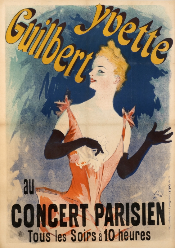
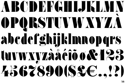
Although lithography was invented in the late 18th century, it continued to be too slow and expensive for producing large posters. That was until French poster artist Jules Chéret produced the first colour lithograph poster with his breakthrough of the 3 stone lithographic process. With this breakthrough, poster designers insisted on using their own, freeform and hand-drawn type instead of sticking to one specific typeface, or continued utilizing the typefaces invented in the early 19th century for posters such as the Slab Serif (Egyptian) or my personal favourite, the Fat Face, which is “fundamentally Didones on steroids” (A Brief History of Type – Part 5). Fat Face type was essentially a Modern type with more weighted strokes and triangulated serifs.
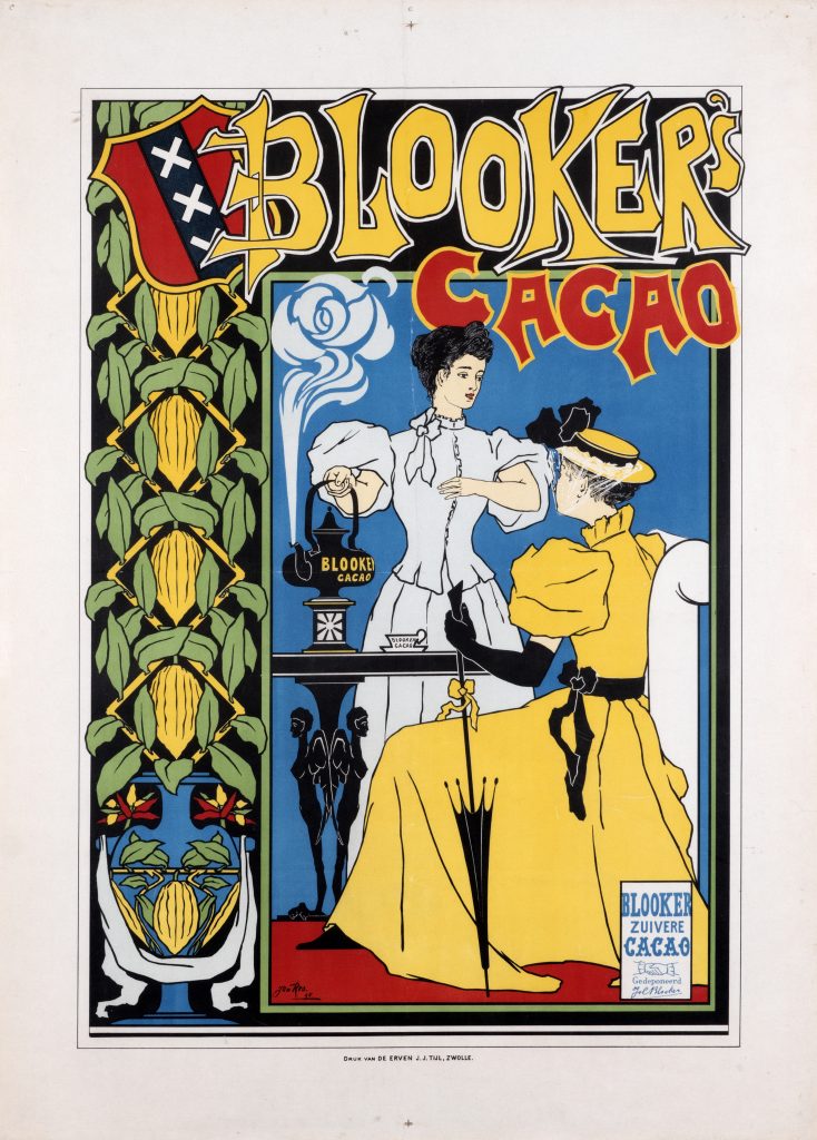
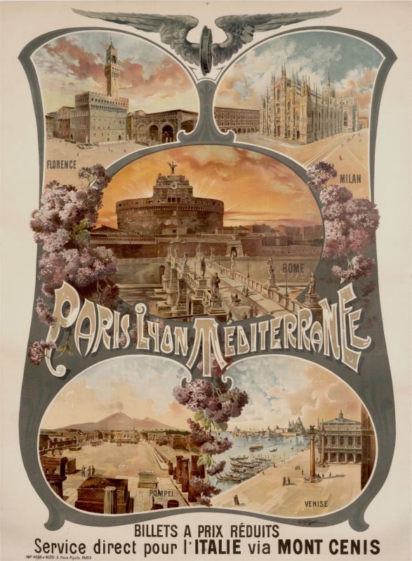
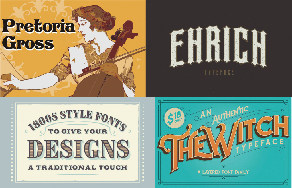
With the innovation of Chéret’s 3 stone lithographic process, designers were not bound to typefaces when it came to posters. This was a period of poster design with one of the most creative hand-drawn fonts ever. Even today, we can find many examples of copied typeface styles from the late 19th century. The designs were captivating and now, nostalgic, and can be seen used in many posters today.
http://www.designishistory.com/1850/poster https://www.vam.ac.uk/articles/a-short-history-of-the-poster https://www.internationalposter.com/a-brief-history-of-the-poster/

