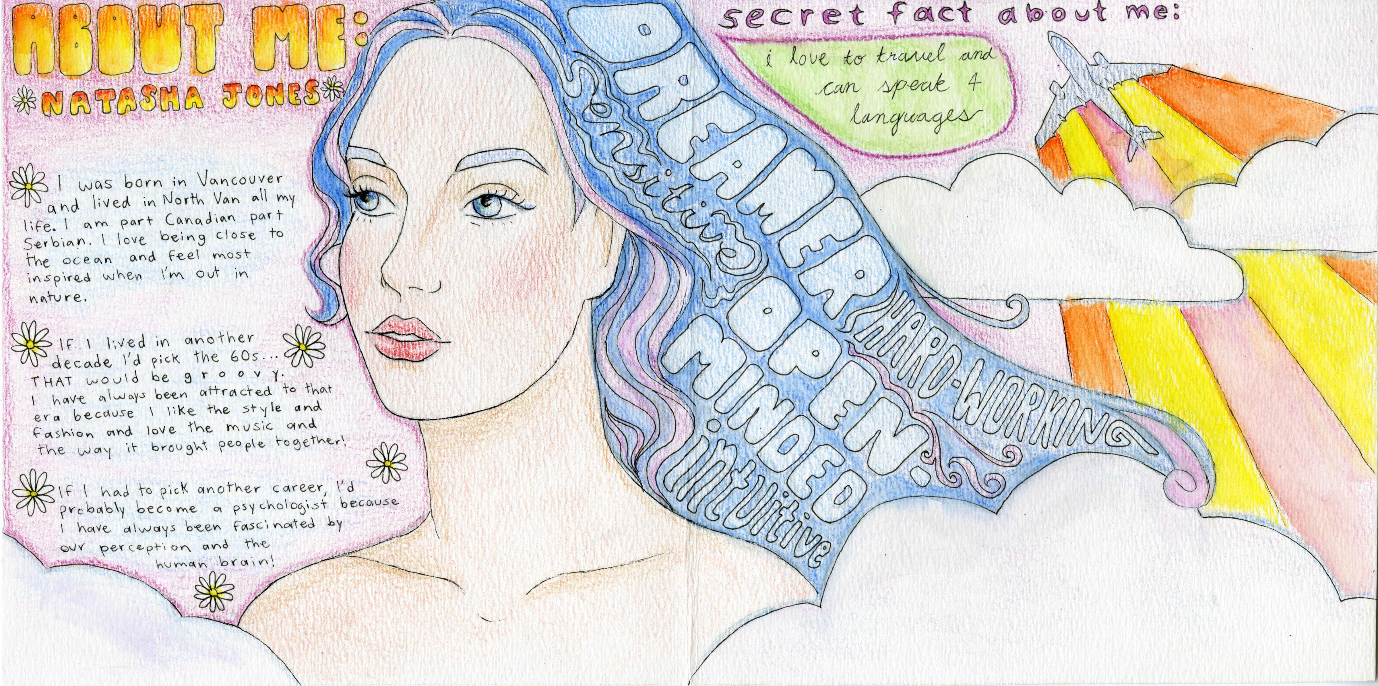
Here is my yearbook spread! It was done in pencil crayon and is inspired by the hippie movement of the late 60s. I was going for something a little more abstract for the self portrait: it might not resemble me exactly but I think it represents me pretty well. I chose to draw my hair blue because it reminds me of the ocean and wanted to show my connection to nature.
I like the way I incorporated the 5 words to describe myself into my hair. Those words are: dreamer, sensitive, hard-working, open-minded and intuitive. I do think I could have made the colours a little more vibrant but I also kind of like the softer look.
For the background, I kept things pretty simple and chose to do it in light pink since that is my current favourite colour. I also added an airplane in the top right corner because it symbolizes my love for travel. The clouds and flowers were put there to create a more dreamy look.
On the left, I wrote a bit about myself. I grew up in North Van and am part Canadian part Serbian. I love to learn languages, and if I weren’t pursuing design I’d probably study Psychology. There are a few more things I wanted to add, but I wanted to keep text fairly minimal to put more emphasis on the drawings. Overall, I think this yearbook spread shows a pretty good summary of who I am.

Leave a Reply