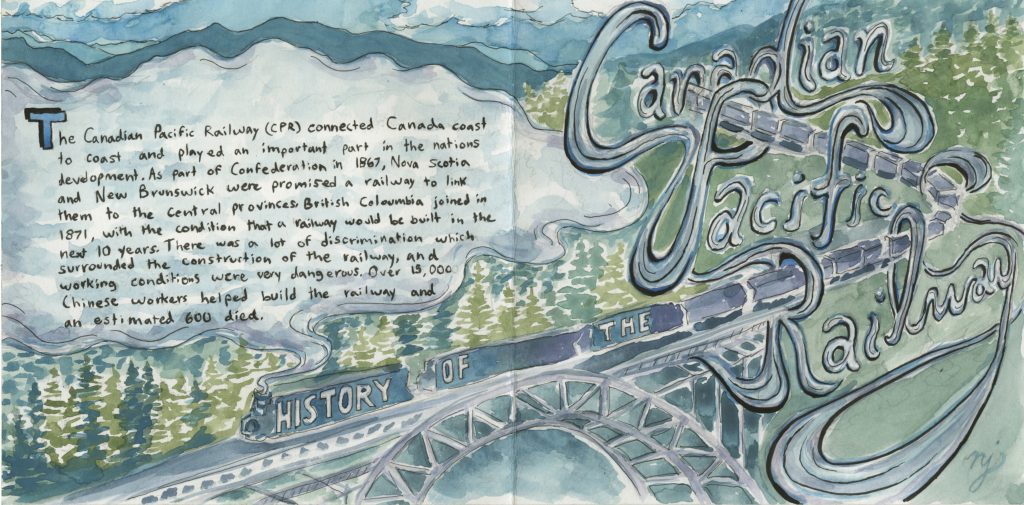
Here is the spread I did for Survey 5. My group chose to research geopolitics, and we came up with the topic of the Canadian Pacific Railway.
I am overall quite pleased with how my spread turned out. I think the watercolours worked well for me and I managed to keep the information legible and captivating. I like the way I incorporated the text into the steam and the way the title intertwines with the train forming loops and tunnels.
However, there are things that I think could have did better. Perhaps making the colours pop a little bit more in some way would have helped, either by making the colours brighter or adding a few accent colours such as red for the drop cap or border. I also originally wanted to keep the title on the left as I feel that it would be a more logical placement, but then again, I think the title works nicely with the whole composition. Also, maybe adding a gold jel pen would have been a nice, final touch.
I give myself a 9/10 for this piece because I put quite a bit of effort into it and think the idea I had for this was an improvement from the previous layout I was working on, which was basically a close up of a train (it would have been too highly detailed making it hard to read the text). There are a few minor tweaks I could have made but I think my concept is pretty strong.
Leave a Reply