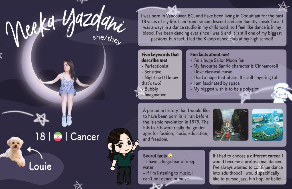
For this yearbook spread, I initially had a completely different idea with the same image of me sitting. It was going to be a brighter, more summery scheme with rainbows and a white background, but then I realized that incorporating some of my favourite things reflects who I am better. I used purple for the colour scheme because it is my absolute favourite colour, and it tied into my love for space and the moon as well! The photo of me is originally sitting on a hammock, and then I edited it to place myself on the moon I created in illustrator, to create an interesting and meaningful image. I also included a drawing of me in a cartoon style to reflect my artistic side! I used both photoshop and procreate to create most of my images, and then used illustrator to put all the elements together.
If I had to give myself a grade, it would be an A- because I think there is always room for improvement! I could’ve added more images for more visual engagement. However, I reflected my creative style of slight minimalism quite well and am satisfied with the flow of my layout. I spent about two full days creating this spread.