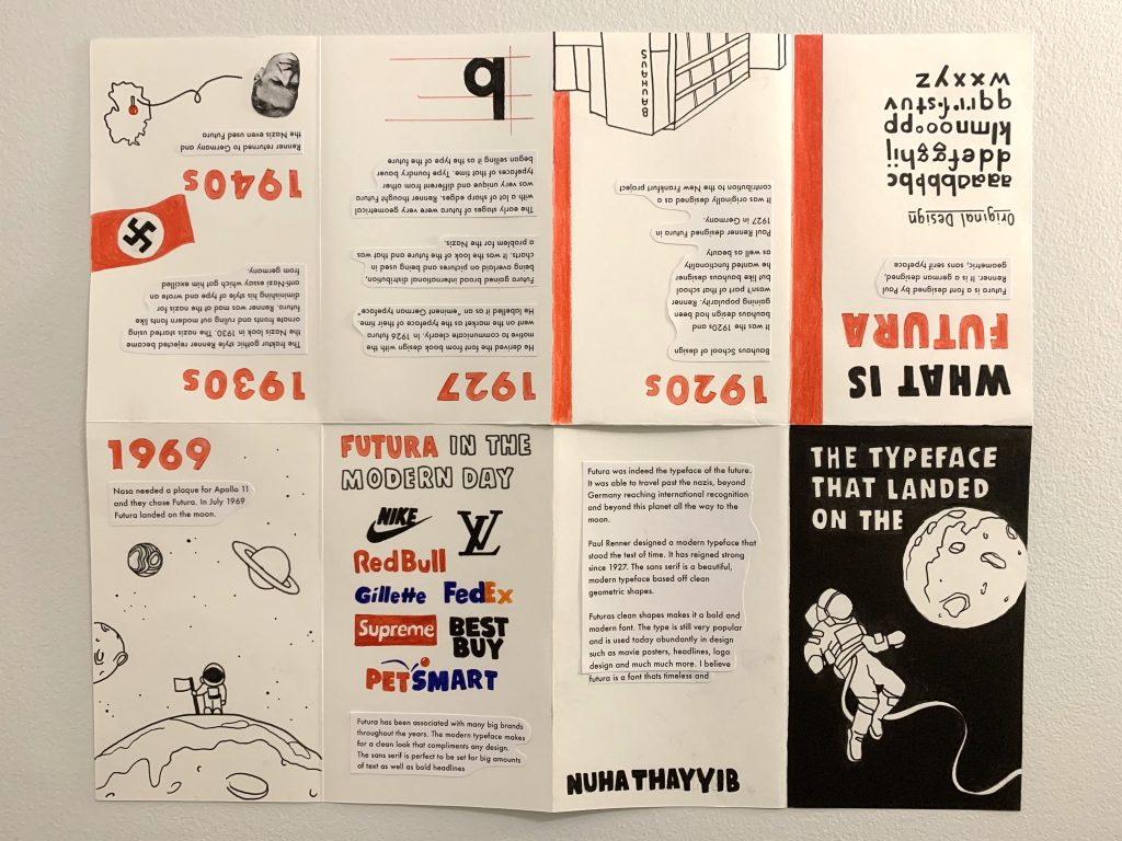
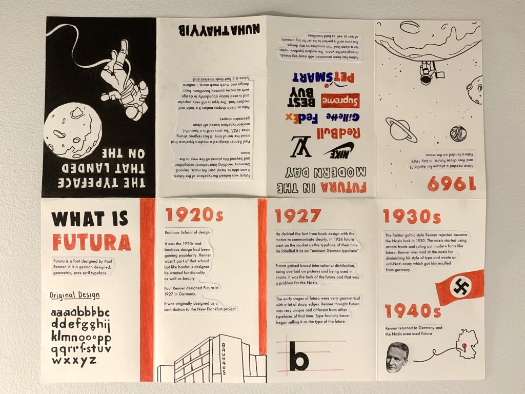
I designed my zine on the Futura Typeface. I mainly focused this history of the typeface, as well as its anatomy and modern day use.
I’m used to making layout designs digitally and rarely create them by hand, so it was a fun challenge for me. I decided to go with a very minimalistic colour palette in order to guide the readers eye and not draw too much attention to certain spots of the design.
It was really fun going through this more hands on experience of creating layouts. I realized that not every detail was going to be perfect and that’s okay! In a way it let me not strive for perfection but more so to see a final concept come together. I quite enjoyed this project, it was very interesting to reading more in-depth about the history of my typeface and being able to learn where it came from and where it’s going.
I would give myself an 9/10 for this project. I am very happy and proud with the way the final product turned out. I like that its clean and minimalistic while still conveying all my information. Making this zine was super fun! I will definitely be using this new learned technique to make some personal zines just for fun!