DESIGN ELEMENTS

SPACE
The movie poster for the film “The Lobster” had so many different and interesting variations. This happened to be one of my favourites due to the excellent use of negative space. Designer Vasilis Marmatakis enjoys working with negative space as a main element in a lot of her design work. This particular use of negative space helped convey the sense of loneliness which is a common theme displayed throughout the film.
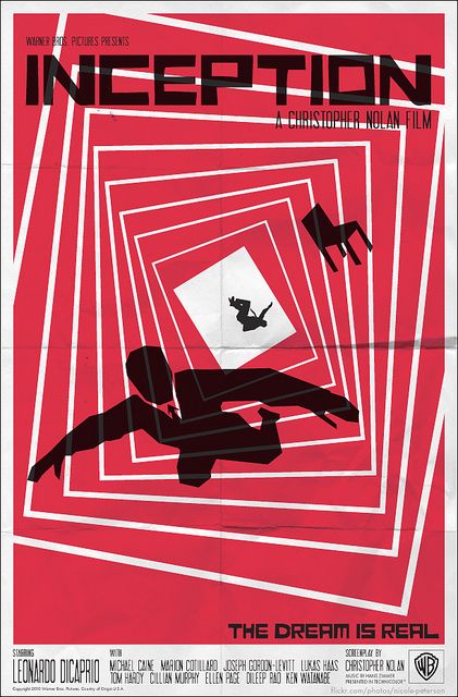
DIRECTION
This is a remade movie poster designed by Saul Bass. Initially, when I came across this poster for the movie “Inception” the obvious element of design I saw used was lines. However, the more I looked at it, I enjoyed the use of direction more. The lines help convey a sense of movement and flow; and even though the shapes are flat the use of size variation and the lines getting thinner and the objects getting smaller as they move back also translates a great sense of direction.
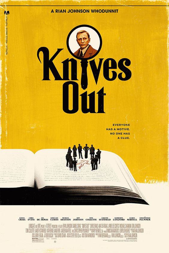
SIZE
This movie poster for “Knives Out” designed by Phantom City Creative make great use of size in this design. It’s a great play on a main running theme within the film. Since the people are scaled so small on the book, it almost looks as if they’re clues waiting to be discovered.