Discovering the Sans Serif
THE FIRST SANS SERIF APPEARS: Typography and Design
The foundry of William Caslon cut the first sans serif in 1748. It was cut for the Oxford University Press as academic work on Etruscan culture. A couple years later in 1785, a different sans serif was created for an institution for blind children. The founder of the school, Valentin Hauy, developed a tactile book system with the typeface called Hauy System which was an early sans serif.
Grotesque
William Calson IV began the development of the grotesque font style. Caslon’s type foundry developed the first sans serif printing type and this Latin alphabet debuted in the 1816 Caslon specimen book. The grotesque or (gothic) font style is a sans serif. Sans serif are a letterform that do not have the extending “serif” features of a serif font style. Sans serif fonts tend to be more minimalistic and simple making their readability higher when set in large quantities of type. Sans serif fonts usually come in a smaller variation of stroke widths. Caslon’s typeface was not well received and was described as “grotesque” or “gothic comments that were influenced by a style of architecture experiencing a revival at the time.
Sans Serif in Design
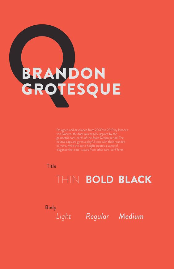
Sans Serif font styles have impacted the design world significantly. Sans Serif fonts were usually quite solid, bold typefaces that are suitable for headlines and advertisements. Earlier Sans Serif Typefaces didn’t commonly feature lowercases or italics. They were more commonly a range of widths and thicknesses that extended from normal to condensed. The grotesque font style had shorter ascenders and descenders, making for an x-height that was more similar to the full font height. This allows for a more tight line spacing in headlines. Letter forms were also very geometric in their design. The circular letters like O, G and D have perfect or near perfect circles.
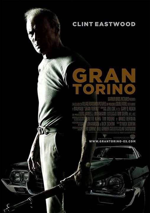
In the Modern day of Design Sans Serifs are used in design to make bold headlines and to make statement. A great use for Sans Serif fonts would be movie posters.

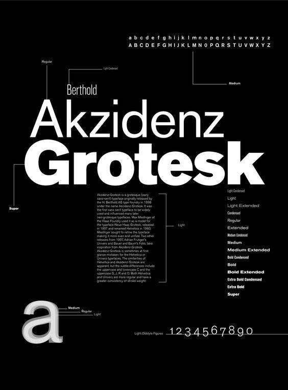
Akzidenz-Grotesque
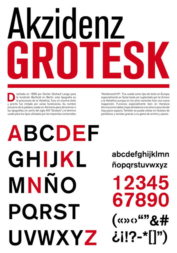
A great example of an early sans serif is Akzidenz-Grotesk. This font family is from the Berthold Foundry. The font is known to have been designed by Walbaum and Didot. Akzidenz-Grotesk paved the way for neo-grotesque and was an inspiration for the more modern sans serifs.
Bibliography
Writing
https://www.canva.com/learn/serif-vs-sans-serif-fonts/
https://en.wikipedia.org/wiki/List_of_sans_serif_typefaces
https://en.wikipedia.org/wiki/Sans-serif
Image
https://www.pinterest.ca/pin/476748310529648135/
https://www.pinterest.ca/pin/532550724688652942/