The three elements of design I decided to focus on were direction, colour, and shape.
Direction: I chose a piece by Paula Scher (Bottom). The different directions the text is being displayed frame the man as the centre piece, which was the purpose. The different sizes as well helps capture your eye and lead us towards the same man we are supposed to see.
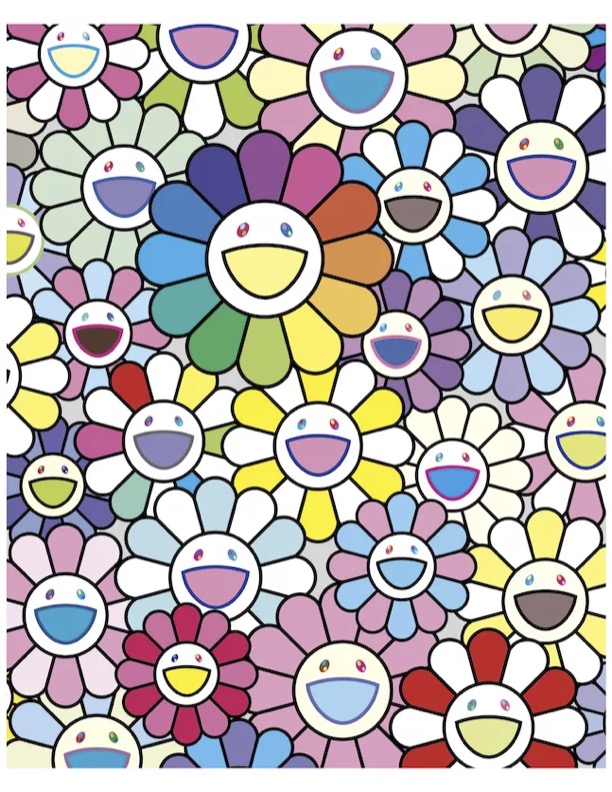
Colour: I chose a piece by Takashi Murakami (Left) to display the element of colour. The usage of pastel colours is used to soften the hard lines of each flower. There are also different petals of the flowers that are a deep red, allowing our eyes to search across the whole piece instead of just the big flower in the centre
Shape: For shape I chose this piece by Allan Fletcher (Right) to represent shape. Fletcher does a great job of conveying shape because even though each figure lasts details and shading, the simple shape of the silhouette alludes us to the idea that they are all cats. each shape is very clear and concise so each cat is very clear and prominent in the piece.


