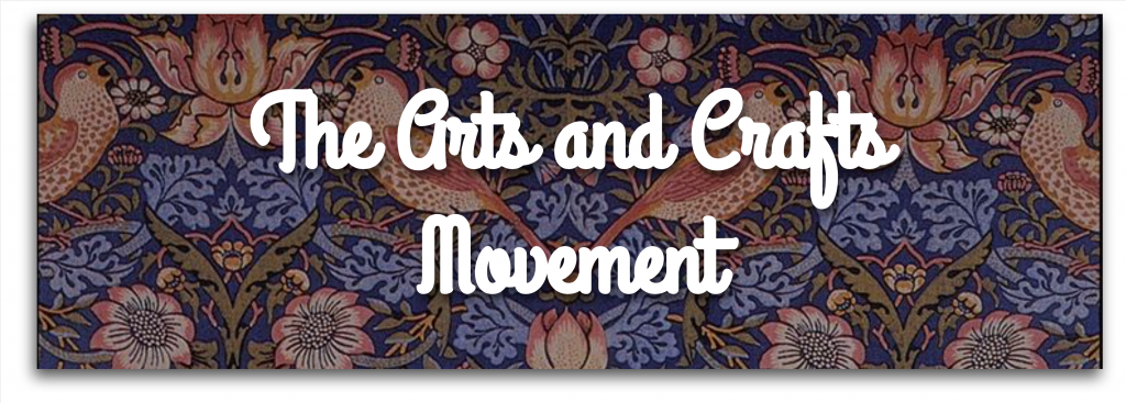
The Arts and Crafts Movement

The Arts and Crafts movement arose during the late Victorian period in England, the most industrialized country at that time. Worries about industrial life drove a positive revaluation of the handcraftsmanship of culture and society. Arts and Crafts designers explored to improve standards of decorative design, thought to have been corrupted by mechanization, and to create environments where beautiful workmanship was managed. The Arts and Crafts movement did not support a particular style, but it did push for reform as part of its belief. It also prompted a critique of industrial labor; as modern machines replaced workers, Arts and Crafts enthusiasts called for an end to the division of labor and furthered the designer as a craftsman.

The American Arts and Crafts movement was undeniably connected to the British movement and closely followed the work of William Morris. Through writing, and societies that sponsored lectures and programs, the work of the Arts and Crafts movement spread. The U.S. movement was multicentered, with these arts and crafts societies forming nationwide. Boston was the first city to highlight a Society of Arts and Crafts, founded in June 1897. Chicago’s Arts and Crafts Society started at Hull House, one of the first American townhouses for social change, in October 1897. Numerous societies followed in cities like Minneapolis, New York, Deerfield, and Massachusetts.

In urban centers, socialist methods were undertaken on a community level, often by educating young women. Ideas of craftwork and simplicity demonstrated themselves in their decorative work, including the pottery and metalwork of the Arts and Crafts movement. Schools and practice programs taught quality design, the base of the Arts and Crafts movement philosophy. Personally, I definitely agree with the arts and crafts movement ideals. Good quality designs and socialist movement? Count me in. I really appreciate nice fabrics and furniture so I understand and appreciate the movements ideas.

SOURCES:

https://www.metmuseum.org/toah/hd/acam/hd_acam.htm

https://www.google.com/url?sa=i&url=https%3A%2F%2Fwww.pinterest.com%2FDavidJonTerry%2Farts-and-crafts-movement%2F&psig=AOvVaw2mQX_n9GK4mElBCBTC9ya2&ust=1635541708820000&source=images&cd=vfe&ved=0CAsQjRxqFwoTCODY_OaB7vMCFQAAAAAdAAAAABA4

https://www.google.com/url?sa=i&url=https%3A%2F%2Fwww.pinterest.com%2Fsassynancy%2Farts-and-crafts-movement%2F&psig=AOvVaw2mQX_n9GK4mElBCBTC9ya2&ust=1635541708820000&source=images&cd=vfe&ved=0CAsQjRxqFwoTCODY_OaB7vMCFQAAAAAdAAAAABBD

https://www.google.com/url?sa=i&url=https%3A%2F%2Fwww.alamy.com%2Fenglish-a-wild-danish-forest-draw-in-sknvirke-style-danish-arts-crafts-movement-similar-to-art-nouveau-1898-anonymus-131-dansk-skov-image188966165.html&psig=AOvVaw2mQX_n9GK4mElBCBTC9ya2&ust=1635541708820000&source=images&cd=vfe&ved=0CAsQjRxqFwoTCODY_OaB7vMCFQAAAAAdAAAAABBO

https://www.google.com/url?sa=i&url=https%3A%2F%2Fmymodernmet.com%2Farts-and-crafts-movement-william-morris%2F&psig=AOvVaw2mQX_n9GK4mElBCBTC9ya2&ust=1635541708820000&source=images&cd=vfe&ved=0CAsQjRxqFwoTCODY_OaB7vMCFQAAAAAdAAAAABBU
Typography Zine Project

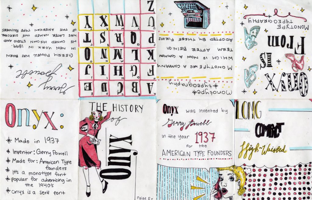
For my Zine project, I decided for my topic to be about the font Onyx. Onyx was created in 1937 but was used mainly in the 1940s for advertising. Therefore, I made my zine to try and reflect on the advertisements during that time. I went for bold colours, a mix of fonts, and simple line art. Overall I wanted to make it feel very pop art ESC while maintaining the vintage feel. Out of 10, I would give myself a 9. There are some spots where my linework went astray, but overall I kept it clean, consistent, and I stuck to my intended idea. In total, I spent around 10 hours on this project.

Typography Zine

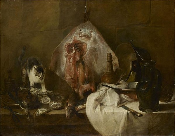
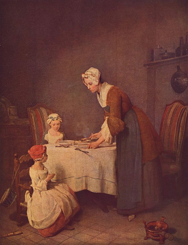
Jean-Baptiste-Siméon Chardin

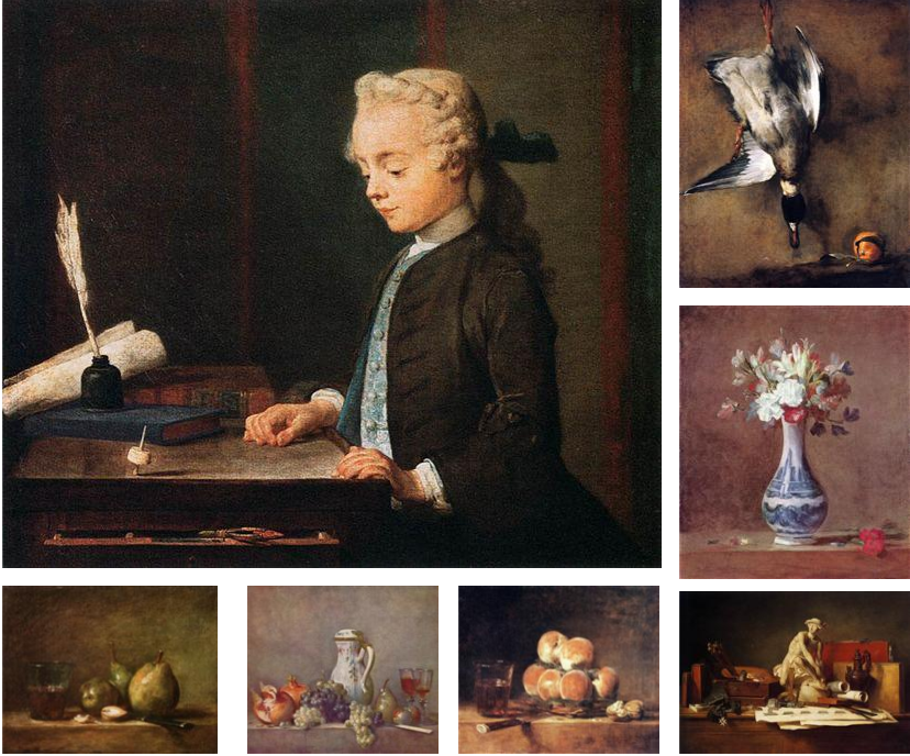
Jean-Baptiste-Siméon Chardin was a French painter who mainly painted still lifes and genres during his career during the Roccoco movement. Baptiste was born in Paris and never strayed far from home. We don’t have much information about his education, but we know he worked with Pierre-Jacques Cazes until 1724. Though he got accepted into the Academy of Saint Luc in 1724, Baptiste’s career didn’t kick off until 1728 when he became a member of the Royal Academy of Painting.


Today, Baptiste’s work is highly appreciated and looked at as some of the best still-life paintings. I appreciate Batiste’s style in art due to his immense detail when it comes to his still life work. Most of his pieces also include symbolism to show the amount of personal loss he suffered in his personal life. These symbols include things such as bubbles and precariously balanced objects. His juxtaposition of such sad and somber topics in scenes from everyday life is what separates him from other Rococo artists.

Sources:

https://www.britannica.com/biography/Jean-Baptiste-Simeon-Chardin

The Ray (Chardin) – Wikipediahttps://en.wikipedia.org › wiki › The_Ray_(Chardin)

Saying Grace (Chardin) – Wikipediahttps://en.wikipedia.org › wiki › Saying_Grace_(Chardin)

Boy with a Spinning-Top – Wikipediahttps://en.wikipedia.org › wiki › Boy_with_a_Spinning…

Chardin Artworks & Famous Paintings – The Art Storyhttps://www.theartstory.org › artist › artworks

https://www.wikiart.org/en/jean-baptiste-simeon-chardin

Woodcut Printing

1450’s– Ars Moriendi: The Art of Dying, woodcut block book

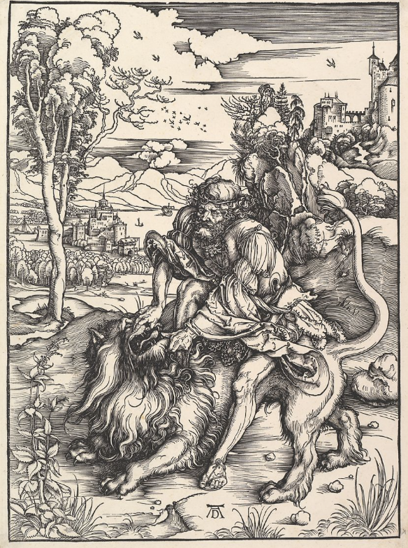
Woodcut is one of the oldest forms of printmaking and was invented back in the 8th century by Japan for textile printing. However, woodcuts were not used to transfer onto paper until the 14th century by France and Germany. The earliest dated print of German origin is the St. Christopher print of 1423 from the Buxheim Monastery. While in the 15th centuries, countries like Austria, Bohemia, and Bavaria used woodcuts to display religious figures onto playing cards.

Samson Rending the Lion: Albrecht Durer

The earliest coloured woodcuts were made to imitate the appearance of chiaroscuro, which was very sought after by collectors. Within these types of drawings, the “coloured paper served as the middle tone, and the artist worked toward the light (chiaro) by adding highlights with white gouache, and toward the dark (scuro) by adding cross hatching in pen or a dark wash with a brush.” (Thompson 4) The chiaroscuro type of woodcut was invented by Hans Burgkmair around 1509.

St. Jerome in the Wilderness: Titian

As soon as the moveable type and printing press were invented in the 15th century, woodcuts gave us the ideal means for creating early printed books. The woodblocks could be placed alongside the type in the press and then printed the woodcuts onto paper. The same image could be used to illustrate more than one texture could even be used again for the same text. The history of woodcuts is very interesting to me because I have always looked at woodcuts and other relief printing forms as something I wanted to try. Though I haven’t realized it yet I hope I could one day due to the fact of how beautiful they seem to turn out.

Source

Titian

Tiziano Vecelli, known as Titian in English, is a famous renaissance artist from the 15-16th centuries. Titian is seen as one of the most versatile artists in Italy as his styles constantly changed throughout his career. Though he may have changed styles, he was always consistent on his use of colour. Though some of his earlier works may not have been as bright, his loose brush work and subtlety of tone were motifs in all of his pieces.

During the 16th period, Titian grew and matured in his Giorgionesque style and undertook larger and more complex subjects in his work. In 1521, Titian rose to the height of his fame after his figure of Saint Sebastian. Later, Titian created a sieges of small madonnas, in which he placed amongst beautiful landscapes and backgrounds. The softness to his pieces are very encapsulating and his use of tone and colour is unmatched. I find his work beautiful and intriguing to look at due to its soft features but immense detail.

Sources:

https://en.wikipedia.org/wiki/Titian#Growth

https://en.wikipedia.org/wiki/A_Man_with_a_Quilted_Sleeve

https://www.sothebys.com/en/artists/titian

https://www.metmuseum.org/art/collection/search/656438

https://geniusrevive.com/en/titian-one-of-the-greatest-high-renaissance-painters/

https://en.wikipedia.org/wiki/Self-Portrait_(Titian,_Madrid)

Mood Board

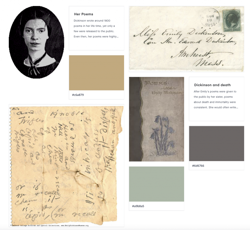
I decided to focus on different artists in the 18th and 19th centuries who died in poverty, but later became some of the biggest names in history. For my artists I decided on El Greco, Emily Dickinson, and Johann Sebastian Bach. Though we all know these iconic artists, many if them were not known in their life time. El Greco died commisionless, Dickinson was held back by the writing industry, and Bach’s composer work was left unknown. I thought it was interesting on how these people were incredibly talented, yet just happened to be born in the wrong time. Though they never got experience fame, we still get to see the effects that they had on history. If I were to give myself a score out of ten, I would give myself an 7/10 because I spent a lot of time researching and getting images, yet I wish I was able to go more in depth. However, I was limited by the Invision website due to my lack of knowledge on how to work it.

Emily Dickinson