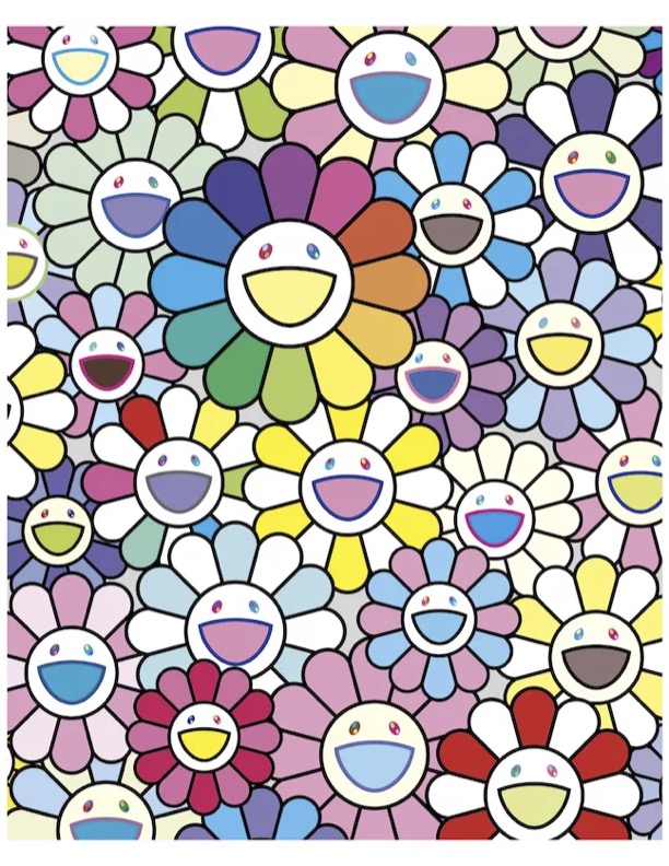
The principles I chose to focus on were: Contrast in texture, Repetition, Figure/Ground, and Closure
Contrast In Texture- Sunrise by Geogiana Paraschiv in the image that I chose to represent the design principle of contrast in texture. The the smooth gradient in the yellow circle and the rough gradient in the grey circle creates a nice contrast. The overlaying of the two circles also create a sense of connection between these two contrasting objects.
Repetition- Love Saves the Day by Paul Rand is a great example of repetition. The diagonal repetition of colour along with the repetition of shape and direction is very well represented in Rands piece.
Figure/Ground- In the Food and Wine festival poster, Gestalts principle of figure/ground is prevalent. The shape of the fork moving down on the left side has prongs that are created by the shape of vine bottles in the negative space between them. This conveys the ideas of food, through the symbol of a fork, and wine, through the symbol of the wine bottles.
Closure- Gestalts principle of closure is conveyed through the image of spikes, creating th idea of them being attached to a circle. Though there is no outline of a circle, the way the spikes are placed creates the shape of a circle within the white.


