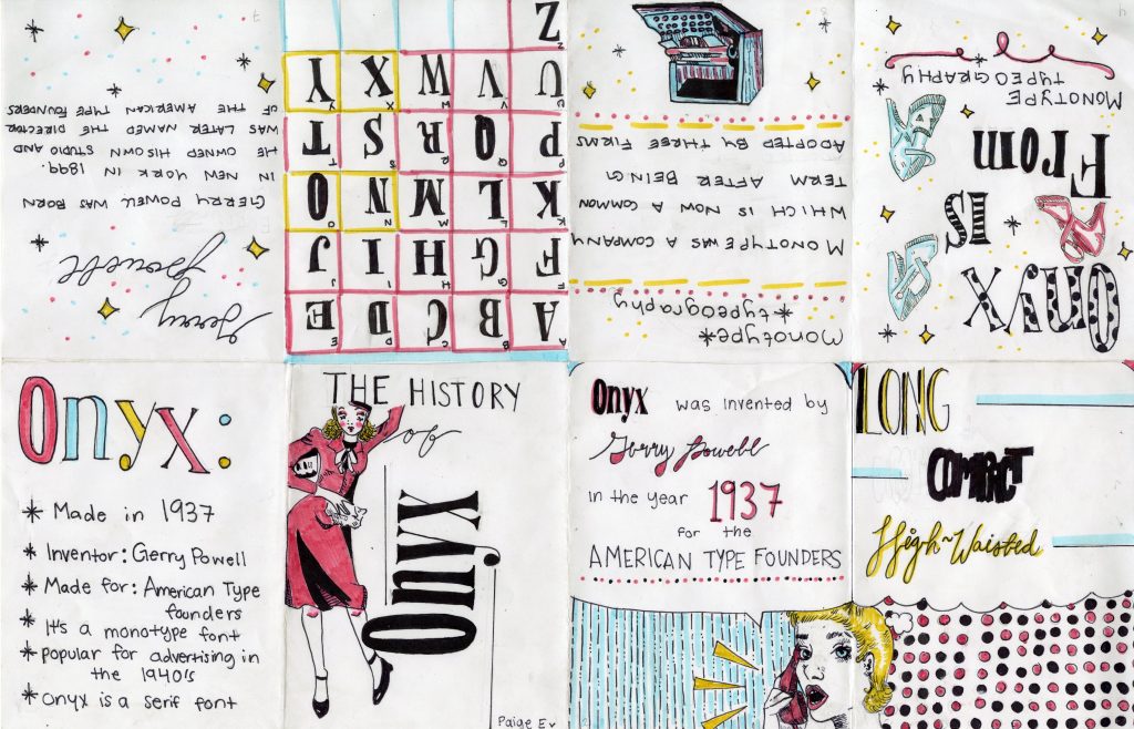
For my Zine project, I decided for my topic to be about the font Onyx. Onyx was created in 1937 but was used mainly in the 1940s for advertising. Therefore, I made my zine to try and reflect on the advertisements during that time. I went for bold colours, a mix of fonts, and simple line art. Overall I wanted to make it feel very pop art ESC while maintaining the vintage feel. Out of 10, I would give myself a 9. There are some spots where my linework went astray, but overall I kept it clean, consistent, and I stuck to my intended idea. In total, I spent around 10 hours on this project.
