Woodcut Printing

1450’s– Ars Moriendi: The Art of Dying, woodcut block book

Woodcut is one of the oldest forms of printmaking and was invented back in the 8th century by Japan for textile printing. However, woodcuts were not used to transfer onto paper until the 14th century by France and Germany. The earliest dated print of German origin is the St. Christopher print of 1423 from the Buxheim Monastery. While in the 15th centuries, countries like Austria, Bohemia, and Bavaria used woodcuts to display religious figures onto playing cards.

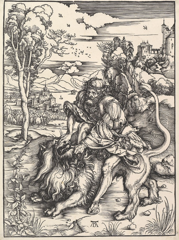
Samson Rending the Lion: Albrecht Durer

The earliest coloured woodcuts were made to imitate the appearance of chiaroscuro, which was very sought after by collectors. Within these types of drawings, the “coloured paper served as the middle tone, and the artist worked toward the light (chiaro) by adding highlights with white gouache, and toward the dark (scuro) by adding cross hatching in pen or a dark wash with a brush.” (Thompson 4) The chiaroscuro type of woodcut was invented by Hans Burgkmair around 1509.

St. Jerome in the Wilderness: Titian

As soon as the moveable type and printing press were invented in the 15th century, woodcuts gave us the ideal means for creating early printed books. The woodblocks could be placed alongside the type in the press and then printed the woodcuts onto paper. The same image could be used to illustrate more than one texture could even be used again for the same text. The history of woodcuts is very interesting to me because I have always looked at woodcuts and other relief printing forms as something I wanted to try. Though I haven’t realized it yet I hope I could one day due to the fact of how beautiful they seem to turn out.

Source

Titian

Tiziano Vecelli, known as Titian in English, is a famous renaissance artist from the 15-16th centuries. Titian is seen as one of the most versatile artists in Italy as his styles constantly changed throughout his career. Though he may have changed styles, he was always consistent on his use of colour. Though some of his earlier works may not have been as bright, his loose brush work and subtlety of tone were motifs in all of his pieces.

During the 16th period, Titian grew and matured in his Giorgionesque style and undertook larger and more complex subjects in his work. In 1521, Titian rose to the height of his fame after his figure of Saint Sebastian. Later, Titian created a sieges of small madonnas, in which he placed amongst beautiful landscapes and backgrounds. The softness to his pieces are very encapsulating and his use of tone and colour is unmatched. I find his work beautiful and intriguing to look at due to its soft features but immense detail.

Sources:

https://en.wikipedia.org/wiki/Titian#Growth

https://en.wikipedia.org/wiki/A_Man_with_a_Quilted_Sleeve

https://www.sothebys.com/en/artists/titian

https://www.metmuseum.org/art/collection/search/656438

https://geniusrevive.com/en/titian-one-of-the-greatest-high-renaissance-painters/

https://en.wikipedia.org/wiki/Self-Portrait_(Titian,_Madrid)

Mood Board

I decided to focus on different artists in the 18th and 19th centuries who died in poverty, but later became some of the biggest names in history. For my artists I decided on El Greco, Emily Dickinson, and Johann Sebastian Bach. Though we all know these iconic artists, many if them were not known in their life time. El Greco died commisionless, Dickinson was held back by the writing industry, and Bach’s composer work was left unknown. I thought it was interesting on how these people were incredibly talented, yet just happened to be born in the wrong time. Though they never got experience fame, we still get to see the effects that they had on history. If I were to give myself a score out of ten, I would give myself an 7/10 because I spent a lot of time researching and getting images, yet I wish I was able to go more in depth. However, I was limited by the Invision website due to my lack of knowledge on how to work it.

Emily Dickinson

Blog Post 1- The Code of Hammurabi

The code of Hammurabi is one of the oldest and well known written forms of law to exist. Though it was not the first code of law discovered, it is the first to state the idea of innocent until proven guilty. Today, innocence until proven guilty is one of the most popular ideologies in modern law and order. Though it doesn’t look like much at surface level, Hammurabi’s Code is over 8 feet tall and has over 30 laws engraved in it. In total, King Hammurabi had created over 280. Most of the laws follow the idea of an eye for an eye. The concept explains that if someone, for example, stole something, they would get their hand cut off as punishment. This general idea applies to a plethora of societies today. Though the seeming harshness, Hammurabi’s code also established the first minimum wage for workers. Minimum wage was a rare concept while looking at the treatment of middle-class workers in other societies. I chose Hammurabi’s code as it has always interested me and that I have had the pleasure to learn the concept in many history classes. As I have read and researched Hammurabi’s code on many separate occasions, I’ve also had the privilege of seeing the actual code in the Louvre when I was 12. While my memories of that trip are limited, I remember seeing the code and being starstruck. To finally see something that I’ve only heard about or seen in textbooks made it almost surreal. I was standing in front of a very influential piece of history. To this day, I still remember that feeling of realizing that I am a part of history. Though I may not be as influential as the code of Hammurabi, it inspired me to try and make the change I knew the world needed. While that does sound pretty dramatic for a 12-year-old, that moment changed my life.

Hammurabi’s Code

Citations:

  • Andrews, Evan. “8 Things You May Not Know about Hammurabi’s Code.” History.com, A&E Television Networks, 17 Dec. 2013, https://www.history.com/news/8-things-you-may-not-know-about-hammurabis-code?li_source=LI&li_medium=m2m-rcw-history. 
  • King, L. W. “The Code of Hammurabi.” The Avalon Project : Code of Hammurabi, 2008, https://avalon.law.yale.edu/ancient/hamframe.asp. 
  • Stanford University. “Hammurabi’s Code.” Stanford History Education Group, 20 Apr. 2020, https://sheg.stanford.edu/history-lessons/hammurabis-code. 
  • Gill, N.S. “What Was the Ancient Babylonian Law Code of Hammurabi?” ThoughtCo, ThoughtCo, 11 Sept. 2018, https://www.thoughtco.com/babylonia-117264. 
  • “Stele with the Code of Hammurabi.” Wikidata, https://www.wikidata.org/wiki/Q12397781. 

C

Visual Research II

The principles I chose to focus on were: Contrast in texture, Repetition, Figure/Ground, and Closure

Contrast In Texture- Sunrise by Geogiana Paraschiv in the image that I chose to represent the design principle of contrast in texture. The the smooth gradient in the yellow circle and the rough gradient in the grey circle creates a nice contrast. The overlaying of the two circles also create a sense of connection between these two contrasting objects.

Repetition- Love Saves the Day by Paul Rand is a great example of repetition. The diagonal repetition of colour along with the repetition of shape and direction is very well represented in Rands piece.

Figure/Ground- In the Food and Wine festival poster, Gestalts principle of figure/ground is prevalent. The shape of the fork moving down on the left side has prongs that are created by the shape of vine bottles in the negative space between them. This conveys the ideas of food, through the symbol of a fork, and wine, through the symbol of the wine bottles.

Closure- Gestalts principle of closure is conveyed through the image of spikes, creating th idea of them being attached to a circle. Though there is no outline of a circle, the way the spikes are placed creates the shape of a circle within the white.

Visual Research I

The three elements of design I decided to focus on were direction, colour, and shape.

Direction: I chose a piece by Paula Scher (Bottom). The different directions the text is being displayed frame the man as the centre piece, which was the purpose. The different sizes as well helps capture your eye and lead us towards the same man we are supposed to see.

Colour: I chose a piece by Takashi Murakami (Left) to display the element of colour. The usage of pastel colours is used to soften the hard lines of each flower. There are also different petals of the flowers that are a deep red, allowing our eyes to search across the whole piece instead of just the big flower in the centre

Shape: For shape I chose this piece by Allan Fletcher (Right) to represent shape. Fletcher does a great job of conveying shape because even though each figure lasts details and shading, the simple shape of the silhouette alludes us to the idea that they are all cats. each shape is very clear and concise so each cat is very clear and prominent in the piece.

Allan Fletcher
Takashi Murakami

Paula Scher

About Me

Funky, fresh, and clinically depressed. Welcome to the wondrous world of Paige. I hope you enjoy your stay, or atleast tolerate it. In my free time I like to stare at my ceiling and contemplate my existence, drink ungodly amounts of caffeine, and art (obviously). Other than that I’m a pretty easy person to grasp as I do talk a lot, especially about myself. I’m not narcissistic, I’m just really cool *enter sarcastic tone here*