Category 121
According to Gestalts theory, the design element “continuity” can be used to indicate movement and directions. In the Nike logo, we see a checkmark with the word “Nike” sitting above it. I believe the designer used the element or continuity… Continue Reading →
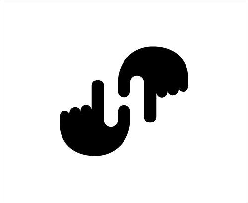
This logo design uses the design element “closure”. Here we see two hands forming a shape. What is most interesting about this logo is that the shape is the letter “H”. Our brains naturally form the letter by filling in… Continue Reading →
This design just would not be the same if not for the texture. The lines coming across the face adds an element of depth and interest. The designer has also utilized this pattern as shading in the style of cross-hatching… Continue Reading →
I have always been drawn to design like this one. Images hiding within images are a great way to grab people’s attention and make people react or feel emotion when looking at your design. The design utilizes white space to… Continue Reading →
Alan Fletcher Bus shelter poster: Shopping (1993) Although colour is but in abundance here, It is still the main design element. Imagine this same poster recreated in only black and white. I believe this design would have significantly less of… Continue Reading →


