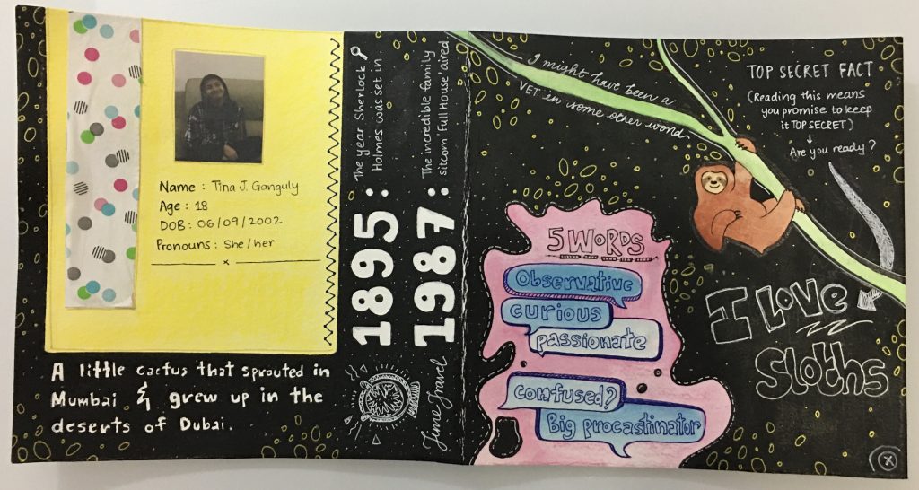
The artwork has a very light and colorful personality on a dark background. I feel like that is an ideal representation of who I am and how I carry myself. The theme is ‘personal expression’ because I was exploring myself in this artwork and went into a state of flow where everything came out naturally. The use of dots, dashes, circles, and doodles all around the page makes it more fun and attractive. The main changes that came about while ideating was color. I initially wanted a blue background to show the calm that I enjoy being in but later felt like a black background resonated much more deeply.
I would give myself 8 out of 10 because I found this an authentic representation of who I am. The artwork came out better than I expected. I wanted it to be engaging and playful which I feel I have achieved. There are improvements needed in some areas, for example, the space in the yellow and pink block could be better. So overall, an 8 is the score I would give myself for authenticity and following the instructions in the brief.
Leave a Reply