A Zine is a short magazine that explores a particular theme or topic. In this zine, I studied the typeface, Cooper Black.
Page 1 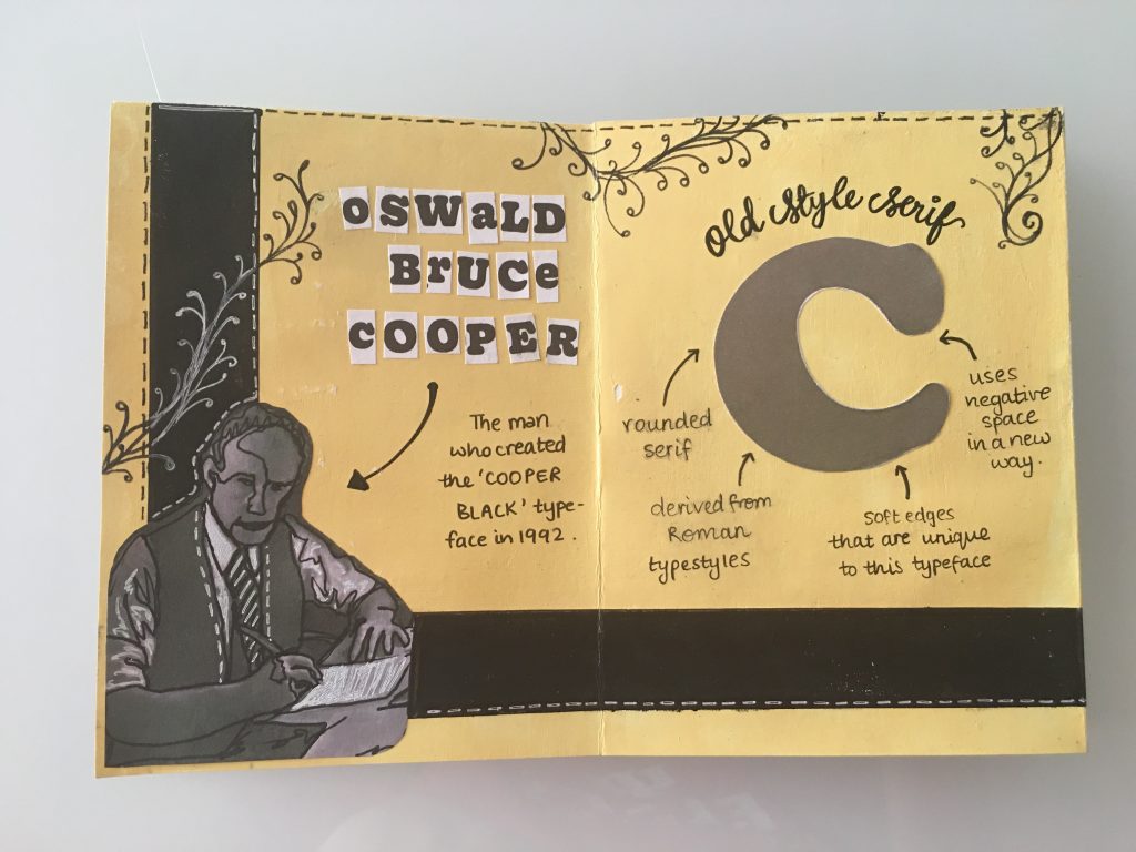
Pages 2 & 3 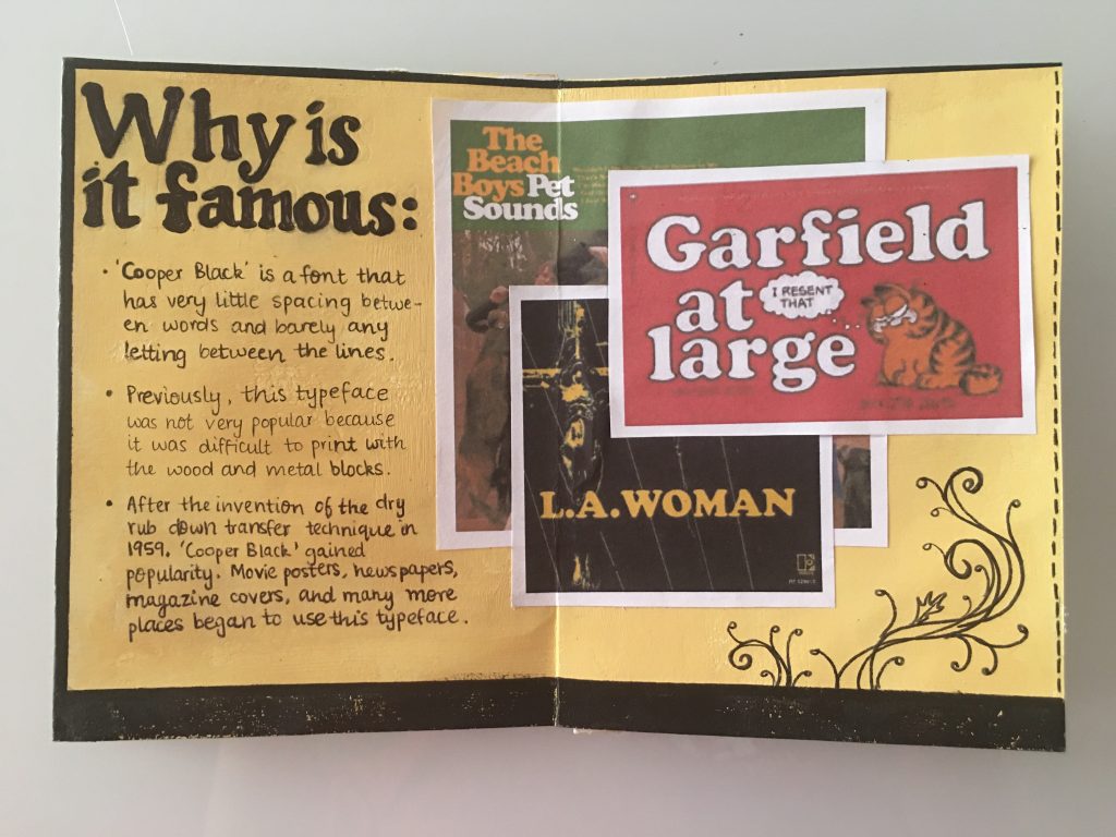
Pages 4 & 5 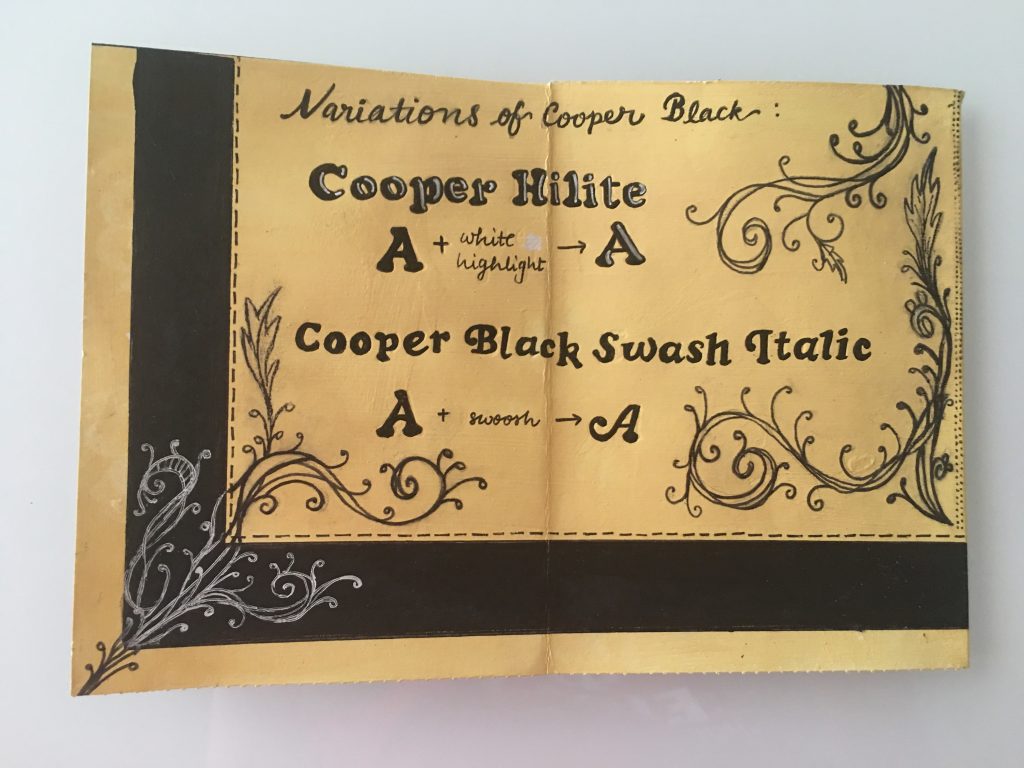
Pages 6 & 7 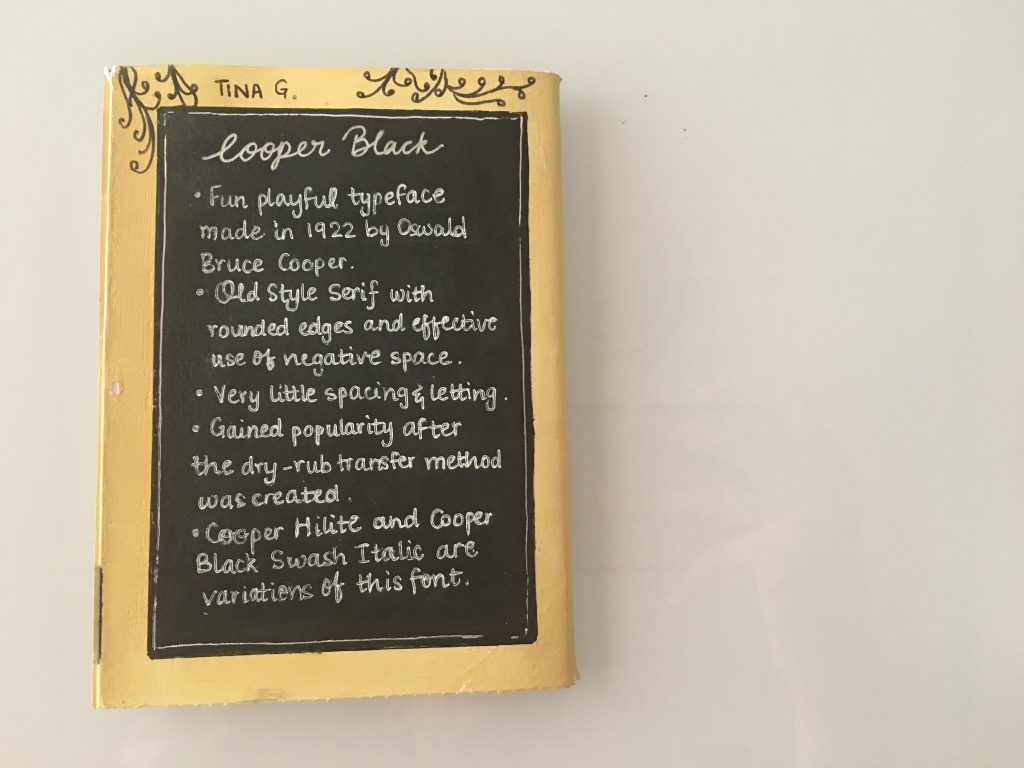
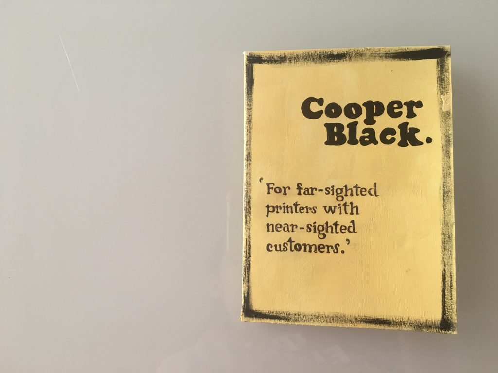
Page 8
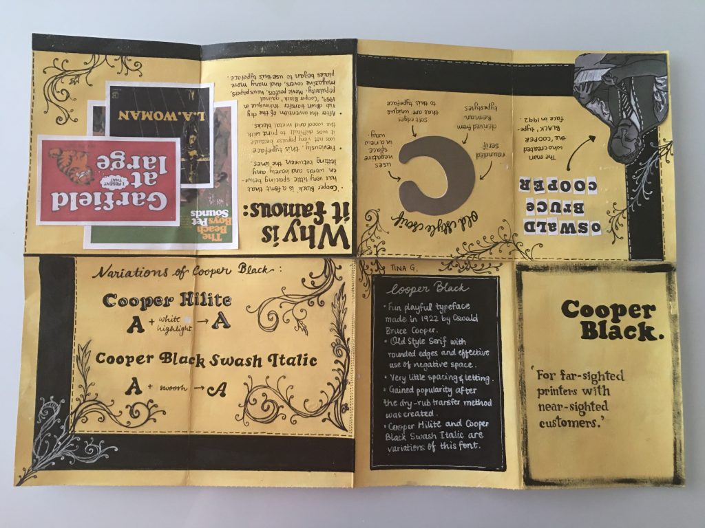
Cooper Black is an old-style font, so I decided to use the old manuscript colors and make the page a little worn out and in a cream color. I used black because of its contrast with the background and the neutrality of it.
Inspired by the manuscripts online, I added a few illustrations around the page to create a complete and cohesive look.
This assignment gave me a chance to explore numerous fonts and typefaces that I was yet to discover. It took me a while to decide on one because quite a few seemed very interesting. Cooper Black is a font I will use more often now and its variants as well.
I would give myself 7.5/10 because I followed all the steps in the brief, and the content is easy to follow.
The design can improve further because I used two different styles in one piece. The information given is interesting, and some elements of this typeface have been left to the viewer to find.
Leave a Reply