
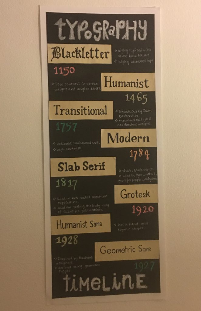
For my infographic, I decided to explore the different type classifications and their characteristics. I used black in the background, so the names and other information stands out to the viewer. I tried to make it casual and friendly because that is something I like in infographics.
After my research, I realized that a good infographic is minimalistic in design and doesn’t have too much detail and color that might distract or take away from the information presented. I strived to make something simple and impactful, so anybody with minimum knowledge about type classifications can also understand the timeline.
I would give myself a 9/10 because I feel like this infographic can be placed in a hallway. I tried my best to present facts in an easily understandable way and made everything by hand. The chalk material stands out and gives the flat paper some texture, which I really like. So overall, I am satisfied with my project.
REFRENCES
https://www.fonts.com/browse?filter=family:classification:sans,family:classification:sans:geometric
http://dyslexiahelp.umich.edu/sites/default/files/good_fonts_for_dyslexia_study.pdf
https://www.typewolf.com/top-10-humanist-sans-serif-fonts
https://www.behance.net/gallery/57613131/History-of-Typography-Timeline
https://en.wikipedia.org/wiki/Slab_serif
http://www.fontbureau.com/NHG/history/
https://www.shutterstock.com/support/article/what-is-a-modern-font
https://www.sitepoint.com/the-blackletter-typeface-a-long-and-colored-history/
Leave a Reply