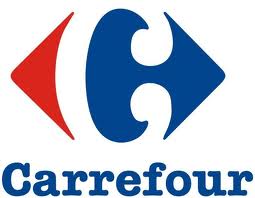
The logo above uses the Gestalt principle- closure to insert its brands initial into the illustration using negative space. The French name ‘Carrefour’ translates to crossroads. Hence, this design incorporates red and blue arrows pointing in different directions. A very famous brand that I have been shopping for groceries here for years. I was pretty impressed by this logo.
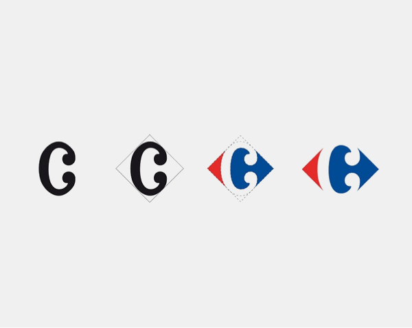
Logo designer: Miles Newlyn
Leave a Reply