Ideas
Initially, I wanted to take the topic of the Kazakh language and its transitions from Cyrillic to Latin and other interesting facts, but due to the lack of information on the Internet on this topic and concern that the presentation of information would be incomprehensible, I decided to choose another topic. This time I chose the font “Bodoni”
Rational
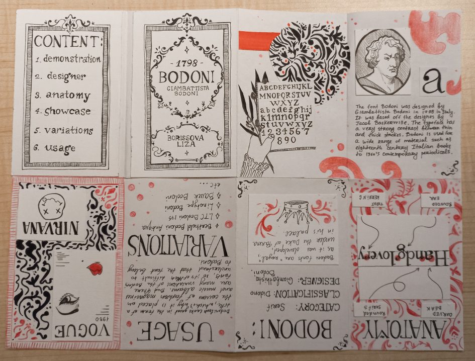
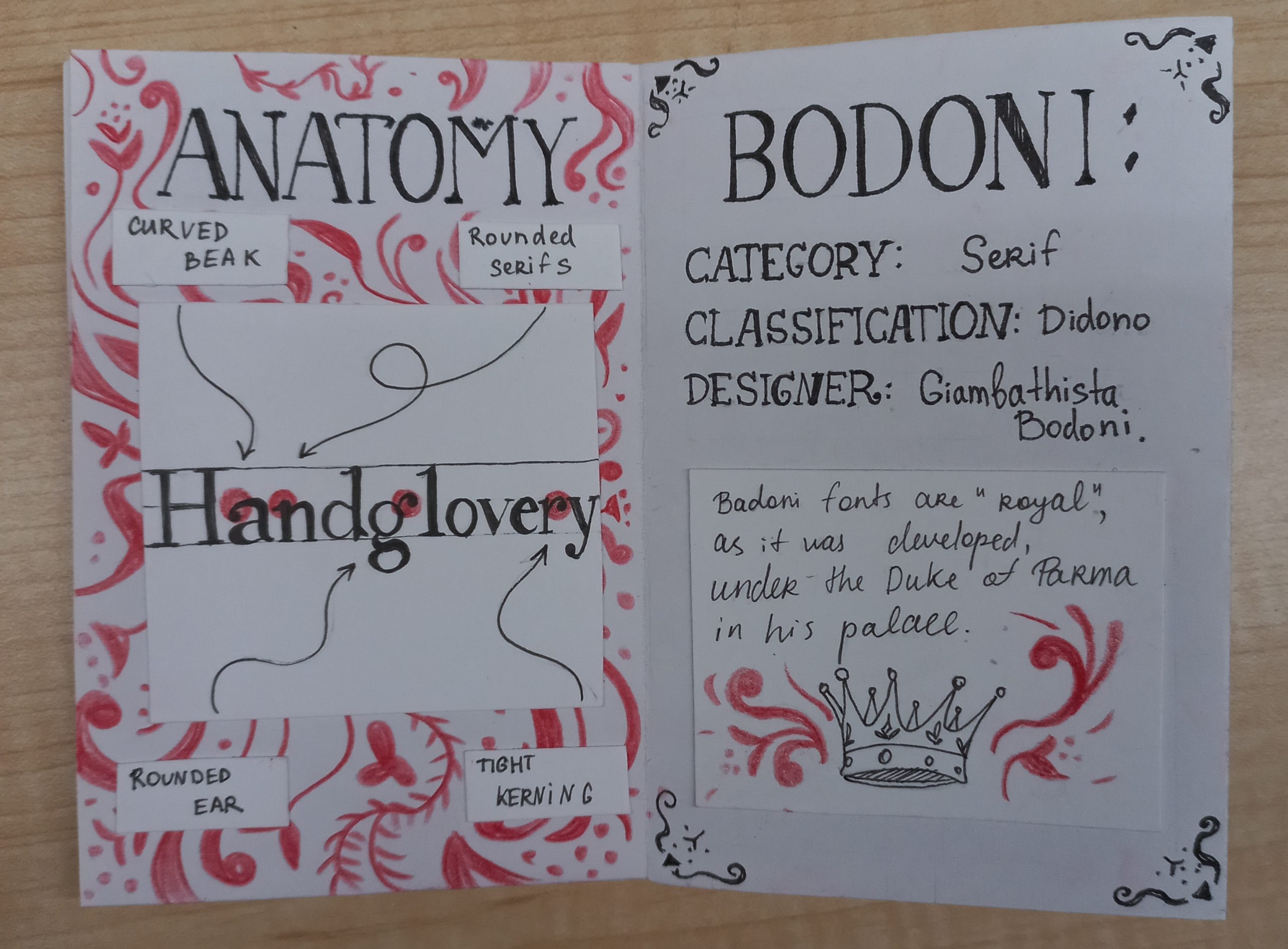
When I started working on this project, I was inspired by the aesthetics of the Renaissance books’ covers and documents, so I chose a relatively calm monochrome palette with a red accent colours. Also you can see patterns and ornaments on almost every page, which I took from the reprint of Giambattista Bodoni’s manual on typography.

page 3-4 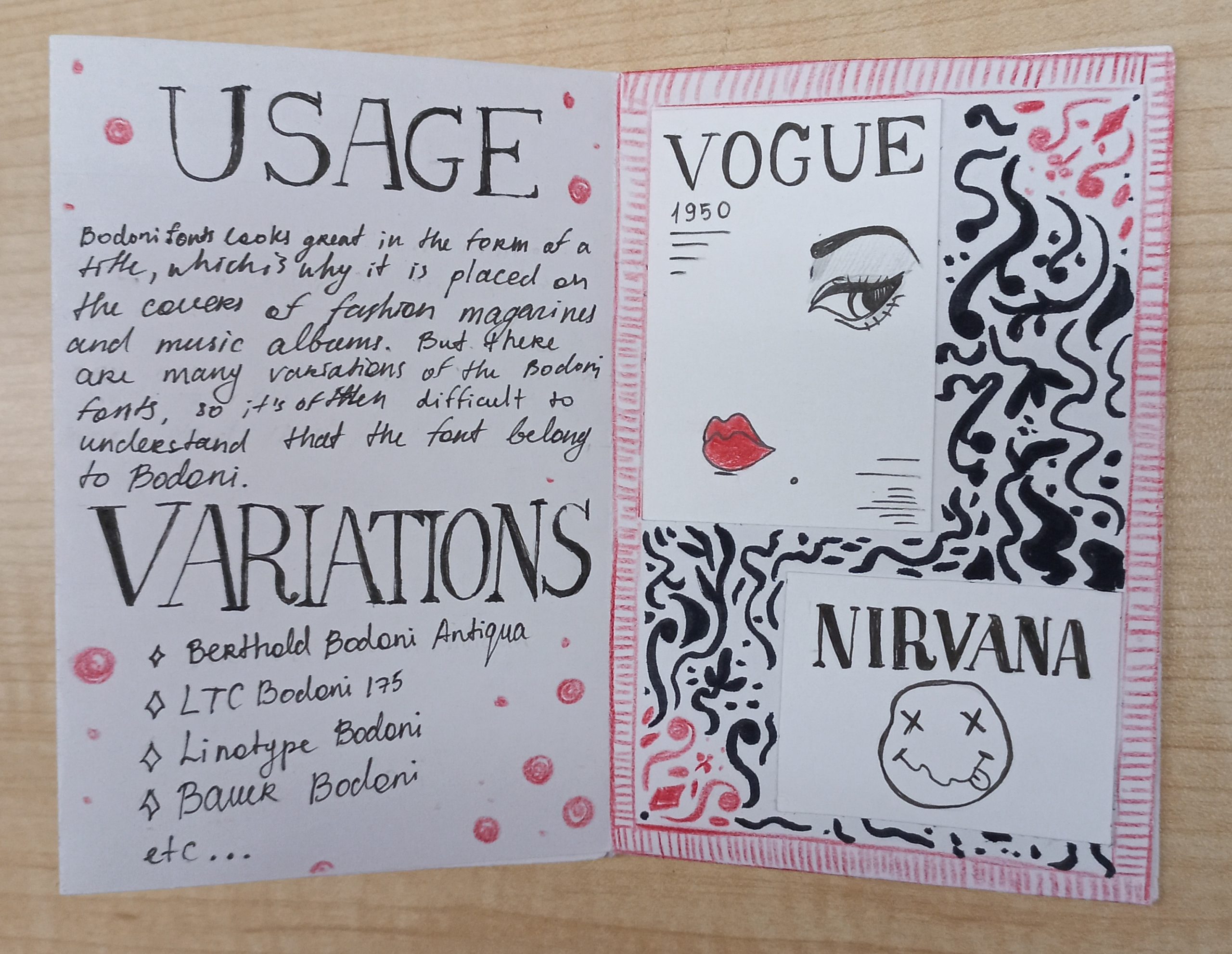
page 5-6
Time
I spent 13 hours on this project, including the time spent on research, sketches and implementation.
Grade
I liked my work with the design and inserts, as well as the fact that I didn’t use any printouts and did everything manually. I am also happy with my imitation of the Bodoni font in my zine, as I have always been terrible at writing fonts, so it was a challenge for me. But I also want to note that the last spread turned out to be sloppy compared to all the others due to the sweeping handwriting and the fact that I did not show examples of font variations. I can rate my work at 7.5 out of 10.
References:
https://www.fonts.com/font/linotype/bodoni/story
https://medium.com/@jevans67/typeface-history-bodoni-f2ef2d285cfe
https://ru.wikipedia.org/wiki/%D0%91%D0%BE%D0%B4%D0%BE%D0%BD%D0%B8_(%D1%88%D1%80%D0%B8%D1%84%D1%82)
Leave a Reply