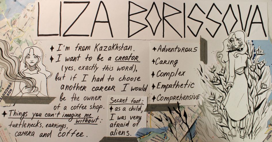
Before doing My Year Book Spread, I knew that I did not want to use bright colours, so I stopped at my main qualities and expressed them through my work. In choosing colours, I was guided by my love for peace and tranquillity, as well as seriousness and rigour in how I look and dress. That is why my poster turned out to be entirely monochrome, occasionally interrupted by pale green and blue. I used only two materials – a black marker and ink.
Furthermore, I am from Kazakhstan and have come quite a long way to be here. That is why the project’s main highlight was the maps of Vancouver, which frame the information in the middle. In addition, the illustration on the right, where I stand between the branches of cotton (I have associated myself with cotton since childhood), was also made for this purpose: to show I do not stop and continue to go and look for real “me”.
I would give this work a rating of 7/10 because I like my illustrations and the idea with maps, but I think I should have paid more attention to the structure and planning initially so that the text and drawings do not mix and it was easier to look at the work as a whole. The poster took me 7 hours.
Leave a Reply