Shape
1960 / Sebastião Rodrigues / PT / magazine cover
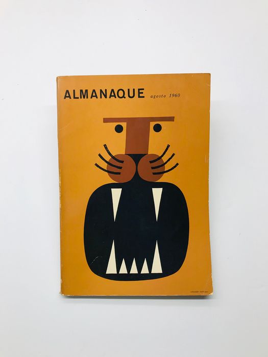
To describe the figure as the basis of the design, I took the famous cover of the “Almanac” magazine from Sebastião Rodrigues. Dots instead of eyes, triangles instead of teeth, circles, lines, and so on. These are simple and uncomplicated figures that line up in the outline of a lion on a solid orange background, which is very organic and pleasing to the eye.
Space
Rokas Aleliunas / poster
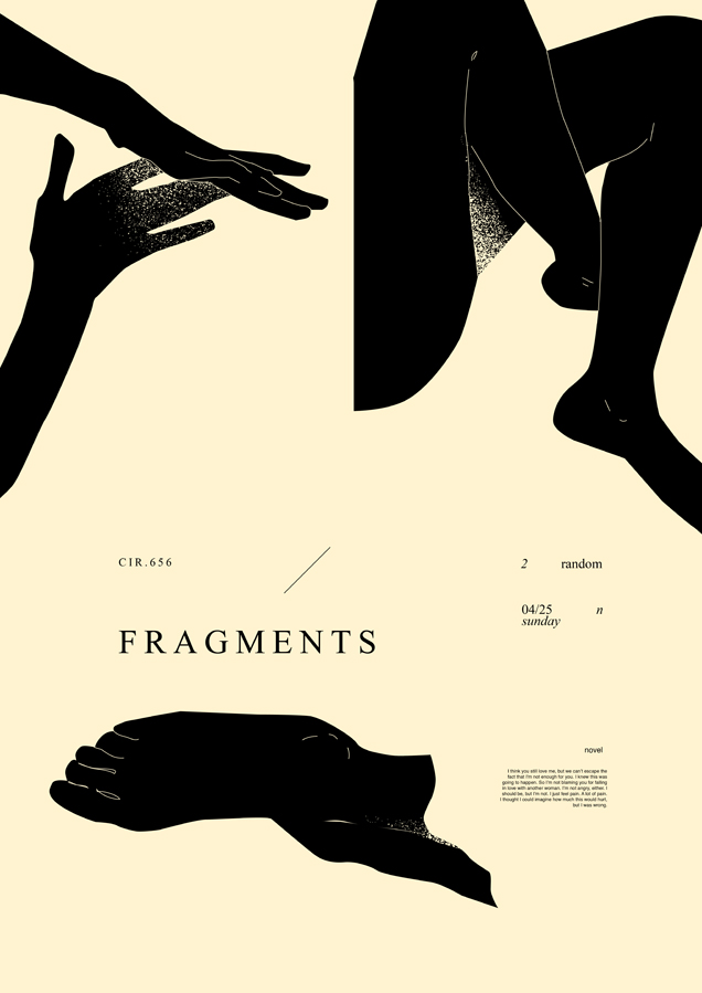
The use of positive and negatives space is illustrated in the poster “Fragments” of Rokas Aleliunas. The positive space is the black outlines of the arms and legs, which perfectly contrast with the milky background. Two spaces complement each other well. The negative one fills the space so that it seems to finish drawing the imaginary parts, combining the picture as a whole, making it balanced and exciting.
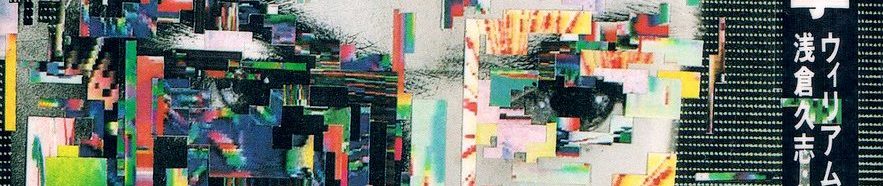
Texture
1987 / Yukimasa Okumura / JP / Book cover
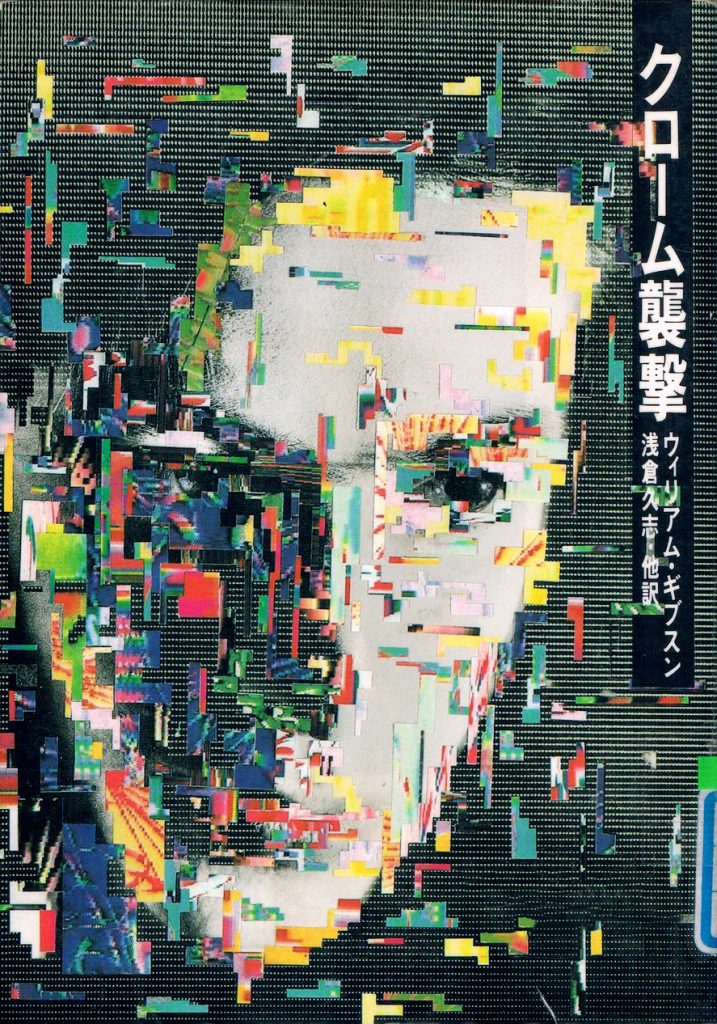
The cover for the science fiction book “Burning Chrome” by William Gibson is intertwined with different textures. The background is filled with the surface of the TV screen. The face and text were also slightly distorted. And the main component of this cover is a glitch located on top of the composition, which perfectly describes the atmosphere of cyberpunk and the idea of the author and designer about the future of that time.
Leave a Reply