Page 2 of 2

Ideas Initially, I wanted to take the topic of the Kazakh language and its transitions from Cyrillic to Latin and other interesting facts, but due to the lack of information on the Internet on this topic and concern that the… Continue Reading →

The man whose invention changed the world Johannes Gutenberg is known for his invention, which is considered one of the most important in the history of humankind. He is the first person who made the printing press practical and accessible…. Continue Reading →
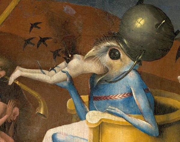
Hieronymus Bosch Hieronymus Bosch is one of the famous and revolutionary artists of the High Renaissance and was well known and highly appreciated during his lifetime and in the 16th century. His work also was collected by Philip II of… Continue Reading →
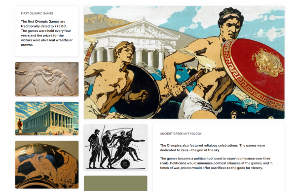
Link to the Mood board: https://lizaborissova701979.invisionapp.com/boards/5H80339642V8T4B Rational: In my mood board, I decided to combine three events: The First Olympic Games, Babylonian zodiac signs, and the Renaissance’s beginning. All three events are united by ancient Greek mythology. Zodiac signs inspired… Continue Reading →
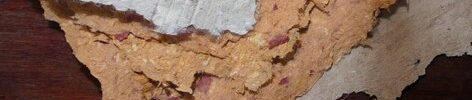
Materials used before paper Paper is a semisynthetic product made by chemically processing cellulosic fibres. To create paper, it needed to grind the source material, boil it in a solution, beat, pour it into a mould, and dry. The first… Continue Reading →

Piero della Francesca (c. 1420–1492) Piero della Francesca is one of the significant artists of the Early Renaissance period. He focused on solid figures, and luminous colour in his paintings and frescoes also showed all his passion for mathematics through… Continue Reading →

Continuity unknown designer / poster In this poster, we see how the principle of continuity is used. The yellow rings form a line that eventually reaches the letter “o” in the word “work”. Furthermore, since they go together in a… Continue Reading →

Shape 1960 / Sebastião Rodrigues / PT / magazine cover To describe the figure as the basis of the design, I took the famous cover of the “Almanac” magazine from Sebastião Rodrigues. Dots instead of eyes, triangles instead of teeth,… Continue Reading →
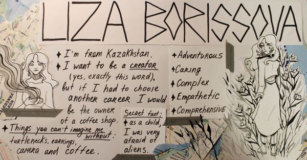
Before doing My Year Book Spread, I knew that I did not want to use bright colours, so I stopped at my main qualities and expressed them through my work. In choosing colours, I was guided by my love for… Continue Reading →