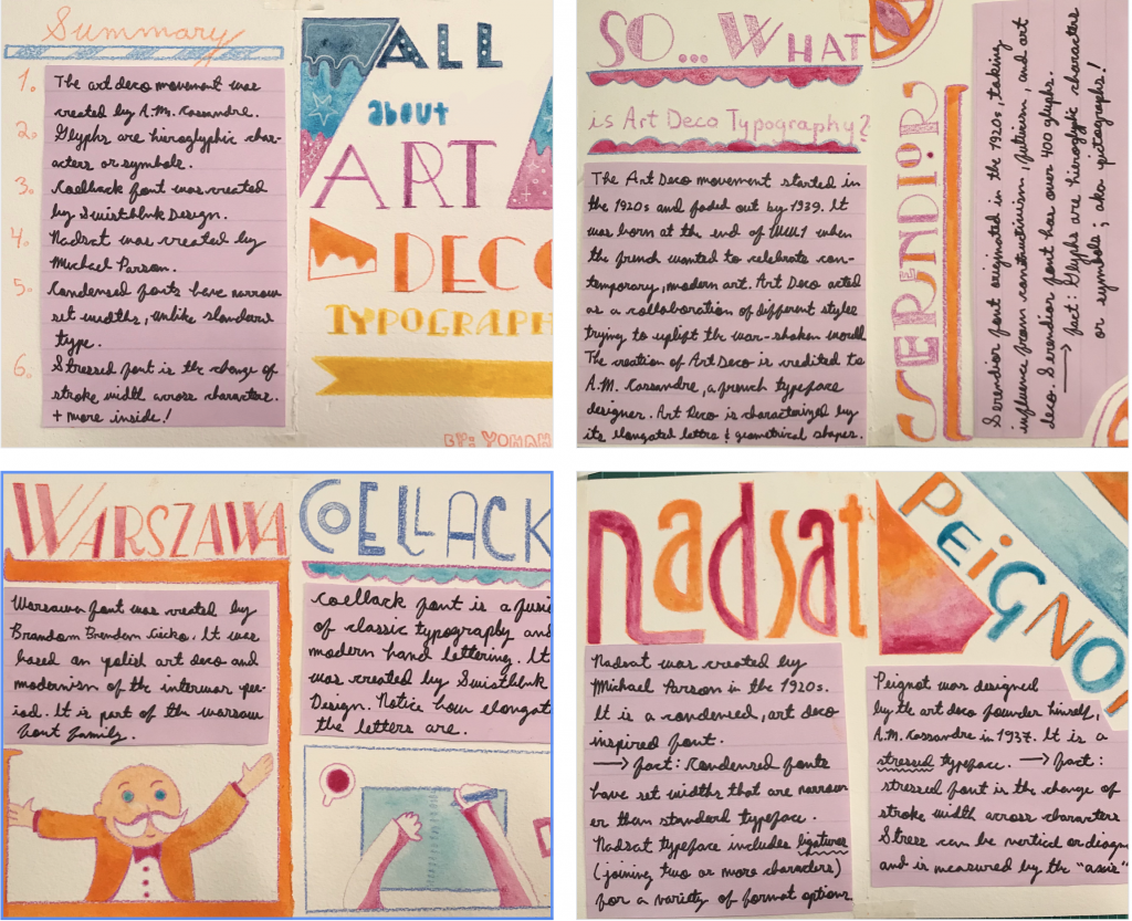
I decided to make my zine using watercolour and pencil crayons. I established a colour pallet of blue, pink/purple, yellow, and orange before starting my process. To help me organize my text in a neat fashion I cut out pieces of lined purple paper to write on. Since I used thick watercolour paper for this project I opted for the stapled spine zine method, as shown in the video example for this assignment. Since I discussed different art deco fonts, I made sure to emphasize the names by writing them in big letters. What I took away from this project is the importance in coming up with a theme for a spread/zine/project with multiple pages. Repeating similar elements (purple paper, theme colours) is important in order to create unity within a design. I would give myself a 7/10. I like how my zine turned out design-wise, but wonder if I could have provided more information for the fonts I featured. When I couldn’t find much background on specific fonts, I tried to supplement any lack of information with technical typography information. For example, when I talk about the origin of Nadsat font I included a fact on what condensed font is (since Nadsat is a condensed font). I spent approximately 7 hours on my zine.
Sources:
Hipfonts. “25 Vintage 1920s Fonts Straight from the Roaring Twenties.” HipFonts, 19 July 2021, hipfonts.com/1920s-fonts.
https:\/\/www.sessions.edu\/notes-on-design\/type-in-history-cassandres-art-deco-type\/#author. “Type in History: Cassandre’s Art Deco Type.” Sessions College, 17 Oct. 2019, www.sessions.edu/notes-on-design/type-in-history-cassandres-art-deco-type.
Vucic, Svetlana. “An Exploration of Art Deco and Its Use in Design – Qode Interactive.” Qode Magazine, 27 May 2021, qodeinteractive.com/magazine/art-deco-design.