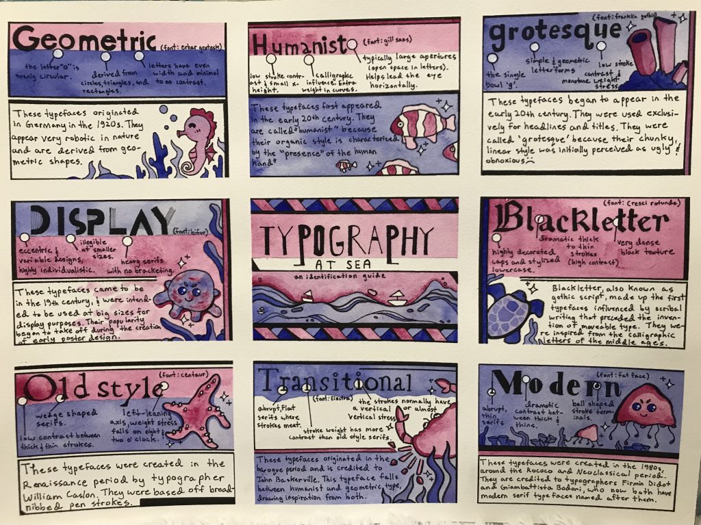
I wanted to have some fun with my type poster! After i’d compiled all my research I began my design process by sketching various thumbnails. I knew I wanted a “boxed” layout (in my mind this was one of the easiest ways for me to organized information). I also knew I wanted to incorporate some sort of illustrative visual element to go with the text. I took inspiration from baby blocks and children’s alphabet rugs. The key elements in each box are the typeface text and the sea animals. The idea was that the sea creatures would make the poster more engaging and approachable. For a colour scheme I wanted to keep it simple. I initially chose pink because it went well with many of the sea animals I chose (starfish, crab, jellyfish etc). Rather than going with blue for the ‘ocean’, I went with a colour closer to analogous with pink; blue-violet. The contrast between the two worked well to create separation between elements. I inked my typeface categories in the example font I chose for each (For transitional serifs I used the font electra, a transitional serif font). I was able to create visual hierarchy with the bold title text in each box. I additionally used contrasting colours to section different pieces of information (ie. Geometric from its characteristics). For my central title box I left almost no space white to separate it from my other 8 information boxes. To point out examples in the text i used small white bubbles with lines because they showed up great against the darker colours.
I am quite happy with how my poster turned out. I like the contrast of the big title text with the information, and how I sectioned my category definitions from my type characteristics. My poster full-filled my initial goal of adding ‘fun’ to the topic of typography identification. However, my type characteristics could have been laid out in a more organized manner. Perhaps If I had sectioned my three characteristics into three boxes, they would appear neater. For future projects, more planning into text layout would help me avoid issues like these. I would give myself a 7.5/10. While I love the aesthetic of the poster, certain text could have been arranged in neater and more reader-friendly ways. I spent around 10 hours on my poster. Researching took around 2-3, and hand inking all the text took me roughly 4-5. Painting took another 2-3 hours.