Louise Bourgeois (1911-2010)

One of the most iconic female feminist surrealist/expressionist artists of the 20-21th century.

Biography

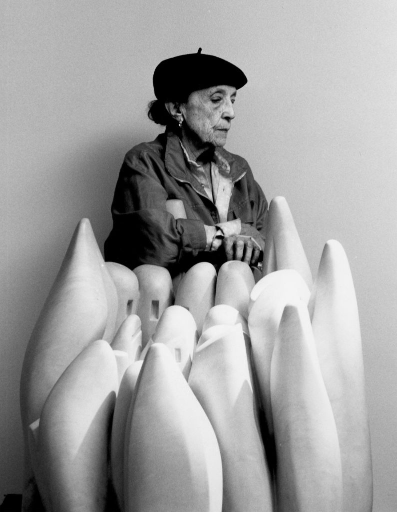
Louise Bourgeois was born to a family who owned a tapestry business in 1911. She was one of three children in the family, and her childhood was very rough due to her father being drafted for WW1. Her father’s affair and the war both destroyed the peace in the family; some of her works are believed to be influenced by these adversities in her life. She went to several different art schools and has experience in many different fields of study, such as math, philosophy, art, and art history. In 1938, she studied with the cubist artist Fernand Léger, who recommended sculpture to her. from 1939-1942, she became the mother of three boys in three years. This was an immense challenge for her, as an artist who is also a mother. However, this did not stop her from her career’s success, as she created many iconic paintings and sculptures throughout her life.

Artworks

Many of Louise Bourgeois’s works reference personal experiences in her life. She often expresses themes of feminism in her most iconic artworks; she is never limited to any material or scale, which is evident in the diversity and variety her works exhibit. Some of Bourgeois’s works have also been exhibited together with other iconic expressionist artists such as Jackson Pollock and Mark Rothko.

From the series “Femme Maison” (1946-1947)

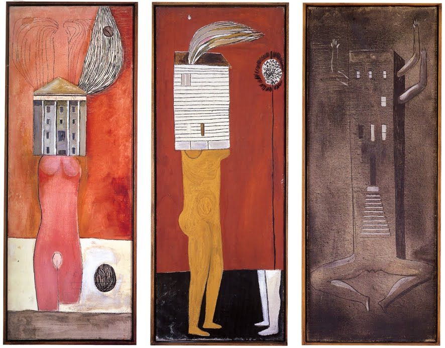
This series’s title literally translates to “housewife”. After learning about her biography, I definitely see why she chose this theme and used this approach. As a woman who has experienced the difficulty of having so many responsibilities in her life, she expresses this burdening reality in this series of paintings.

from the series “Soft landscapes II” (1967)

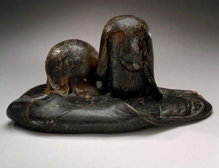
This sculpture, made of resin, latex, cement, and other materials, expresses what Louise Bourgeois feels about the relationship between earth and our bodies. She once said that “Our own body could be considered, from a topological point-of-view, a landscape with mounds and valleys and caves and holes. So it seems rather evident to me that our body is a figuration that appears in Mother Earth.”

“Pregnant Woman” (2009)

As seen in many of Bourgeois’s works, she often likes to create shapes that are visually similar to body parts that explore themes of sexuality, and gender, which is something she had challenges within her past.

from the Personnages series, “Femme Volage” (1951)

The shapes and tools in this piece resemble spindles, needles, and other objects that may reference her mother being a weaver. This piece represents the different connections she has with the people in her life. According to Bourgeois, this piece is meant to show a “reconstruction” of her past.

“the Destruction of the Father” (1974)

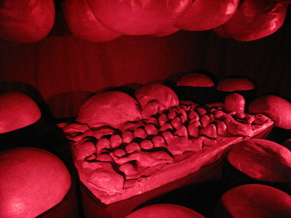
This may be one of her most famous pieces, as it is a reference to the betrayal and hatred she has towards what her father did to her family when she was young. The flesh-like shapes (a reference to her father being dismembered and liquidated) are placed in a room that resembles a bedroom/dining room, suggesting that she would devour her father for what he did. Truly an impactful and gruesome piece that really delivers her emotions.

“Maman” (1999)

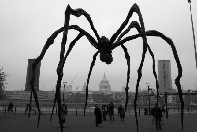
Perhaps one of the most iconic pieces that people think of when they remember Louise Bourgeois. Although this may look like a menacing huge spider, its story is heartwarming. It is a tribute to her mother, to whom she is deeply attached. Spiders, in Louise Bourgeois’s mind, are diligent and intelligent weavers who are protective of their children that devour their enemies. Her mother also has these qualities, which is why Bourgeois chose the spider to represent her. This subject appeared constantly and consistently in Bourgeois’s works during the 90’s.

Reflection

I was fascinated by Louise Bourgeois’s works and how emotionally impactful they are. In my opinion, successful abstract/expressionism art wouldn’t be purposely made to look confusing without meaning or effort, it should still deliver strong ideas or emotions, even if it’s up to the audience’s interpretation. This is why I love Bourgeois’s works. I can feel her ideas, her personality, and how much her experiences and memories mean to her.

Sources

https://www.theartstory.org/artist/bourgeois-louise/artworks/

https://www.tate.org.uk/art/artists/louise-bourgeois-2351/art-louise-bourgeois

https://www.artsy.net/artwork/louise-bourgeois-pregnant-woman-12

https://www.thoughtco.com/louise-bourgeois-quick-facts-183337

https://www.moma.org/artists/710

Assembling and integrating sources

In “The Honorable Harvest” by Robin Wall Kimmer and Marie Mourad’s “Thinking Outside the Bin,” both sources address the issue of overconsumption of foods, promoting sustainable food production. In “The Honourable Harvest”, Kimmer addresses this issue from more of a indigenous lifestyle’s perspective, suggesting that the act of harvesting food should focus on respect and gratitude of the planet’s resources. On the other hand, Mourad analyzes the issue from a more urban standpoint, focusing on the statistics and solutions to reduce food waste in the production process.

Historical artifacts: rational

This was overall a fun project, and I enjoyed experimenting with the art nouveau art style by creating a label for it. I looked at many Art Nouveau packaging references before attempting to recreate this label, and I think it turned out mostly accurate. For materials, I used pencil crayons and ink for the label, and I painted over the box. I do wish, however, that I spent a little more time to perfect it and maybe add a bit more details to the overall look of the packaging. Overall, I give myself 7.5/10 for the accuracy and details.

Leon Wyczółkowski (1852-1936)

A Polish artist who helped bring modern art to Poland.

“self portrait” (1913)

About the artist

Leon Wyczółkowski was a realist painter who helped bring the Young Poland Movement to its success. The young Poland movement was a revolutionary change for art, literature, and music in Poland since modernism and symbolism in art began to find its way into the country. He was a realist/impressionist painter who studied at several different fine arts academies in Poland and produced over 700 works in his lifetime. Later in his career, he began exploring graphic art and sculpture and also became the president of the Academy of Fine Arts in Kraków. His works often convey a strong feeling of a certain mood in daily life, through his style of color usage and tones.

I really resonate with his style of painting. I love the way he depicts the feeling of solitude with the simple composition, and a very muddy, grey background (not a bad thing at all!). I just love the foggy landscape that have a strong sense of depth, and the gaze of himself in the foreground feels absolutely melancholic although I cannot even see his eyes! This painting almost makes me feel sad and nostalgic, and allows me to ponder a lot. But I love that he is able to convey these emotions.

“Untitled” (1911)

This is a classic representation of his style. The usage of saturated blues in the atmospheric light in his paintings, and the back of a human figure facing towards somewhere the audience cannot see. I think this is why many of his paintings feel melancholic. However, I personally feel that the mood of this painting feels more comforting and peaceful rather than sad. The slight extension of the leg towards the water, and the warm sunlight shining on the figure captures the small feeling of assured peacefulness in this very short moment of this fisherman’s day (personal feeling).

“Ploughing in Ukraine” (1892)
“Untitled” (1893)

He loved painting the working class. I feel like the way he paints in the last photo especially shows how he blurs the lines between realism and impressionism. He uses both techniques, as he captures a brief moment of the day with seemingly loose brushwork, but also captures the mood and certain details of his subjects very well. Again, the people in his paintings are not looking directly at the viewer, instead, they are working away at the task at hand. I think he intends to show this feeling of the workers’ diligence and mood in their daily life by painting the way they focus on their work.

“Self portrait in Chinese tailoring”

Like many artists during his time, Wyczółkowski was also greatly influenced by Chinese, Japanese, and asian art. This is often seen through the pattern and subjects in his paintings. Another aspect that often stands out, again, is the usage of blue. He loves to use saturated azure blue for his shadows, instead of making them very dark. It almost gives his paintings a velvety look.

Reflection

I thoroughly enjoyed viewing and learning about Wyczółkowski through his artworks. I think the reason I resonate with his style so much is simply becasue he is able to capture what I want to achieve——the mood of nostalgia. Not as in I personally experienced the scenes in his paintings myself, but the way he delivers the feeling as if you were there, as if you can recall a memory where you experienced the same thing. I think artists who are able to convey these emotions through a frame of a moment are amazing.

Sources:

https://culture.pl/en/artist/leon-wyczolkowski

https://prabook.com/web/leon.wyczo_kowski/3742556#works

https://en.wikipedia.org/wiki/Young_Poland

https://commons.wikimedia.org/wiki/File:Leon_Wyczółkowski_%27Orka_na_Ukrainie%27.jpg

https://useum.org/artwork/Untitled-Leon-Wyczolkowski-1911

https://www.google.com/search?q=Leon+Wycz%C3%B3%C5%82kowski+profile&tbm=isch&ved=2ahUKEwizsb30rvbsAhUjJX0KHT50AxEQ2-cCegQIABAA&oq=Leon+Wycz%C3%B3%C5%82kowski+profile&gs_lcp=CgNpbWcQAzoCCAA6BAgAEB5Qu68BWNi-AWC4vwFoAXAAeACAAewBiAHFCJIBBTIuNi4xmAEAoAEBqgELZ3dzLXdpei1pbWfAAQE&sclient=img&ei=Q6-pX_ODHaPK9AO-6I2IAQ&bih=919&biw=1558&client=safari#imgrc=AggOGCwM6JvJhM

Survey 6: Claude Monet’s colors and the Victorian Gibson girls

1895-1905

Color: Impressionism

You’ve definitely heard of a few artists of this period, but have you noticed the iconic style of color usage in their paintings?

Claude Monet: The Father of Impressionism

Claude Monet (1840-1926)

I think we’ve all heard of him, haven’t we? Let’s talk about the characteristics of the way he changed color usage in paintings.

“Boulevard de Capucine” (1873)

Claude Monet is known to be the one who caused impressionism to rise. He paints the motif or the “impression” of a scene by being in the environment and quickly capturing a moment. Though these paintings may look “sketchy” and loose, he is a master of controlling the balance of colors, by balancing foggy, muted colors with saturated atmospheric colors. This is the iconic character of color usage in impressionist paintings.

“The Grand Canal” (1908)

As seen in this painting, Monet’s colours are often low in contrast of values, but high in contrast of saturation. This would become a classic style of impressionist colors.

“Impression, sunrise” (1874)

Another great example of the foggy, soft, and low contrast impressionistic colours.

Many great impressionist artists who were influenced by Monet use this same style of color combinations in their artworks.

“The Reader” (1872)
“Woman with a Parasol” (1875)

This is where we begin to see a common theme emerge from the paintings in this era: the Victorian Gibson girls. From here we move on to fashion.

Women’s Fashion: Victorian style

Noble women in the late 19th century usually had the standard Victorian combo: Bustles, high updos, corsets, and draped, frilly dresses.

Example of the trendy hairstyle in the late 19th century

As seen in Monet’s paintings, women often wore high, curly updos with lots of buns and braids. The hair got even taller once bustles became the “hot new thing”!

French women fashion in the late 19th century
Bustles and hoop skirts were used to accentuate the bottom half of a woman’s figure
Classic Victorian fashion trends at its peak

The large, exaggerated bustles in contrast to a tiny waist was very common. The dresses reached their max fullness in volume, and it was beginning to get a little too fancy.

However, bustles began to back out of the fashion trend near the beginning of the 20th century.

Early Edwardian era fashion

Here, we see the fashion trend moving towards a new era: the Edwardian era. The Edwardian era represented a more serious, well-conducted, and strict fashion trend. The skirts began to diminish in size, as well as the height of women’s hair. Instead, a straighter, slimmer silhouette of simpler dresses was much more preferred, and the big hats became very trendy.

The Edwardian era fashion standards

As we can see here, women’s dresses were much more toned-down in terms of puffs, frills, and fancy folds. They were almost suit-like.

A family in the Edwardian era, with classic big hats and formal, mature attire

Sources

monet parasol

impression sunrise color palette

boulevard de capucines monet

https://www.nga.gov/collection/art-object-page.61379.html

https://www.theartstory.org/artist/monet-claude/artworks/

monet the reader

https://www.pinterest.ca/redhookcath/edwardian/

https://bellatory.com/fashion-industry/Fashion-History-Victorian-Costume-and-Design-Trends-1837-1900-With-Pictures

https://www.pinterest.ca/pin/614108099166841084/

https://commons.wikimedia.org/wiki/File:Illustrated_fashion_catalogue_-_summer,_1890_(1890)_(14597302399).jpg