“I do not photograph nature, I photograph my visions.”
Biography
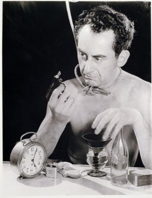
Man Ray (born as Emmanuel Radnitzky) was a successful American artist who transitioned from dadaism to surrealism. He is not a man living in the past, as he doesn’t even want to let people know of his original name. Man Ray is best known for his surrealist photography, which he calls “rayographs”, a pun on his name and the word “photograph”. In his teenage years, he often visited art museums and galleries with old masters’ paintings, which became sources of inspiration in his earlier years. His works exhibit many different styles, from cubism, dadaism, to surrealism. After he graduated from art school, He became close friends with Marcel Duchamp, and they influenced each other’s works on the journey of modern art.
Earlier works-paintings/sculptures
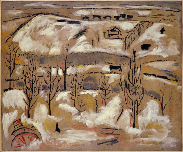
In his earlier works, he often works with oil paintings and we can see how he transitions by starting off with a more dadaist style and approach. He did many landscapes and still lives in his earlier paintings.

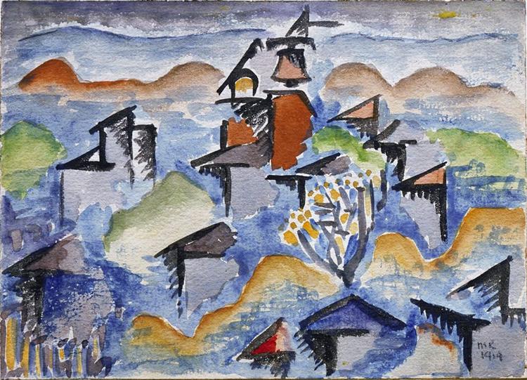
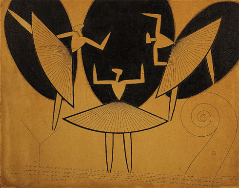
As we approach closer to the 1920s, we can see that Man Ray has adopted a more cubist style as a reaction to WWI, like many other artists of this period. The last piece titled “Silhouette” holds many iconic characteristics that would begin to appear later on in his photographs. The use of overlapping shapes, the composition, and the negative space would all become a consistent style seen in his works.
Rayographs/photography
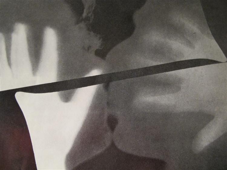
Finally, in 1922, his first “Rayograph” was born. In this photo, no cameras were used. Instead, he used a piece of paper that was exposed to light multiple times, using the kissing heads of his lover and himself as a stencil on the paper to create the shapes in this image. I wonder if he was inspired by Gustav Klimt’s version of “The Kiss” for this piece.
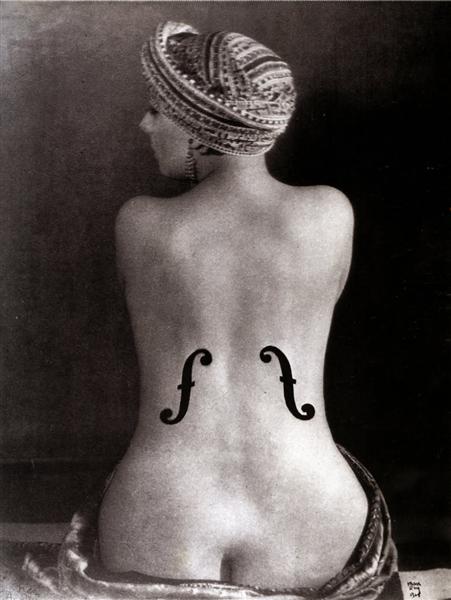
This is a piece referencing ean Auguste Dominique Ingres’s painting of a nude woman, titled “La grande baigneuse”. However, in Ray’s version, he combines the shape of a woman with characteristics of a violin, which becomes another classic theme seen in his works: objects and women’s figures. This photo is One of his most iconic pieces in the era of surrealism.
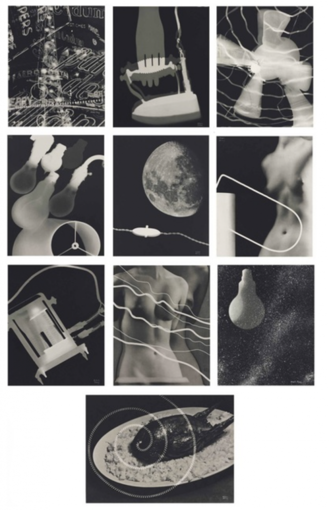
Possibly the best example of his surrealist style in photography. During that time, electricity was not very commonly used for household energy consumption. This series was commissioned by the French electric company (La Campagnie Parisiene de Distribution d’Électricité) as an advertisement/promotion of electricity during the interwar period. Ray’s visual representation of electricity in our lives is indeed surreal and captiviating, as he combines the theme of electricity with nude figures of women, and roasted chicken.
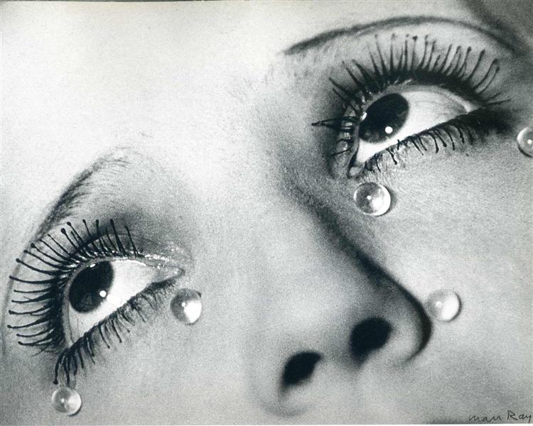
This piece shows a more cinematic/film-like approach. Using a mannequin with glass beads on its cheek, Ray wanted to convey the theme of “revenge”, which originated from his heartbreaking break-up with his lover, Lee Miller. The cropping of the image amplifies emotion seen through the eyes, and many believe he challenges the definition of reality and still life photography in this piece.
Reflection
Honestly speaking, although I am personally not a big fan of the movements during this era, I loved seeing Man Ray’s works. It was simply fascinating to witness his evolution through many movements of this era, as his works was an amalgamation and embodiment of some of the most iconic artistic themes during this time. I think that he’s a successful artist for being able to capture the essence of this time period through his works.